Date: 10/08/2019 14:55:06
From: party_pants
ID: 1421327
Subject: Define "Red"
Let’s say there was a law that required certain things to be pained red, or some other thing never to be painted red.
Is there a way of scientifically defining what colour is red?
Date: 10/08/2019 14:58:21
From: Tamb
ID: 1421330
Subject: re: Define "Red"
party_pants said:
Let’s say there was a law that required certain things to be pained red, or some other thing never to be painted red.
Is there a way of scientifically defining what colour is red?
Red is the color at the end of the visible spectrum of light, next to orange and opposite violet. It has a dominant wavelength of approximately 625–740 nanometres. It is a primary color in the
RGB color model and the
CMYK color model, and is the complementary color of cyan.
Date: 10/08/2019 15:01:42
From: dv
ID: 1421335
Subject: re: Define "Red"
In the sense that you can come up with a surface in RGzB or HSV space that encircles “red” but
A) it’s not a simple shape
B) Perversely it does NOT depend only on hue: human colour perception is weird
C) the boundary is fuzzy so you’d just have to make a judgment call: eg the boundary between orange and red is a cline, so you just have to cut a path
D) not everyone is going to agree. Even among people with normal colour vision, people will have varying ideas about what the chromatic extent of red is since the boundaries are somewhat arbitrary
Date: 10/08/2019 15:04:49
From: Tamb
ID: 1421338
Subject: re: Define "Red"
dv said:
In the sense that you can come up with a surface in RGzB or HSV space that encircles “red” but
A) it’s not a simple shape
B) Perversely it does NOT depend only on hue: human colour perception is weird
C) the boundary is fuzzy so you’d just have to make a judgment call: eg the boundary between orange and red is a cline, so you just have to cut a path
D) not everyone is going to agree. Even among people with normal colour vision, people will have varying ideas about what the chromatic extent of red is since the boundaries are somewhat arbitrary
It’s not about what people see it’s the nm value.
Date: 10/08/2019 15:06:37
From: Michael V
ID: 1421340
Subject: re: Define "Red"
Tamb said:
party_pants said:
Let’s say there was a law that required certain things to be pained red, or some other thing never to be painted red.
Is there a way of scientifically defining what colour is red?
Red is the color at the end of the visible spectrum of light, next to orange and opposite violet. It has a dominant wavelength of approximately 625–740 nanometres. It is a primary color in the RGB color model and the CMYK color model, and is the complementary color of cyan.
Perfect.
Dusts hands off.
Full solvered. No further correspondence is needed nor should be entered into.
Date: 10/08/2019 15:09:51
From: Tamb
ID: 1421341
Subject: re: Define "Red"
Michael V said:
Tamb said:
party_pants said:
Let’s say there was a law that required certain things to be pained red, or some other thing never to be painted red.
Is there a way of scientifically defining what colour is red?
Red is the color at the end of the visible spectrum of light, next to orange and opposite violet. It has a dominant wavelength of approximately 625–740 nanometres. It is a primary color in the RGB color model and the CMYK color model, and is the complementary color of cyan.
Perfect.
Dusts hands off.
Full solvered. No further correspondence is needed nor should be entered into.
Quod erat demonstrandum.
Date: 10/08/2019 15:13:35
From: buffy
ID: 1421342
Subject: re: Define "Red"
And the question they always put to optometry students:
Explain the sensation of “red”.
Which you can’t.
Date: 10/08/2019 15:15:08
From: buffy
ID: 1421343
Subject: re: Define "Red"
And more than you could ever want to know about colour…
https://munsell.com/
Munsell is a very widely used system.
Date: 10/08/2019 15:17:39
From: buffy
ID: 1421344
Subject: re: Define "Red"
Oh, and “red” is a learned name. You could, if you chose, teach a child to call blue things, “red”. You are taught what to call a particular sensation.
Date: 10/08/2019 15:18:18
From: Tamb
ID: 1421345
Subject: re: Define "Red"
buffy said:
And more than you could ever want to know about colour…
https://munsell.com/
Munsell is a very widely used system.
We used the Lovibond Tintometer.
Date: 10/08/2019 15:19:34
From: Tamb
ID: 1421346
Subject: re: Define "Red"
buffy said:
Oh, and “red” is a learned name. You could, if you chose, teach a child to call blue things, “red”. You are taught what to call a particular sensation.
As shown by the different colour names in different languages.
Date: 10/08/2019 15:21:10
From: buffy
ID: 1421347
Subject: re: Define "Red"
Tamb said:
buffy said:
And more than you could ever want to know about colour…
https://munsell.com/
Munsell is a very widely used system.
We used the Lovibond Tintometer.
In colour vision testing it’s Munsell all the way.
:)
Date: 10/08/2019 15:25:09
From: Tamb
ID: 1421348
Subject: re: Define "Red"
buffy said:
Tamb said:
buffy said:
And more than you could ever want to know about colour…
https://munsell.com/
Munsell is a very widely used system.
We used the Lovibond Tintometer.
In colour vision testing it’s Munsell all the way.
:)
Yes I understand that. We needed to make cable colours adhere to an international standard independent of perceived colour.
Date: 10/08/2019 15:26:06
From: party_pants
ID: 1421349
Subject: re: Define "Red"
buffy said:
Oh, and “red” is a learned name. You could, if you chose, teach a child to call blue things, “red”. You are taught what to call a particular sensation.
Well yes of course. But they would be outliers if they had a specifically different upbringing.
Date: 10/08/2019 15:26:30
From: The Rev Dodgson
ID: 1421350
Subject: re: Define "Red"
What colour is an orange in the head?
Date: 10/08/2019 15:28:52
From: sibeen
ID: 1421351
Subject: re: Define "Red"
Tamb said:
buffy said:
Tamb said:
We used the Lovibond Tintometer.
In colour vision testing it’s Munsell all the way.
:)
Yes I understand that. We needed to make cable colours adhere to an international standard independent of perceived colour.
LOL slaps knee ROFL
Date: 10/08/2019 15:36:52
From: buffy
ID: 1421354
Subject: re: Define "Red"
Tamb said:
buffy said:
Tamb said:
We used the Lovibond Tintometer.
In colour vision testing it’s Munsell all the way.
:)
Yes I understand that. We needed to make cable colours adhere to an international standard independent of perceived colour.
Are you talking electrical cables? My understanding is that it’s really a matter of making sure the colours look different from each other to all comers. Which can be done, but it’s not easy. On a similar note, the actual colour of red reflectors and red traffic signal lights was adjusted some years ago so that protan colour defective observers had some chance of being able to see them. There was a bit of trouble with protans running up the tray of parked trucks at night because to them the reflectors of the old type were simply not visible.
Date: 10/08/2019 15:36:58
From: Tau.Neutrino
ID: 1421355
Subject: re: Define "Red"
party_pants said:
Let’s say there was a law that required certain things to be pained red, or some other thing never to be painted red.
Is there a way of scientifically defining what colour is red?
Spectral colors
Color Wavelength Frequency
Green 500–565 nm 530–600 THz
Yellow 565–590 nm 510–530 THz
Orange 590–625 nm 480–510 THz
Red 625–740 nm 405–480 THz
https://en.m.wikipedia.org/wiki/Visible_spectrum
https://en.wikipedia.org/wiki/Color
Date: 10/08/2019 15:41:06
From: buffy
ID: 1421358
Subject: re: Define "Red"
And if anyone needs them…here are the colour confusion lines for people with colour vision difficulties.
https://www.color-blindness.com/2009/01/19/colorblind-colors-of-confusion/
In basic essence, a person with a protan defect will find red lights dark. May not even be able to see them. A person with a deutan defect will see green lights as pale, washed out, even white. But there are degrees.
Colour vision is very complex.
Date: 10/08/2019 15:42:19
From: Tau.Neutrino
ID: 1421359
Subject: re: Define "Red"
Tau.Neutrino said:
party_pants said:
Let’s say there was a law that required certain things to be pained red, or some other thing never to be painted red.
Is there a way of scientifically defining what colour is red?
Spectral colors
Color Wavelength Frequency
Green 500–565 nm 530–600 THz
Yellow 565–590 nm 510–530 THz
Orange 590–625 nm 480–510 THz
Red 625–740 nm 405–480 THz
https://en.m.wikipedia.org/wiki/Visible_spectrum
https://en.wikipedia.org/wiki/Color
Color is the temperature of reflected or emitted light and what it vibrates at on the frequency spectrum.
Mollwollfumble can give a detailed answer
Date: 10/08/2019 15:43:46
From: Tamb
ID: 1421360
Subject: re: Define "Red"
buffy said:
Tamb said:
buffy said:
In colour vision testing it’s Munsell all the way.
:)
Yes I understand that. We needed to make cable colours adhere to an international standard independent of perceived colour.
Are you talking electrical cables? My understanding is that it’s really a matter of making sure the colours look different from each other to all comers. Which can be done, but it’s not easy. On a similar note, the actual colour of red reflectors and red traffic signal lights was adjusted some years ago so that protan colour defective observers had some chance of being able to see them. There was a bit of trouble with protans running up the tray of parked trucks at night because to them the reflectors of the old type were simply not visible.
Not just 240V cables. Some have up to 1000 conductors in them & you must know how to identify every one. There is a convention used but it still comes down to colour combinations.
Date: 10/08/2019 15:49:44
From: buffy
ID: 1421362
Subject: re: Define "Red"
Gosh…you want geek?!
https://signaleer.wordpress.com/2010/04/28/cabling-for-the-color-blind/
Date: 10/08/2019 15:54:27
From: Divine Angel
ID: 1421363
Subject: re: Define "Red"
buffy said:
And the question they always put to optometry students:
Explain the sensation of “red”.
Which you can’t.
In the movie Mask, Eric Stoltz’s character tries to show Laura Dern’s character, who is blind, what colours are. He uses heat for red, cold for blue, cotton wool for white. Or maybe cotton wool was for clouds, I can’t remember.
But anyway, a blind person can’t really grasp the concept of colour, nor what red (or any other colour) actually looks like.
Date: 10/08/2019 15:55:53
From: Divine Angel
ID: 1421365
Subject: re: Define "Red"
dv said:
In the sense that you can come up with a surface in RGzB or HSV space that encircles “red” but
A) it’s not a simple shape
B) Perversely it does NOT depend only on hue: human colour perception is weird
C) the boundary is fuzzy so you’d just have to make a judgment call: eg the boundary between orange and red is a cline, so you just have to cut a path
D) not everyone is going to agree. Even among people with normal colour vision, people will have varying ideas about what the chromatic extent of red is since the boundaries are somewhat arbitrary
Cadbury has trademarked a particular hue of purple. How is that particular shade defined?
Date: 10/08/2019 15:59:17
From: buffy
ID: 1421366
Subject: re: Define "Red"
Divine Angel said:
dv said:
In the sense that you can come up with a surface in RGzB or HSV space that encircles “red” but
A) it’s not a simple shape
B) Perversely it does NOT depend only on hue: human colour perception is weird
C) the boundary is fuzzy so you’d just have to make a judgment call: eg the boundary between orange and red is a cline, so you just have to cut a path
D) not everyone is going to agree. Even among people with normal colour vision, people will have varying ideas about what the chromatic extent of red is since the boundaries are somewhat arbitrary
Cadbury has trademarked a particular hue of purple. How is that particular shade defined?
Apparently like this:
https://www.thedrum.com/news/2018/12/05/cadbury-purple-trademark-battle-isnt-over-yet
Date: 10/08/2019 16:00:13
From: JudgeMental
ID: 1421367
Subject: re: Define "Red"
Divine Angel said:
dv said:
In the sense that you can come up with a surface in RGzB or HSV space that encircles “red” but
A) it’s not a simple shape
B) Perversely it does NOT depend only on hue: human colour perception is weird
C) the boundary is fuzzy so you’d just have to make a judgment call: eg the boundary between orange and red is a cline, so you just have to cut a path
D) not everyone is going to agree. Even among people with normal colour vision, people will have varying ideas about what the chromatic extent of red is since the boundaries are somewhat arbitrary
Cadbury has trademarked a particular hue of purple. How is that particular shade defined?
Pantone 2685C
Date: 10/08/2019 16:01:54
From: buffy
ID: 1421369
Subject: re: Define "Red"
Oh my goodness. It’s some commercial colour system.
https://www.pantone.com/color-systems/pantone-color-systems-explained
Date: 10/08/2019 16:02:09
From: JudgeMental
ID: 1421370
Subject: re: Define "Red"
buffy said:
Divine Angel said:
dv said:
In the sense that you can come up with a surface in RGzB or HSV space that encircles “red” but
A) it’s not a simple shape
B) Perversely it does NOT depend only on hue: human colour perception is weird
C) the boundary is fuzzy so you’d just have to make a judgment call: eg the boundary between orange and red is a cline, so you just have to cut a path
D) not everyone is going to agree. Even among people with normal colour vision, people will have varying ideas about what the chromatic extent of red is since the boundaries are somewhat arbitrary
Cadbury has trademarked a particular hue of purple. How is that particular shade defined?
Apparently like this:
https://www.thedrum.com/news/2018/12/05/cadbury-purple-trademark-battle-isnt-over-yet
it is pantone not panatone, usually shortened to PMS, pantone matching system. Never show the client the PMS or the typeface books.
Date: 10/08/2019 16:03:22
From: JudgeMental
ID: 1421372
Subject: re: Define "Red"
buffy said:
Oh my goodness. It’s some commercial colour system.
https://www.pantone.com/color-systems/pantone-color-systems-explained
it is a recipe book. standard in the industry.
Date: 10/08/2019 16:04:37
From: buffy
ID: 1421373
Subject: re: Define "Red"
JudgeMental said:
buffy said:
Oh my goodness. It’s some commercial colour system.
https://www.pantone.com/color-systems/pantone-color-systems-explained
it is a recipe book. standard in the industry.
And the Munsell system is the one used in Science. It probably could be used as an industry standard, I guess. When colour vision testing equipment is made up, the colours are defined by Munsell numbers.
Date: 10/08/2019 16:06:22
From: Tau.Neutrino
ID: 1421377
Subject: re: Define "Red"
So to help answer the question
The human eye is a very sensitive photon light sensor which interacts with the environment through reflected and emitted light, the eye then converts those photons which vibrate at different frequencies using rods and cones into electrical signals that are processed by the brain into an image of the environment being looked at. The colour red vibrates at 405–480 THz
Spectral Colours

Color Wavelength Frequency Photon energy
Violet 380–450 nm 680–790 THz 2.95–3.10 eV
Blue 450–485 nm 620–680 THz 2.64–2.75 eV
Cyan 485–500 nm 600–620 THz 2.48–2.52 eV
Green 500–565 nm 530–600 THz 2.25–2.34 eV
Yellow 565–590 nm 510–530 THz 2.10–2.17 eV
Orange 590–625 nm 480–510 THz 2.00–2.10 eV
Red 625–740 nm 405–480 THz 1.65–2.00 eV
Date: 10/08/2019 16:06:32
From: JudgeMental
ID: 1421378
Subject: re: Define "Red"
buffy said:
JudgeMental said:
buffy said:
Oh my goodness. It’s some commercial colour system.
https://www.pantone.com/color-systems/pantone-color-systems-explained
it is a recipe book. standard in the industry.
And the Munsell system is the one used in Science. It probably could be used as an industry standard, I guess. When colour vision testing equipment is made up, the colours are defined by Munsell numbers.
pantone uses standard ink colours that you mix to get PMS colours. EG Cobalt Blue 80% Titanium White 20% + whatever PMS # that is.
Date: 10/08/2019 16:08:05
From: JudgeMental
ID: 1421381
Subject: re: Define "Red"
JudgeMental said:
buffy said:
JudgeMental said:
it is a recipe book. standard in the industry.
And the Munsell system is the one used in Science. It probably could be used as an industry standard, I guess. When colour vision testing equipment is made up, the colours are defined by Munsell numbers.
pantone uses standard ink colours that you mix to get PMS colours. EG Cobalt Blue 80% Titanium White 20% = whatever PMS # that is.
fixed
You can use inks from whatever manufacturer you like.
Date: 10/08/2019 16:08:15
From: Divine Angel
ID: 1421383
Subject: re: Define "Red"
buffy said:
Oh my goodness. It’s some commercial colour system.
https://www.pantone.com/color-systems/pantone-color-systems-explained
https://medium.com/@simonlewington/what-is-a-pantone-colour-and-do-i-need-it-for-my-printing-de68acb8a9d
Date: 10/08/2019 16:10:27
From: Tau.Neutrino
ID: 1421384
Subject: re: Define "Red"
I’m a visual artist
I love colours.
I love science too.
I like space as well.
Date: 10/08/2019 16:23:08
From: PermeateFree
ID: 1421386
Subject: re: Define "Red"
Tau.Neutrino said:
I’m a visual artist
I love colours.
I love science too.
I like space as well.
You should be locked in a dark room.
Date: 10/08/2019 16:27:51
From: Tau.Neutrino
ID: 1421387
Subject: re: Define "Red"
PermeateFree said:
Tau.Neutrino said:
I’m a visual artist
I love colours.
I love science too.
I like space as well.
You should be locked in a dark room.
Perceptual mediation?
Date: 10/08/2019 16:32:12
From: Tau.Neutrino
ID: 1421389
Subject: re: Define "Red"
Imagine painting the universe in different colours, Its always black. We could make it brighter.
https://www.youtube.com/watch?reload=9&v=6c1BThu95d8
Date: 10/08/2019 16:39:50
From: Witty Rejoinder
ID: 1421394
Subject: re: Define "Red"
Tau.Neutrino said:
I’m a visual artist
Is that what you call it?
Date: 10/08/2019 17:04:07
From: dv
ID: 1421400
Subject: re: Define "Red"
Tamb said:
dv said:
In the sense that you can come up with a surface in RGzB or HSV space that encircles “red” but
A) it’s not a simple shape
B) Perversely it does NOT depend only on hue: human colour perception is weird
C) the boundary is fuzzy so you’d just have to make a judgment call: eg the boundary between orange and red is a cline, so you just have to cut a path
D) not everyone is going to agree. Even among people with normal colour vision, people will have varying ideas about what the chromatic extent of red is since the boundaries are somewhat arbitrary
It’s not about what people see it’s the nm value.
Incorrect
Date: 10/08/2019 17:08:18
From: dv
ID: 1421402
Subject: re: Define "Red"
Tau.Neutrino said:
So to help answer the question
The human eye is a very sensitive photon light sensor which interacts with the environment through reflected and emitted light, the eye then converts those photons which vibrate at different frequencies using rods and cones into electrical signals that are processed by the brain into an image of the environment being looked at. The colour red vibrates at 405–480 THz
Spectral Colours
Color Wavelength Frequency Photon energy
Violet 380–450 nm 680–790 THz 2.95–3.10 eV
Blue 450–485 nm 620–680 THz 2.64–2.75 eV
Cyan 485–500 nm 600–620 THz 2.48–2.52 eV
Green 500–565 nm 530–600 THz 2.25–2.34 eV
Yellow 565–590 nm 510–530 THz 2.10–2.17 eV
Orange 590–625 nm 480–510 THz 2.00–2.10 eV
Red 625–740 nm 405–480 THz 1.65–2.00 eV
Right but real paint doesn’t reflect in just one frequency. It has a reflectivity function that varies with wavelength, so determining whether a particular paint counts as “red” becomes a more involved matter ( see my first post).
Date: 10/08/2019 17:33:40
From: Tau.Neutrino
ID: 1421409
Subject: re: Define "Red"
dv said:
Tau.Neutrino said:
So to help answer the question
The human eye is a very sensitive photon light sensor which interacts with the environment through reflected and emitted light, the eye then converts those photons which vibrate at different frequencies using rods and cones into electrical signals that are processed by the brain into an image of the environment being looked at. The colour red vibrates at 405–480 THz
Spectral Colours
Color Wavelength Frequency Photon energy
Violet 380–450 nm 680–790 THz 2.95–3.10 eV
Blue 450–485 nm 620–680 THz 2.64–2.75 eV
Cyan 485–500 nm 600–620 THz 2.48–2.52 eV
Green 500–565 nm 530–600 THz 2.25–2.34 eV
Yellow 565–590 nm 510–530 THz 2.10–2.17 eV
Orange 590–625 nm 480–510 THz 2.00–2.10 eV
Red 625–740 nm 405–480 THz 1.65–2.00 eV
Right but real paint doesn’t reflect in just one frequency. It has a reflectivity function that varies with wavelength, so determining whether a particular paint counts as “red” becomes a more involved matter ( see my first post).
Yes, If it did it would look different.
Imperfections within the paint lead to the variations.
Date: 10/08/2019 19:54:52
From: mollwollfumble
ID: 1421466
Subject: re: Define "Red"
xkcd answered this question.
Almost, it didn’t cover all unsaturated colours.
By the way, the answer varies if you’re a guy or gal. Really!
Averaging over both sexes, red is the area of colour space bordered by pink, magenta, maroon, brown and orange. Not purple, interestingly enough.
For overall results see https://blog.xkcd.com/2010/05/03/color-survey-results/
For full saturated colour chart see http://imgs.xkcd.com/blag/satfaces_map_1024.png
You can also download a text file where each rgb triplet is given a named colour, at http://xkcd.com/color/satfaces.txt
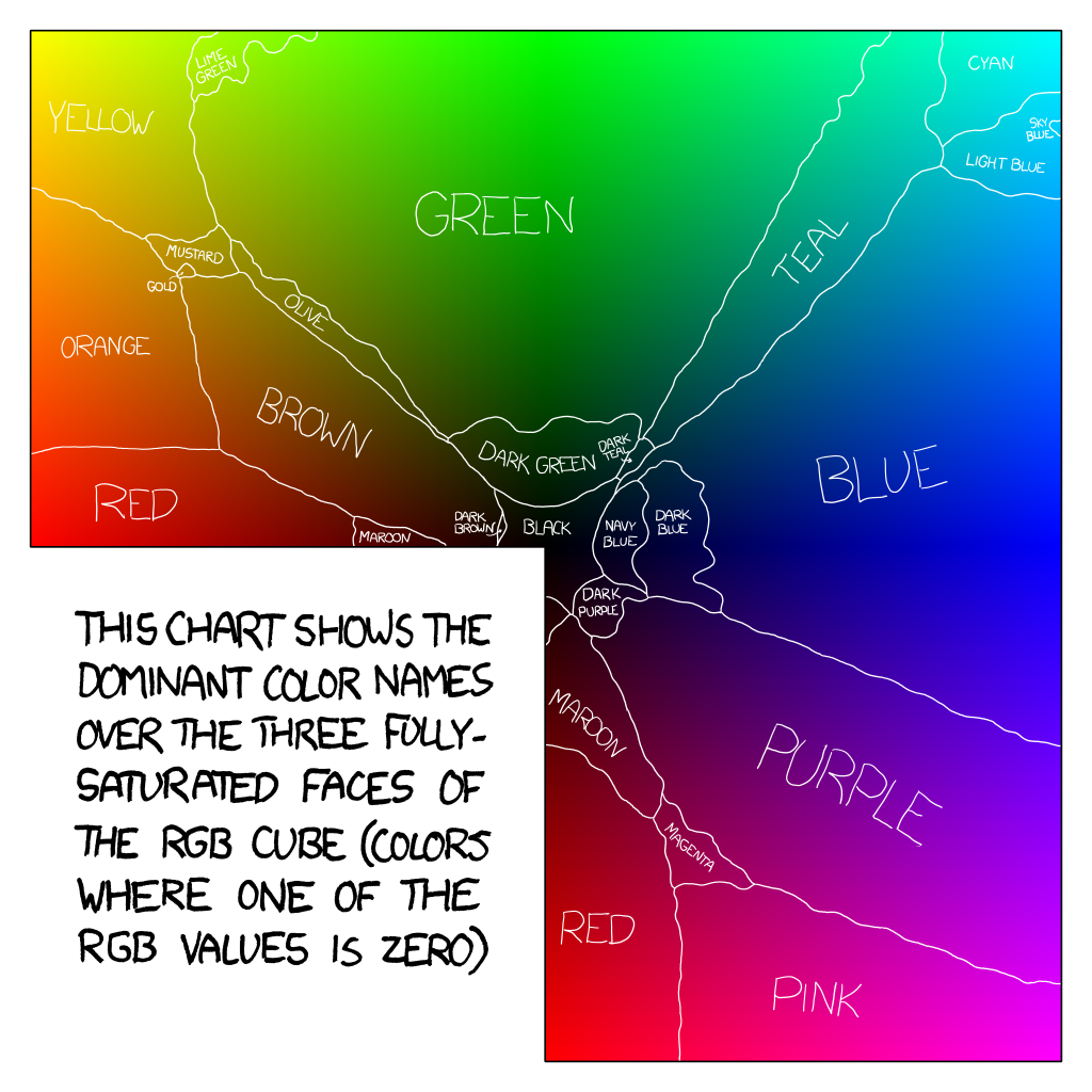
Date: 10/08/2019 20:13:15
From: mollwollfumble
ID: 1421470
Subject: re: Define "Red"
mollwollfumble said:
xkcd answered this question.
Almost, it didn’t cover all unsaturated colours.
By the way, the answer varies if you’re a guy or gal. Really!
Averaging over both sexes, red is the area of colour space bordered by pink, magenta, maroon, brown and orange. Not purple, interestingly enough.
For overall results see https://blog.xkcd.com/2010/05/03/color-survey-results/
For full saturated colour chart see http://imgs.xkcd.com/blag/satfaces_map_1024.png
You can also download a text file where each rgb triplet is given a named colour, at http://xkcd.com/color/satfaces.txt
Here are the color names most disproportionately popular among women:
Dusty Teal
Blush Pink
Dusty Lavender
Butter Yellow
Dusky Rose
Okay, pretty flowery, certainly. Kind of an incense-bomb-set-off-in-a-Bed-Bath-&-Beyond vibe. Well, let’s take a look at the other list.
Here are the color names most disproportionately popular among men:
Penis
Gay
WTF
Dunno
Baige
I … that’s not my typo in #5—the only actual color in the list really is a misspelling of “beige”. And keep in mind, this is based on the number of unique people who answered the color, not the number of times they typed it. This isn’t just the effect of a couple spammers. In fact, this is after the spamfilter.
Date: 10/08/2019 20:17:52
From: The Rev Dodgson
ID: 1421473
Subject: re: Define "Red"
mollwollfumble said:
mollwollfumble said:
xkcd answered this question.
Almost, it didn’t cover all unsaturated colours.
By the way, the answer varies if you’re a guy or gal. Really!
Averaging over both sexes, red is the area of colour space bordered by pink, magenta, maroon, brown and orange. Not purple, interestingly enough.
For overall results see https://blog.xkcd.com/2010/05/03/color-survey-results/
For full saturated colour chart see http://imgs.xkcd.com/blag/satfaces_map_1024.png
You can also download a text file where each rgb triplet is given a named colour, at http://xkcd.com/color/satfaces.txt
Here are the color names most disproportionately popular among women:
Dusty Teal
Blush Pink
Dusty Lavender
Butter Yellow
Dusky Rose
Okay, pretty flowery, certainly. Kind of an incense-bomb-set-off-in-a-Bed-Bath-&-Beyond vibe. Well, let’s take a look at the other list.
Here are the color names most disproportionately popular among men:
Penis
Gay
WTF
Dunno
Baige
I … that’s not my typo in #5—the only actual color in the list really is a misspelling of “beige”. And keep in mind, this is based on the number of unique people who answered the color, not the number of times they typed it. This isn’t just the effect of a couple spammers. In fact, this is after the spamfilter.
The chart is QI, but I really think you are over-rating the stats on this one.
(unless you were joking, in which case, carry on).
Date: 10/08/2019 23:34:57
From: SCIENCE
ID: 1421578
Subject: re: Define "Red"
Date: 10/08/2019 23:53:13
From: transition
ID: 1421582
Subject: re: Define "Red"
>Define “Red”
not unusual to need an example of something to communicate a quality, or essence if you will, in this case the common sensation of redness.
oxygenated blood is probably a common example of red, to some extent a reference.
it’s quite possibly (the colour of blood) influenced the sensation of red, evolution of vision processing and more, you know blood is a good indication of injury.
Date: 10/08/2019 23:59:50
From: transition
ID: 1421585
Subject: re: Define "Red"
transition said:
>Define “Red”
not unusual to need an example of something to communicate a quality, or essence if you will, in this case the common sensation of redness.
oxygenated blood is probably a common example of red, to some extent a reference.
it’s quite possibly (the colour of blood) influenced the sensation of red, evolution of vision processing and more, you know blood is a good indication of injury.
well, should clarify, deoxygenated blood is darker red
Date: 11/08/2019 00:02:07
From: transition
ID: 1421586
Subject: re: Define "Red"
transition said:
transition said:
>Define “Red”
not unusual to need an example of something to communicate a quality, or essence if you will, in this case the common sensation of redness.
oxygenated blood is probably a common example of red, to some extent a reference.
it’s quite possibly (the colour of blood) influenced the sensation of red, evolution of vision processing and more, you know blood is a good indication of injury.
well, should clarify, deoxygenated blood is darker red
I think fury/rage can literally turn things red, not sure how it does.
Date: 11/08/2019 09:18:08
From: The Rev Dodgson
ID: 1421664
Subject: re: Define "Red"
SCIENCE said:
define “bright”
not dull.
Date: 11/08/2019 14:01:44
From: SCIENCE
ID: 1421753
Subject: re: Define "Red"
Date: 11/08/2019 14:05:39
From: Tamb
ID: 1421755
Subject: re: Define "Red"
SCIENCE said:
si
si, Si si.
Date: 11/08/2019 15:06:18
From: dv
ID: 1421775
Subject: re: Define "Red"
Some real world illustrative examples:
Here are the reflection spectra of tomatoes at various stages of ripeness. Probably we’d all count the first four as not-red, and the sixth as red, but some might argue that the fifth is in the realm of orange. There is a fuzzy zone where the balance of green and red is such that there would not be a unanimous call on whether the colour counts as red, so if you wanted to make a firm boundary your decision would be partly arbitrary. Perhaps you could crowd-source it: get one of those captca panels and ask people to click all the panels that are red.

Date: 11/08/2019 15:19:46
From: mollwollfumble
ID: 1421790
Subject: re: Define "Red"
SCIENCE said:
define “bright”
I might even be able to have a go at that based on xkcd results.
Firstly be aware that “bright” differs from “light”.
Light just means that a lot of white is added. Bright has to be closer to saturation, darker.
Bright green is colour #01ff07. You see it has the rgb triplet but also has just a touch of r and b to make it lighter.
Bright blue is colour #0165fc. Really high b content but added g to make it lighter because b is a naturally dark colour.
Bright purple is colour #be03fd. Full blue but only 3/4 red, negligible green.
Bright pink is colour #fe01b1. So the opposite of bright purple, 100% red and 75% blue, with negligible green. Note well that “bright pink” is darker than “light pink” and lighter than “hot pink”.
Bright teal is colour #01f9c6. So really high green content with about 80% b.
Bright turquoise is colour #0ffef9. So close to as light as you can get in the blue-greens, with just a touch of red added for extra lightness.
Bright magenta is colour #ff08e8. So, 100% red with 90% blue.
Bright aqua is #0bf9ea. So, 100% green with over 90% blue an just a touch ofvrer for added lightness.
Bright sky blue is #02ccfe.
Bright lime green is #65fe08
Then there’s bright light blue, etc.
You get the idea. In general, define “bright” as a primary colour fully saturated, with a secondary colour mixed in to get the correct hue and add lightness, and no tertiary colour.
This differs frim “light” in which a tertiary colour is also added.
Date: 11/08/2019 15:29:40
From: mollwollfumble
ID: 1421800
Subject: re: Define "Red"
mollwollfumble said:
SCIENCE said:
define “bright”
I might even be able to have a go at that based on xkcd results.
Firstly be aware that “bright” differs from “light”.
Light just means that a lot of white is added. Bright has to be closer to saturation, darker.
Bright green is colour #01ff07. You see it has the rgb triplet but also has just a touch of r and b to make it lighter.
Bright blue is colour #0165fc. Really high b content but added g to make it lighter because b is a naturally dark colour.
Bright purple is colour #be03fd. Full blue but only 3/4 red, negligible green.
Bright pink is colour #fe01b1. So the opposite of bright purple, 100% red and 75% blue, with negligible green. Note well that “bright pink” is darker than “light pink” and lighter than “hot pink”.
Bright teal is colour #01f9c6. So really high green content with about 80% b.
Bright turquoise is colour #0ffef9. So close to as light as you can get in the blue-greens, with just a touch of red added for extra lightness.
Bright magenta is colour #ff08e8. So, 100% red with 90% blue.
Bright aqua is #0bf9ea. So, 100% green with over 90% blue an just a touch ofvrer for added lightness.
Bright sky blue is #02ccfe.
Bright lime green is #65fe08
Then there’s bright light blue, etc.
You get the idea. In general, define “bright” as a primary colour fully saturated, with a secondary colour mixed in to get the correct hue and add lightness, and no tertiary colour.
This differs frim “light” in which a tertiary colour is also added.
Looking at the difference between “bright yellow” and “yellow”. They are almost synonyms but not quite.
Yellow is #ffff14
Bright yellow is #fffd01
See the difference? Bright yellow has no tertiary colour. Yellow does.
Yellow is thus a lighter colour than bright yellow. The brighter colour is purer but darker.
The difference between ff and fd is negligible.
Date: 12/08/2019 10:15:27
From: Cymek
ID: 1422064
Subject: re: Define "Red"
I have a book on that very topic think its under the bed
Date: 12/08/2019 10:41:23
From: transition
ID: 1422082
Subject: re: Define "Red"
red certainly pops out, it’s a sensation, in the see-feel department for me anyway, the processing is evidenced so, suggesting high sensitivity’s been selected for, carried a survival advantage
Date: 12/08/2019 10:44:03
From: Tamb
ID: 1422086
Subject: re: Define "Red"
transition said:
red certainly pops out, it’s a sensation, in the see-feel department for me anyway, the processing is evidenced so, suggesting high sensitivity’s been selected for, carried a survival advantage
Maybe because is the colour of blood and thus a bad thing to see.
Date: 12/08/2019 10:45:21
From: transition
ID: 1422089
Subject: re: Define "Red"
Tamb said:
transition said:
red certainly pops out, it’s a sensation, in the see-feel department for me anyway, the processing is evidenced so, suggesting high sensitivity’s been selected for, carried a survival advantage
Maybe because is the colour of blood and thus a bad thing to see.
certainly of injury, you’d be right
Date: 12/08/2019 10:46:27
From: Peak Warming Man
ID: 1422090
Subject: re: Define "Red"
Michael V said:
Tamb said:
party_pants said:
Let’s say there was a law that required certain things to be pained red, or some other thing never to be painted red.
Is there a way of scientifically defining what colour is red?
Red is the color at the end of the visible spectrum of light, next to orange and opposite violet. It has a dominant wavelength of approximately 625–740 nanometres. It is a primary color in the RGB color model and the CMYK color model, and is the complementary color of cyan.
Perfect.
Dusts hands off.
Full solvered. No further correspondence is needed nor should be entered into.
LOL
Date: 12/08/2019 10:50:33
From: transition
ID: 1422094
Subject: re: Define "Red"
Tamb said:
transition said:
red certainly pops out, it’s a sensation, in the see-feel department for me anyway, the processing is evidenced so, suggesting high sensitivity’s been selected for, carried a survival advantage
Maybe because is the colour of blood and thus a bad thing to see.
there is too the ‘red’ you can feel and not see, that radiates heat, IR
it’d probably blur your vision a lot if you could see it, as well
same other end of spectrum, UV’d probably mess up your vision
so keeping the spectrum narrower adds clarity, less processing required, and the antennas in the eyeballs don’t have to be so wideband
rods and cones are antennas
Date: 12/08/2019 11:07:26
From: dv
ID: 1422100
Subject: re: Define "Red"
Cymek said:
I have a book on that very topic think its under the bed
boom tish
Date: 12/08/2019 13:08:34
From: buffy
ID: 1422123
Subject: re: Define "Red"
Tamb said:
transition said:
red certainly pops out, it’s a sensation, in the see-feel department for me anyway, the processing is evidenced so, suggesting high sensitivity’s been selected for, carried a survival advantage
Maybe because is the colour of blood and thus a bad thing to see.
Or the colour of ripe fruit, and thus a good thing to see.