Back in the old days before photoshop, the now familiar image manipulation techniques of dodge, burn, blur etc, were “traditional darkroom techniques”. Such techniques were used to create mist, shadows, enhance colours etc.
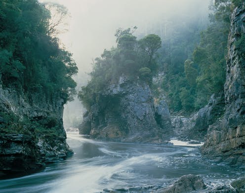
Now cast your mind back to the mid 1970s. A photographer called Dombroskis was producing spectacularly beautiful images of the wilderness. Being unfamiliar with darkroom image manipulation techniques, I, and many other people, accepted these images as genuine representations of reality. Except for one image, this one.
This photograph, although undoubtedly beautiful, made me nervous. I felt back in the mid 1970s, without knowing why, that no combination of atmospheric phenomena and lighting could produce such an image.
Listening to an offhand comment a week ago that the Franklin River was worth saving because it is beautiful, made me wonder. Is it intrinsically beautiful, or does it have average beauty that was enhanced by an exceptional photographer? The poster image for the famous “no dams” campaign was produced by Dombroskis, and that caused me to dig up the image above again.
The foreground in shadow and the background in light is unusual, but is not in itself cause for concern. The brightness range has been artificially compressed to allow shadow and sunlight to show details in the same photograph. Again unusual but not a cause for concern.
What is cause for concern is that the sunlight in the background is shining from three different directions. In the foreground, the sky’s light is also shining from multiple directions. The sunlight is also incompatible with the fog, because the colours in fog would be more muted. All told, the natural lighting is shining from six different directions.
It’s been shopped.
So Dombroskis shopped at least some of his images. And that fits with my observation that every Dombroskis image is beautiful, he imposed beauty in his darkroom on scenes that were not intrinsically beautiful. You can find photographers doing the same thing today.
So now we turn to the Franklin River and the “No Dams” poster image, this one by Dombroskis. Ten out of ten for beauty.
Now let’s compare that with a more recent real photo of the same scene. Not beautiful, almost on the point of being downright ugly.
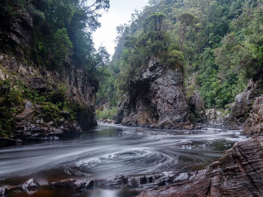
Differences between the two can’t easily be explained by different river height, different camera viewpoint, or different atmospheric and lighting conditions.
Fog doesn’t pour down mountainsides that way in the early morning, and this was supposed to be taken in the morning. It’s suspiciously like what could be obtained by adding fog using a “dodge” in the darkroom. The work is very finely and beautifully done, but it’s done to hide the fact that it’s not an intrinsically beautiful scene.
And the political party, the Australian Greens.