Date: 12/09/2019 12:52:52
From: mollwollfumble
ID: 1434953
Subject: Excel VB question
Can you do bitmap graphics in Excel VB?
For example, write a VB program to compute and display a Mandelbrot?
Can you do bitmap graphics in Excel VB?
For example, write a VB program to compute and display a Mandelbrot?
mollwollfumble said:
Can you do bitmap graphics in Excel VB?For example, write a VB program to compute and display a Mandelbrot?
Plotting hi-res bitmap graphics in Excel is very slow though.
The Rev Dodgson said:
mollwollfumble said:
Can you do bitmap graphics in Excel VB?For example, write a VB program to compute and display a Mandelbrot?
Plotting hi-res bitmap graphics in Excel is very slow though.
Brilliant program.
I’m not concerned about speed in this case.
I’ll look into it more to see if that’s just a scatter plot from a 1-d array.
I’m looking for a colour plot from a 2-d array. A plot sort of like this.

mollwollfumble said:
The Rev Dodgson said:
mollwollfumble said:
Can you do bitmap graphics in Excel VB?For example, write a VB program to compute and display a Mandelbrot?
Plotting hi-res bitmap graphics in Excel is very slow though.
Yes, it is just 1D, but it would be quite easy to extend to 2D.
Do you have an algorithm for generating the numbers, or a good link?
I might have a go myself.
Brilliant program.I’m not concerned about speed in this case.
I’ll look into it more to see if that’s just a scatter plot from a 1-d array.
I’m looking for a colour plot from a 2-d array. A plot sort of like this.
The Rev Dodgson said:
mollwollfumble said:
The Rev Dodgson said:Plotting hi-res bitmap graphics in Excel is very slow though.
I’m not concerned about speed in this case.
I’ll look into it more to see if that’s just a scatter plot from a 1-d array.
I’m looking for a colour plot from a 2-d array. A plot sort of like this.
Yes, it is just 1D, but it would be quite easy to extend to 2D.
Do you have an algorithm for generating the numbers, or a good link?
I might have a go myself.
Brilliant program.
Don’t have the algorithm, or a link, but let me write out how I think it works.
That ends the calculation. Now for the (contour) plot.
Set up colour levels for plot, user controlled eg. rainbow red to blue or jump back and forth.
One nice way to set up the colour levels is to input a starting rgb and a change in rgb in range 0 to 255 for each of rgb.
eg. starting rgb = 0,0,255, change in rgb = 200,100,50.
So like this for contour levels. For each saved iter.
r = (rstart + iter*rchange) (mod 256)
g = (gstart + iter*gchange) (mod 256)
b = (bstart + iter*bchange) (mod 256)
r=0, g=0, b=0 for iter = miter
Then plot rgb for each value of iter from picture window array (i,j).
Thanks for that.
I also found :
https://preshing.com/20110926/high-resolution-mandelbrot-in-obfuscated-python/
which looks like it might be interesting.
This one has VBA code:
http://www.andypope.info/fun/mandelbrot.htm
It uses worksheet cells for the plot, rather than a scatter graph, so not high res, but it might give some ideas.
The Rev Dodgson said:
This one has VBA code:
http://www.andypope.info/fun/mandelbrot.htmIt uses worksheet cells for the plot, rather than a scatter graph, so not high res, but it might give some ideas.
Will view. Any idea how to turn it into a scatter plot?
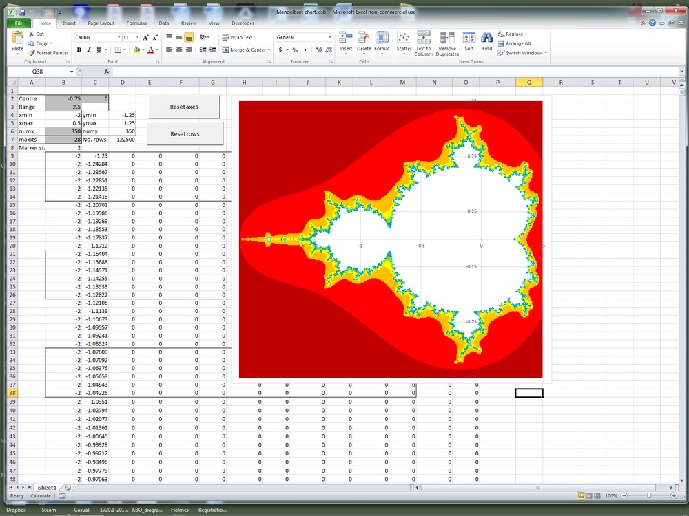
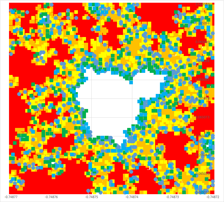
Output from first effort:

I will post a link to the spreadsheet when it has finished uploading.
mollwollfumble said:
The Rev Dodgson said:
This one has VBA code:
http://www.andypope.info/fun/mandelbrot.htmIt uses worksheet cells for the plot, rather than a scatter graph, so not high res, but it might give some ideas.
Will view. Any idea how to turn it into a scatter plot?
See latest post.
It uses a scatter plot with 300×300 resolution, and even that’s very slow.
I’ll have a look at alternatives when I have time.
Link for Mandelbrot spreadsheet:
https://1drv.ms/x/s!Aq0NeYoemF0niKgUpi9NM1Srrn2KdA?e=SDiaeY
You should be able to download from there.
The Rev Dodgson said:
Link for Mandelbrot spreadsheet:https://1drv.ms/x/s!Aq0NeYoemF0niKgUpi9NM1Srrn2KdA?e=SDiaeY
You should be able to download from there.
That doesn’t work; try this one:
https://1drv.ms/u/s!Aq0NeYoemF0nhPkWO5P4XZX77Kjj1Q?e=N6tdjS
The Rev Dodgson said:
The Rev Dodgson said:
Link for Mandelbrot spreadsheet:https://1drv.ms/x/s!Aq0NeYoemF0niKgUpi9NM1Srrn2KdA?e=SDiaeY
You should be able to download from there.
That doesn’t work; try this one:
https://1drv.ms/u/s!Aq0NeYoemF0nhPkWO5P4XZX77Kjj1Q?e=N6tdjS
New version now uploaded to link above:
Recalc set to manual; press F9 to recalc.
Enter centre point and range.
Buttons to automatically reset graph limits and data ranges when required.
Let me know if you have questions/comments.
The Rev Dodgson said:
The Rev Dodgson said:
The Rev Dodgson said:
Link for Mandelbrot spreadsheet:https://1drv.ms/x/s!Aq0NeYoemF0niKgUpi9NM1Srrn2KdA?e=SDiaeY
You should be able to download from there.
That doesn’t work; try this one:
https://1drv.ms/u/s!Aq0NeYoemF0nhPkWO5P4XZX77Kjj1Q?e=N6tdjS
New version now uploaded to link above:
Recalc set to manual; press F9 to recalc.
Enter centre point and range.
Buttons to automatically reset graph limits and data ranges when required.Let me know if you have questions/comments.
I can’t wait to try it out.
mollwollfumble said:
The Rev Dodgson said:
The Rev Dodgson said:That doesn’t work; try this one:
https://1drv.ms/u/s!Aq0NeYoemF0nhPkWO5P4XZX77Kjj1Q?e=N6tdjS
New version now uploaded to link above:
Recalc set to manual; press F9 to recalc.
Enter centre point and range.
Buttons to automatically reset graph limits and data ranges when required.Let me know if you have questions/comments.
I can’t wait to try it out.
Just be patient :)
Enter data in the grey shaded cells,
Press F9.
Wait till graph redraws.
The Rev Dodgson said:
mollwollfumble said:
The Rev Dodgson said:New version now uploaded to link above:
Recalc set to manual; press F9 to recalc.
Enter centre point and range.
Buttons to automatically reset graph limits and data ranges when required.Let me know if you have questions/comments.
I can’t wait to try it out.
Just be patient :)
Enter data in the grey shaded cells,
Press F9.
Wait till graph redraws.
Um, not working for me, perhaps because I only have Excel 2010? Need to update?
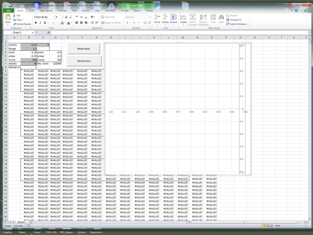
On download looks like this. Nice graph! But row and column values are zero. Same after enable editing and enable macros.
Pressing reset rows (not changing the data) gives this.
Pressing F9 either does nothing or does something like this.
mollwollfumble said:
The Rev Dodgson said:
mollwollfumble said:I can’t wait to try it out.
Just be patient :)
Enter data in the grey shaded cells,
Press F9.
Wait till graph redraws.Um, not working for me, perhaps because I only have Excel 2010? Need to update?
On download looks like this. Nice graph! But row and column values are zero. Same after enable editing and enable macros.
Pressing reset rows (not changing the data) gives this.
Pressing F9 either does nothing or does something like this.
I’ll check it on a different computer. Excel 2010 should be fine (afaik).
Regarding all the zero values: there are 7 data ranges (14 columns), and each row only has data for one range, so the first screen-shot is how it should look.
I’m going to do some more work to make it more convenient with low-res settings, so you can get a quick response, then switch to higher resolution. Also make the plotting more efficient so it doesn’t need such a huge file.
Regarding the resolution, the scatter graph markers in Excel have a minimum size of 2 pixels, so the image in the first screenshot is about the best you can get. I tried using “shapes” to plot directly to the worksheet rather than a chart, but it was taking about half an hour for every redraw (except when it crashed), so I gave that up.
Should have an update later today.
The Rev Dodgson said:
mollwollfumble said:
The Rev Dodgson said:Just be patient :)
Enter data in the grey shaded cells,
Press F9.
Wait till graph redraws.Um, not working for me, perhaps because I only have Excel 2010? Need to update?
On download looks like this. Nice graph! But row and column values are zero. Same after enable editing and enable macros.
Pressing reset rows (not changing the data) gives this.
Pressing F9 either does nothing or does something like this.
I’ll check it on a different computer. Excel 2010 should be fine (afaik).
Regarding all the zero values: there are 7 data ranges (14 columns), and each row only has data for one range, so the first screen-shot is how it should look.
I’m going to do some more work to make it more convenient with low-res settings, so you can get a quick response, then switch to higher resolution. Also make the plotting more efficient so it doesn’t need such a huge file.
Regarding the resolution, the scatter graph markers in Excel have a minimum size of 2 pixels, so the image in the first screenshot is about the best you can get. I tried using “shapes” to plot directly to the worksheet rather than a chart, but it was taking about half an hour for every redraw (except when it crashed), so I gave that up.
Should have an update later today.
Thanks. I was wondering about “shapes”. Now i see why not. Only suitable for very small plots.
I looked into updating Excel. Office 2019 only works on Windows 10 – i’m still on Windows 7. Office 365, not sure about that. May be able to get a free trial.
My other computer currently says:
“Repairing disk errors. This might take over an hour to complete”
But I’m pretty sure Excel 2010 should work OK.
Something you might try if you feel like it is to re-enter the array formula:
Select the top left cell (B9)
Hold down shift and press: End-down, End-right
Press F2
Press Ctrl-Shift-Enter
That will re-enter the formula as an array, to return all the results.
Alternatively, wait for the next version which will write the results as values from VBA, rather than using a user-defined function.
The Rev Dodgson said:
My other computer currently says:“Repairing disk errors. This might take over an hour to complete”
But I’m pretty sure Excel 2010 should work OK.
Something you might try if you feel like it is to re-enter the array formula:
Select the top left cell (B9)
Hold down shift and press: End-down, End-right
Press F2
Press Ctrl-Shift-EnterThat will re-enter the formula as an array, to return all the results.
Alternatively, wait for the next version which will write the results as values from VBA, rather than using a user-defined function.
Thanks. Will try that.
About shapes. Could you get a significant speed-up using run length encoding? By that i mean, instead of plotting each pixel as a shape, count the number of identical colours in sequence in a row and then plot a line of that length.
Eg, plotting a filled circle on a 300*300 grid using run length encoding would be about 100 times as fast as plotting each pixel as a shape. The speedup would be less for a Mandelbrot, but perhaps still significant.
mollwollfumble said:
The Rev Dodgson said:
My other computer currently says:“Repairing disk errors. This might take over an hour to complete”
But I’m pretty sure Excel 2010 should work OK.
Something you might try if you feel like it is to re-enter the array formula:
Select the top left cell (B9)
Hold down shift and press: End-down, End-right
Press F2
Press Ctrl-Shift-EnterThat will re-enter the formula as an array, to return all the results.
Alternatively, wait for the next version which will write the results as values from VBA, rather than using a user-defined function.
Thanks. Will try that.
About shapes. Could you get a significant speed-up using run length encoding? By that i mean, instead of plotting each pixel as a shape, count the number of identical colours in sequence in a row and then plot a line of that length.
Eg, plotting a filled circle on a 300*300 grid using run length encoding would be about 100 times as fast as plotting each pixel as a shape. The speedup would be less for a Mandelbrot, but perhaps still significant.
Good idea, should work using an xy chart as well, but plot lines without markers, instead of just the markers.
If using a chart with lines, I’ll need to take account of:
I have now uploaded a new version that works quicker, and adjusts the marker size and axes limits automatically.
Same link:
https://1drv.ms/u/s!Aq0NeYoemF0nhPkWO5P4XZX77Kjj1Q?e=N6tdjS
I have uploaded with low resolution, but if you change numx to 300 it should redraw reasonably quickly (about 6 seconds on my machine).
It should work with XL2010, but if not let me know.
Nice Mandelbrot generator here:
https://arachnoid.com/mandelbrot_set/
Latest version now uploaded:
Calculation routine improved:
- Variants replaced with doubles
- C^2 replaced with C*C
- C*C is used twice, so assign to a variable and only do the calc once.
Plotting routine tidied up:
- Data moved to a second sheet
- Routine to re-size plot range improved
Calculation now runs 2-3 x faster than the Python code here:
https://www.ibm.com/developerworks/community/blogs/jfp/entry/How_To_Compute_Mandelbrodt_Set_Quickly?lang=en
which I’m pretty happy with.
It’s still way slower than compiled code of course.

The Rev Dodgson said:
Oooo…pretty :)
Some good high-res journeys through the Mandelbrot:
https://www.youtube.com/watch?v=PD2XgQOyCCk
https://www.youtube.com/watch?v=X-_LkF9V8AM&t=172s
Probably plenty more on the Choob. You can supply your own music.
Bubblecar said:
Some good high-res journeys through the Mandelbrot:https://www.youtube.com/watch?v=PD2XgQOyCCk
https://www.youtube.com/watch?v=X-_LkF9V8AM&t=172s
Probably plenty more on the Choob. You can supply your own music.
Liked the first one, not so keen on the second.
Four still images only at:
https://newtonexcelbach.com/2019/09/15/plotting-mandelbrot/
But you do get to download the software.
The Rev Dodgson said:
Bubblecar said:
Some good high-res journeys through the Mandelbrot:https://www.youtube.com/watch?v=PD2XgQOyCCk
https://www.youtube.com/watch?v=X-_LkF9V8AM&t=172s
Probably plenty more on the Choob. You can supply your own music.
Liked the first one, not so keen on the second.
Four still images only at:
https://newtonexcelbach.com/2019/09/15/plotting-mandelbrot/But you do get to download the software.
The mandelbrot journeys practically never give the source code. Will download when i’m back on windows.
mollwollfumble said:
The Rev Dodgson said:
Bubblecar said:
Some good high-res journeys through the Mandelbrot:https://www.youtube.com/watch?v=PD2XgQOyCCk
https://www.youtube.com/watch?v=X-_LkF9V8AM&t=172s
Probably plenty more on the Choob. You can supply your own music.
Liked the first one, not so keen on the second.
Four still images only at:
https://newtonexcelbach.com/2019/09/15/plotting-mandelbrot/But you do get to download the software.
The mandelbrot journeys practically never give the source code. Will download when i’m back on windows.
Should work on Excel 2010, but let me know if not.
Performance is not too bad now, but I’ll have a look at some of the faster Python options when I have time.
The Rev Dodgson said:
I have now uploaded a new version that works quicker, and adjusts the marker size and axes limits automatically.Same link:
https://1drv.ms/u/s!Aq0NeYoemF0nhPkWO5P4XZX77Kjj1Q?e=N6tdjSI have uploaded with low resolution, but if you change numx to 300 it should redraw reasonably quickly (about 6 seconds on my machine).
It should work with XL2010, but if not let me know.
Hi Rev D,
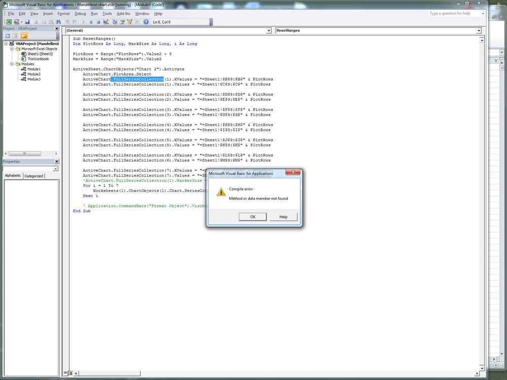
Still crashing on “ActiveChart.FullSeriesCollection(i).XValues = XRng”
For some reason it doesn’t like FullSeriesCollection.
> Replace FullSeriesCollection object with SeriesCollection
I tried that already. Didn’t work. Trying again, Worked.
I need a bit of help with markers. Reducing marker size from 9 to 5 on default 100*100 helps a bit, but not enough. With marker size 9 it looks like:
OK, by 400*400 the marker size reduces to 2 and sorts itself out. Don’t want 100*100 anyway.
mollwollfumble said:
The Rev Dodgson said:
I have now uploaded a new version that works quicker, and adjusts the marker size and axes limits automatically.Same link:
https://1drv.ms/u/s!Aq0NeYoemF0nhPkWO5P4XZX77Kjj1Q?e=N6tdjSI have uploaded with low resolution, but if you change numx to 300 it should redraw reasonably quickly (about 6 seconds on my machine).
It should work with XL2010, but if not let me know.
Hi Rev D,
Still crashing on “ActiveChart.FullSeriesCollection(i).XValues = XRng”
For some reason it doesn’t like FullSeriesCollection.
> Replace FullSeriesCollection object with SeriesCollection
I tried that already. Didn’t work. Trying again, Worked.
I need a bit of help with markers. Reducing marker size from 9 to 5 on default 100*100 helps a bit, but not enough. With marker size 9 it looks like:
OK, by 400*400 the marker size reduces to 2 and sorts itself out. Don’t want 100*100 anyway.
Yeah, some help in changing marker shape, don’t like the circular markers much.
Looking through the code I can’t see the line(s) that actually do the plotting.
How would the code differ if it was using shapes instead of markers?
Thanks for picking up the fullseriescollection thing, and the solution. I’ll fix that in the online file.
The 100×100 resolution was only to reduce the file size. 350 reduces the marker size to 2, which is the minimum. 1000 gives a better picture, but gets quite slow with high iterations.
All the markers were supposed to be square, but series 5 I had missed and was still a circle, so I’ll fix that.
It would also be quite easy to increase the number of data ranges, and specify colours for each range, so I’ll have a look at that.
The chart redraws itself, the code just adjusts the length of the data ranges, and re-sets the axis limits and marker size if required. I have added comments to the code, and removed “full” from “seriescollection”:
‘ Copy data to spreadsheet
For i = 1 To NumBands
PltRngName = “PltRng” & i
Rows = LastRow(i)
If Rows = 0 Then Rows = 2
If Rows > MaxRows Then Rows = MaxRows
‘ Create 2 column array for each band
ReDim PlotVals(1 To Rows, 1 To 2)
Col = (i – 1) * 2 + 1
For j = 1 To Rows
PlotVals(j, 1) = PlotXY(j, Col)
PlotVals(j, 2) = PlotXY(j, Col + 1)
Next j
‘ Clear old data, resize range and copy PlotVals to the spreadsheet
With Range(PltRngName)
.ClearContents
.Resize(Rows, 2).Name = PltRngName
End With
‘ Resize range names for X and Y data for each band
Range(PltRngName).Value2 = PlotVals
Range(“X_” & i).Resize(Rows, 1).Name = “X_” & i
Range(“Y_” & i).Resize(Rows, 1).Name = “Y_” & i
Next i
AdjustAxes
‘ Adjust chart marker size and set data ranges to named range for each band
MarkSize = Range(“MarkSize”).Value2
ActiveSheet.ChartObjects(“Chart 2”).Activate
ActiveChart.PlotArea.Select
For i = 1 To NumBands
XRng = “=Sheet2!X_” & i
YRng = “=Sheet2!Y_” & i
ActiveChart.SeriesCollection(i).XValues = XRng
ActiveChart.SeriesCollection(i).Values = YRng
Worksheets(1).ChartObjects(1).Chart.SeriesCollection(i).MarkerSize = MarkSize
Next i
The adjustaxes subroutine is just to avoid problems with the auto-resize rounding up to the nearest integer, which doesn’t work well with small xy ranges.
If you want to try plotting shapes, I have a spreadsheet that will plot shapes from xy data. It gets more complex because you have to specify a shape type and full format information for each different coloured shape you want, and it is very slow, but it should work.
Downloads and more details at:
https://newtonexcelbach.com/2012/09/24/daily-download-8-drawing-in-excel/
The latest version of the spreadsheet is at:
http://interactiveds.com.au/software/Plotxy-xlsb.zip
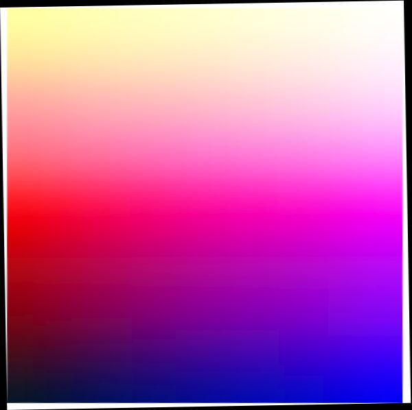
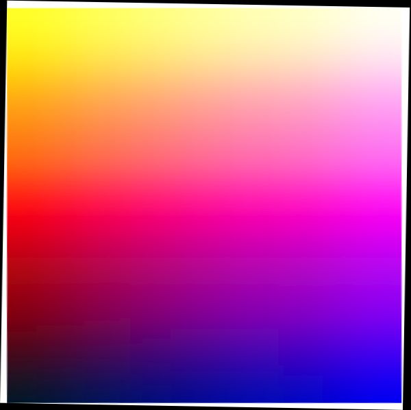
Slightly off topic, but i managed to combine Rev D’s ideas about using markers in Excel with Irfanview to produce the following colour chart. All done manually, I’m sorry, I haven’t figured out how to do it in VB. Use a scatter plot to produce a vertical line of nine square markers 30 pixels across, one point per data series. Each marker has a left to right gradient. Adjust chart size to remove white space.
In Irfanview, crop, change aspect ratio, reduce resolution to 9*9, then enlarge again and a couple of 1 degree fine rotations for the border.
Purpose, a 2 way smooth gradient colourblind-friendly picture for making into a jigsaw.
Chart set out to be:
Yellow, Pale Yellow, White
Red, Hot pink, Magenta
Black, Dark Blue, Blue
Should I do the yellow a little darker perhaps.
The Rev Dodgson said:
Thanks for picking up the fullseriescollection thing, and the solution. I’ll fix that in the online file.The 100×100 resolution was only to reduce the file size. 350 reduces the marker size to 2, which is the minimum. 1000 gives a better picture, but gets quite slow with high iterations.
All the markers were supposed to be square, but series 5 I had missed and was still a circle, so I’ll fix that.
It would also be quite easy to increase the number of data ranges, and specify colours for each range, so I’ll have a look at that.
The chart redraws itself, the code just adjusts the length of the data ranges, and re-sets the axis limits and marker size if required. I have added comments to the code, and removed “full” from “seriescollection”:
‘ Copy data to spreadsheet
For i = 1 To NumBands PltRngName = “PltRng” & i Rows = LastRow(i) If Rows = 0 Then Rows = 2 If Rows > MaxRows Then Rows = MaxRows ‘ Create 2 column array for each band ReDim PlotVals(1 To Rows, 1 To 2) Col = (i – 1) * 2 + 1 For j = 1 To Rows PlotVals(j, 1) = PlotXY(j, Col) PlotVals(j, 2) = PlotXY(j, Col + 1) Next j ‘ Clear old data, resize range and copy PlotVals to the spreadsheet With Range(PltRngName) .ClearContents .Resize(Rows, 2).Name = PltRngName End With ‘ Resize range names for X and Y data for each band Range(PltRngName).Value2 = PlotVals Range(“X_” & i).Resize(Rows, 1).Name = “X_” & i Range(“Y_” & i).Resize(Rows, 1).Name = “Y_” & i
Next iAdjustAxes
‘ Adjust chart marker size and set data ranges to named range for each band
MarkSize = Range(“MarkSize”).Value2
ActiveSheet.ChartObjects(“Chart 2”).Activate ActiveChart.PlotArea.Select For i = 1 To NumBands XRng = “=Sheet2!X_” & i YRng = “=Sheet2!Y_” & i ActiveChart.SeriesCollection(i).XValues = XRng ActiveChart.SeriesCollection(i).Values = YRng Worksheets(1).ChartObjects(1).Chart.SeriesCollection(i).MarkerSize = MarkSize Next iThe adjustaxes subroutine is just to avoid problems with the auto-resize rounding up to the nearest integer, which doesn’t work well with small xy ranges.
If you want to try plotting shapes, I have a spreadsheet that will plot shapes from xy data. It gets more complex because you have to specify a shape type and full format information for each different coloured shape you want, and it is very slow, but it should work.
Downloads and more details at:
https://newtonexcelbach.com/2012/09/24/daily-download-8-drawing-in-excel/The latest version of the spreadsheet is at:
http://interactiveds.com.au/software/Plotxy-xlsb.zip
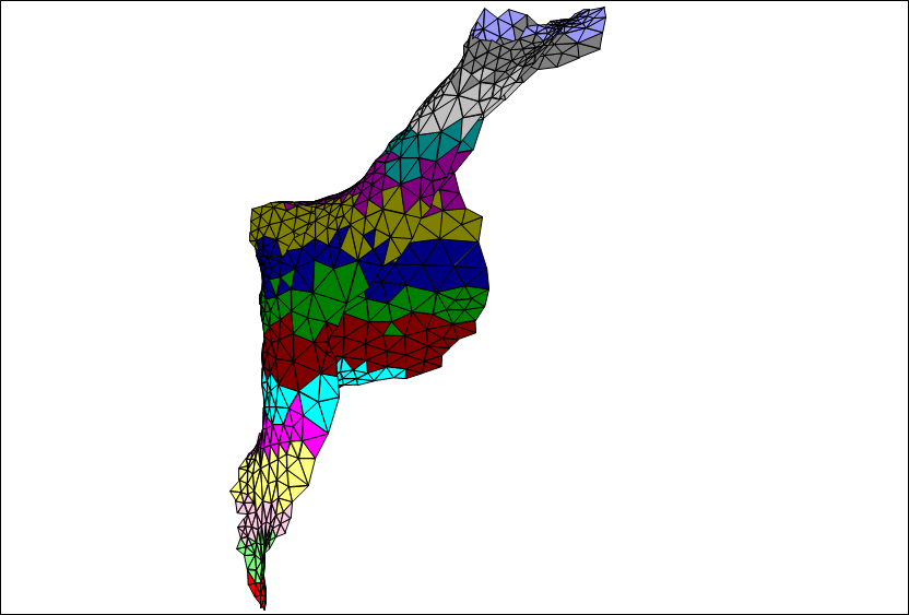
Trying out Plotxy.xlsb
Looks bleedin’ marvellous. I love the ability to draw triangulated freeform shapes, with edges. I can use that. I also very much like the retro style of coordinate and polyline lists, it gives total control over the shapes. Which is perfect. And it’s what I used to use for fluid dynamics display back in the days when SAP meant “Structural Analysis Program”.
What is it actually a drawing of, 3-D organic?
I can’t see any code to explain what is behind the “DrawXY” button. How do I see that? But perhaps I don’t need to.
The Rev Dodgson said:
If using a chart with lines, I’ll need to take account of:
> Back in 2012 (When is an xy chart not an xy chart) I concluded that it was not possible to return an array with empty rows from a user defined function (UDF), and as a result it was not possible to generate a series with gaps in an x-y chart.
Yes. I found that to be an absolute pest.
> For those not using Office 365 it’s not so easy , but the spreadsheet SpecialNum.xlsb, using code from the Stackoverflow discussion at “How do you get VB6 to initialize doubles with +infinity, -infinity and NaN”
LOL. But that is very useful. I could even use that in the analysis of Buffy’s myopia data. I needed gaps between each patient and had ended up adding blank lines manually.
mollwollfumble said:
Slightly off topic, but i managed to combine Rev D’s ideas about using markers in Excel with Irfanview to produce the following colour chart. All done manually, I’m sorry, I haven’t figured out how to do it in VB. Use a scatter plot to produce a vertical line of nine square markers 30 pixels across, one point per data series. Each marker has a left to right gradient. Adjust chart size to remove white space.In Irfanview, crop, change aspect ratio, reduce resolution to 9*9, then enlarge again and a couple of 1 degree fine rotations for the border.
Purpose, a 2 way smooth gradient colourblind-friendly picture for making into a jigsaw.
Chart set out to be:
Yellow, Pale Yellow, White
Red, Hot pink, Magenta
Black, Dark Blue, BlueShould I do the yellow a little darker perhaps.
Very nice.
In the Mandelbrot spreadsheet I have increased the number of ranges to 16, and added code to adjust the colour depending on the number of iterations.
At the moment it is hard coded in the VBA, but I’m working on that.
I will copy the current version to the Onedrive link.
I have been looking at the code here:
https://www.ibm.com/developerworks/community/blogs/jfp/entry/My_Christmas_Gift?lang=en
which I got working directly from Python, writing to a png file.
I’ll have a look at calling that from Excel (but using pyxll, which is not free after 1 month trial).

mollwollfumble said:
The Rev Dodgson said:
Thanks for picking up the fullseriescollection thing, and the solution. I’ll fix that in the online file.The 100×100 resolution was only to reduce the file size. 350 reduces the marker size to 2, which is the minimum. 1000 gives a better picture, but gets quite slow with high iterations.
All the markers were supposed to be square, but series 5 I had missed and was still a circle, so I’ll fix that.
It would also be quite easy to increase the number of data ranges, and specify colours for each range, so I’ll have a look at that.
The chart redraws itself, the code just adjusts the length of the data ranges, and re-sets the axis limits and marker size if required. I have added comments to the code, and removed “full” from “seriescollection”:
‘ Copy data to spreadsheet
For i = 1 To NumBands PltRngName = “PltRng” & i Rows = LastRow(i) If Rows = 0 Then Rows = 2 If Rows > MaxRows Then Rows = MaxRows ‘ Create 2 column array for each band ReDim PlotVals(1 To Rows, 1 To 2) Col = (i – 1) * 2 + 1 For j = 1 To Rows PlotVals(j, 1) = PlotXY(j, Col) PlotVals(j, 2) = PlotXY(j, Col + 1) Next j ‘ Clear old data, resize range and copy PlotVals to the spreadsheet With Range(PltRngName) .ClearContents .Resize(Rows, 2).Name = PltRngName End With ‘ Resize range names for X and Y data for each band Range(PltRngName).Value2 = PlotVals Range(“X_” & i).Resize(Rows, 1).Name = “X_” & i Range(“Y_” & i).Resize(Rows, 1).Name = “Y_” & i
Next iAdjustAxes
‘ Adjust chart marker size and set data ranges to named range for each band
MarkSize = Range(“MarkSize”).Value2
ActiveSheet.ChartObjects(“Chart 2”).Activate ActiveChart.PlotArea.Select For i = 1 To NumBands XRng = “=Sheet2!X_” & i YRng = “=Sheet2!Y_” & i ActiveChart.SeriesCollection(i).XValues = XRng ActiveChart.SeriesCollection(i).Values = YRng Worksheets(1).ChartObjects(1).Chart.SeriesCollection(i).MarkerSize = MarkSize Next iThe adjustaxes subroutine is just to avoid problems with the auto-resize rounding up to the nearest integer, which doesn’t work well with small xy ranges.
If you want to try plotting shapes, I have a spreadsheet that will plot shapes from xy data. It gets more complex because you have to specify a shape type and full format information for each different coloured shape you want, and it is very slow, but it should work.
Downloads and more details at:
https://newtonexcelbach.com/2012/09/24/daily-download-8-drawing-in-excel/The latest version of the spreadsheet is at:
http://interactiveds.com.au/software/Plotxy-xlsb.zipTrying out Plotxy.xlsb
Looks bleedin’ marvellous. I love the ability to draw triangulated freeform shapes, with edges. I can use that. I also very much like the retro style of coordinate and polyline lists, it gives total control over the shapes. Which is perfect. And it’s what I used to use for fluid dynamics display back in the days when SAP meant “Structural Analysis Program”.
What is it actually a drawing of, 3-D organic?
I can’t see any code to explain what is behind the “DrawXY” button. How do I see that? But perhaps I don’t need to.
The Rev Dodgson said:
If using a chart with lines, I’ll need to take account of:> Back in 2012 (When is an xy chart not an xy chart) I concluded that it was not possible to return an array with empty rows from a user defined function (UDF), and as a result it was not possible to generate a series with gaps in an x-y chart.
Yes. I found that to be an absolute pest.
> For those not using Office 365 it’s not so easy , but the spreadsheet SpecialNum.xlsb, using code from the Stackoverflow discussion at “How do you get VB6 to initialize doubles with +infinity, -infinity and NaN”
LOL. But that is very useful. I could even use that in the analysis of Buffy’s myopia data. I needed gaps between each patient and had ended up adding blank lines manually.
The plot is part of a skull from a Strand7 demo file: http://www.strand7.com/html/archive/biomechanical/skull.htm. Its very easy in Strand7 to copy the node coordinate and connections data into a spreadsheet.
The code for the Draw XY button is PlotXY in the mCharts module. The code has got quite bloated over time, and could probably be simplified, but it works.
To see the code linked to a button (in Excel 365):
Go to the developer tab (may need to be unhidden using File-Options)
Click Design Mode
Right click the button and select view code.
It’s probably different in 2010 though.
The Rev Dodgson said:
mollwollfumble said:
The Rev Dodgson said:
Thanks for picking up the fullseriescollection thing, and the solution. I’ll fix that in the online file.The 100×100 resolution was only to reduce the file size. 350 reduces the marker size to 2, which is the minimum. 1000 gives a better picture, but gets quite slow with high iterations.
All the markers were supposed to be square, but series 5 I had missed and was still a circle, so I’ll fix that.
It would also be quite easy to increase the number of data ranges, and specify colours for each range, so I’ll have a look at that.
The chart redraws itself, the code just adjusts the length of the data ranges, and re-sets the axis limits and marker size if required. I have added comments to the code, and removed “full” from “seriescollection”:
‘ Copy data to spreadsheet
For i = 1 To NumBands PltRngName = “PltRng” & i Rows = LastRow(i) If Rows = 0 Then Rows = 2 If Rows > MaxRows Then Rows = MaxRows ‘ Create 2 column array for each band ReDim PlotVals(1 To Rows, 1 To 2) Col = (i – 1) * 2 + 1 For j = 1 To Rows PlotVals(j, 1) = PlotXY(j, Col) PlotVals(j, 2) = PlotXY(j, Col + 1) Next j ‘ Clear old data, resize range and copy PlotVals to the spreadsheet With Range(PltRngName) .ClearContents .Resize(Rows, 2).Name = PltRngName End With ‘ Resize range names for X and Y data for each band Range(PltRngName).Value2 = PlotVals Range(“X_” & i).Resize(Rows, 1).Name = “X_” & i Range(“Y_” & i).Resize(Rows, 1).Name = “Y_” & i
Next iAdjustAxes
‘ Adjust chart marker size and set data ranges to named range for each band
MarkSize = Range(“MarkSize”).Value2
ActiveSheet.ChartObjects(“Chart 2”).Activate ActiveChart.PlotArea.Select For i = 1 To NumBands XRng = “=Sheet2!X_” & i YRng = “=Sheet2!Y_” & i ActiveChart.SeriesCollection(i).XValues = XRng ActiveChart.SeriesCollection(i).Values = YRng Worksheets(1).ChartObjects(1).Chart.SeriesCollection(i).MarkerSize = MarkSize Next iThe adjustaxes subroutine is just to avoid problems with the auto-resize rounding up to the nearest integer, which doesn’t work well with small xy ranges.
If you want to try plotting shapes, I have a spreadsheet that will plot shapes from xy data. It gets more complex because you have to specify a shape type and full format information for each different coloured shape you want, and it is very slow, but it should work.
Downloads and more details at:
https://newtonexcelbach.com/2012/09/24/daily-download-8-drawing-in-excel/The latest version of the spreadsheet is at:
http://interactiveds.com.au/software/Plotxy-xlsb.zipTrying out Plotxy.xlsb
Looks bleedin’ marvellous. I love the ability to draw triangulated freeform shapes, with edges. I can use that. I also very much like the retro style of coordinate and polyline lists, it gives total control over the shapes. Which is perfect. And it’s what I used to use for fluid dynamics display back in the days when SAP meant “Structural Analysis Program”.
What is it actually a drawing of, 3-D organic?
I can’t see any code to explain what is behind the “DrawXY” button. How do I see that? But perhaps I don’t need to.
The Rev Dodgson said:
If using a chart with lines, I’ll need to take account of:> Back in 2012 (When is an xy chart not an xy chart) I concluded that it was not possible to return an array with empty rows from a user defined function (UDF), and as a result it was not possible to generate a series with gaps in an x-y chart.
Yes. I found that to be an absolute pest.
> For those not using Office 365 it’s not so easy , but the spreadsheet SpecialNum.xlsb, using code from the Stackoverflow discussion at “How do you get VB6 to initialize doubles with +infinity, -infinity and NaN”
LOL. But that is very useful. I could even use that in the analysis of Buffy’s myopia data. I needed gaps between each patient and had ended up adding blank lines manually.
The plot is part of a skull from a Strand7 demo file: http://www.strand7.com/html/archive/biomechanical/skull.htm. Its very easy in Strand7 to copy the node coordinate and connections data into a spreadsheet.
The code for the Draw XY button is PlotXY in the mCharts module. The code has got quite bloated over time, and could probably be simplified, but it works.
To see the code linked to a button (in Excel 365):
Go to the developer tab (may need to be unhidden using File-Options)
Click Design Mode
Right click the button and select view code.It’s probably different in 2010 though.
It works in 2010. Thanks. Double click on mCharts.
I’m looking at it to see if I can add a colour gradient to Plotxy.xlsb.
PS. For me the ultimate would be to get VBA to draw a sphere using NURB (non-uniform rational b-spline) surfaces.
But before that to draw a 2-D colour gradient on an arbitrary quadrilateral using isoparametric methods. Map the quadrilateral onto a unit square (0 -1,0 -1). Have the four corner colours c1 at (0,0), c2 at corner (1,0), c3 at corner (1,1), c4 at corner (0,1). Then set the colour at point x,y to c1*(1-x)*(1-y)+c2*x*(1-y)+ c3*x*y+c4*(1-x)*y in each of the r,g,b coordinates.)
From the web:
“You can set a gradient for a shape’s fill through VBA, but you can’t do it for a line. You can either create a thin shape with gradient fill and no border.”
Darn, that slows down gradients for run length encoding.
mollwollfumble said:
The Rev Dodgson said:
mollwollfumble said:> Back in 2012 (When is an xy chart not an xy chart) I concluded that it was not possible to return an array with empty rows from a user defined function (UDF), and as a result it was not possible to generate a series with gaps in an x-y chart.
Yes. I found that to be an absolute pest.
> For those not using Office 365 it’s not so easy , but the spreadsheet SpecialNum.xlsb, using code from the Stackoverflow discussion at “How do you get VB6 to initialize doubles with +infinity, -infinity and NaN”
LOL. But that is very useful. I could even use that in the analysis of Buffy’s myopia data. I needed gaps between each patient and had ended up adding blank lines manually.
The plot is part of a skull from a Strand7 demo file: http://www.strand7.com/html/archive/biomechanical/skull.htm. Its very easy in Strand7 to copy the node coordinate and connections data into a spreadsheet.
The code for the Draw XY button is PlotXY in the mCharts module. The code has got quite bloated over time, and could probably be simplified, but it works.
To see the code linked to a button (in Excel 365):
Go to the developer tab (may need to be unhidden using File-Options)
Click Design Mode
Right click the button and select view code.It’s probably different in 2010 though.
It works in 2010. Thanks. Double click on mCharts.
I’m looking at it to see if I can add a colour gradient to Plotxy.xlsb.
PS. For me the ultimate would be to get VBA to draw a sphere using NURB (non-uniform rational b-spline) surfaces.
But before that to draw a 2-D colour gradient on an arbitrary quadrilateral using isoparametric methods. Map the quadrilateral onto a unit square (0 -1,0 -1). Have the four corner colours c1 at (0,0), c2 at corner (1,0), c3 at corner (1,1), c4 at corner (0,1). Then set the colour at point x,y to
c1*(1-x)*(1-y)+c2*x*(1-y)+ c3*x*y+c4*(1-x)*yin each of the r,g,b coordinates.)From the web:
“You can set a gradient for a shape’s fill through VBA, but you can’t do it for a line. You can either create a thin shape with gradient fill and no border.”Darn, that slows down gradients for run length encoding.
Can’t get plotxy.xlsb to work.
First problem is that the Draw XY button works once, but then never works again.
mollwollfumble said:
Can’t get plotxy.xlsb to work.
First problem is that the Draw XY button works once, but then never works again.
I’ll have a look. The code was written pre-2010, so that shouldn’t be an issue.
When you say the Draw XY button never works again, do you mean nothing happens when you click it?
What about the redraw button, does that work?
The Rev Dodgson said:
mollwollfumble said:
Can’t get plotxy.xlsb to work.
First problem is that the Draw XY button works once, but then never works again.I’ll have a look. The code was written pre-2010, so that shouldn’t be an issue.
When you say the Draw XY button never works again, do you mean nothing happens when you click it?
What about the redraw button, does that work?
Maybe check you are not in “Design Mode”.
New version of my spreadsheet now uploaded to the OneDrive link.
You can now specify RGB colours for 16 ranges on the spreadsheet.
It also now links to Python code, which is quite fast when combined with Numba, but you need Python and pyxll installed for that to work. Enter 0 in the “Use py” cell, and it will use the VBA code.
The Rev Dodgson said:
New version of my spreadsheet now uploaded to the OneDrive link.You can now specify RGB colours for 16 ranges on the spreadsheet.
It also now links to Python code, which is quite fast when combined with Numba, but you need Python and pyxll installed for that to work. Enter 0 in the “Use py” cell, and it will use the VBA code.
OK. Giving up on VBA graphics for now. Great mandelbrot program.
I might try python next, on its own, if i can figure out how.
> https://preshing.com/20110926/high-resolution-mandelbrot-in-obfuscated-python/
> https://www.ibm.com/developerworks/community/blogs/jfp/entry/My_Christmas_Gift?lang=en
> pyxll, which is not free after 1 month trial
Pay after one month trial is annoying.
It would be good if i could get graphics with the C programming language (not c++) working. By did try that using a step by step tutorial a year back and failed.
Perhaps … shudder … cloud?
Anyway, combining Excel and Irfanview gave me this two way gradient, which may be the easiest possible jigsaw puzzle for red-green colourblind people. At low resolution 324 pieces it’s easily faster than all the other 500+ puzzles I’ve made. Still to try up to 1296 pieces, which will take a while.
mollwollfumble said:
The Rev Dodgson said:
New version of my spreadsheet now uploaded to the OneDrive link.You can now specify RGB colours for 16 ranges on the spreadsheet.
It also now links to Python code, which is quite fast when combined with Numba, but you need Python and pyxll installed for that to work. Enter 0 in the “Use py” cell, and it will use the VBA code.
OK. Giving up on VBA graphics for now. Great mandelbrot program.
I might try python next, on its own, if i can figure out how.
The best sites I found for Python code were:
https://www.ibm.com/developerworks/community/blogs/jfp/entry/How_To_Compute_Mandelbrodt_Set_Quickly?lang=en
and
https://www.ibm.com/developerworks/community/blogs/jfp/entry/My_Christmas_Gift?lang=en
Python by itself is even slower than VBA, but with Numba it is much faster, and the links above include the code for using Numba, which is dead easy.
If you want to call Python code from Excel, and don’t want to pay for pyxll, try xlwings which is free and open-source.
Python + matplotlib + xlwings or pyxll should be a good way of avoiding the very slow plot time when using Excel shapes.
Can you provide more details of the problems you had using the xyplot spreadsheet please.
What happens when you click the buttons after the first time?
Have you tried stepping through the code?
Can you send a non-working example to my Gmail account (dougaj4).