Date: 28/08/2020 14:28:27
From: mollwollfumble
ID: 1611395
Subject: Map projections
I have a lot of new map projections I want to try out.
- My favourite one that needs inventing is “Best equal area in a rectangle”. The idea here is that maps in atlases are rectangular. Given an area (in sq km) of Earth to be shown in a rectangle, what is the unique equal are one that least-square minimises deviations from conformality. A conformal map is one that maps a small circle to a circle, equal area maps map a small circle to an ellipse. So this map projection makes these ellipses as circular as possible. Net necessarily suitable for whole Earth.
- A second one that needs inventing is “rubber sheet continent”. Here, applying the well known laws of elasticity, deform an irregular shape on a sphere onto a flat surface. The irregular shape can be a continent, large country, group of continents, ocean, where we desire the greatest fidelity. Excellent for odd shapes. The odder the shape, the better the improvement over other map projections. Perfect for ‘Tee-shaped’ continents.
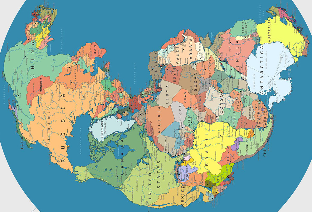
- A third one that needs inventing, I could call “Pangea”. Ignore the oceans and place the Americas next to Europe-Africa. Place Antarctica next to Australia and India. Individual continents could be done using something like Lambert azimuthal equal area. Fitting them together gives a map that is ideal for land-based illustrations including world geology, vegetation and sociology.
- A fourth map projection that needs inventing would map all the oceans of the world together to maximum accuracy, ignoring the land. Land area on this world map would shrink as it is pushed in by the edges of the oceans.
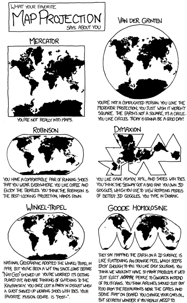
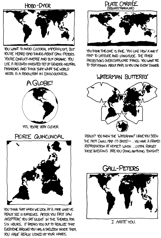
Now for some fun. Vote for your favourite map projection. One of these, perhaps.


Dang it. I have another that I really like, but Google can’t find it.
Date: 28/08/2020 14:45:16
From: furious
ID: 1611400
Subject: re: Map projections
Date: 28/08/2020 14:48:24
From: The Rev Dodgson
ID: 1611401
Subject: re: Map projections
furious said:
Euler Spiral Projection
Very nice.
Especially when I eventually noticed the slider down at the bottom.
Date: 28/08/2020 14:51:40
From: furious
ID: 1611403
Subject: re: Map projections
The Rev Dodgson said:
furious said:
Euler Spiral Projection
Very nice.
Especially when I eventually noticed the slider down at the bottom.
I can’t open youtube here but I think this is where I first heard about that:
A Strange Map Projection (Euler Spiral) – Numberphile
Date: 28/08/2020 14:56:45
From: esselte
ID: 1611408
Subject: re: Map projections
The main thing I don’t like about flat global map projections is that none of them convey very well the how big the Pacific Ocean is.
Date: 28/08/2020 14:57:49
From: mollwollfumble
ID: 1611409
Subject: re: Map projections
The Rev Dodgson said:
furious said:
Euler Spiral Projection
Very nice.
Especially when I eventually noticed the slider down at the bottom.
Not voting for it. For no value of the slider is Antarctica portrayed correctly.
In fact, only a single one of the above world map projections shows Antarctica correctly, the Waterman butterfly.
Date: 28/08/2020 14:59:35
From: The Rev Dodgson
ID: 1611410
Subject: re: Map projections
mollwollfumble said:
The Rev Dodgson said:
furious said:
Euler Spiral Projection
Very nice.
Especially when I eventually noticed the slider down at the bottom.
Not voting for it. For no value of the slider is Antarctica portrayed correctly.
In fact, only a single one of the above world map projections shows Antarctica correctly, the Waterman butterfly.
pfft
Who cares about Antarctica? :)
Date: 28/08/2020 15:00:55
From: furious
ID: 1611411
Subject: re: Map projections
Date: 28/08/2020 15:04:22
From: party_pants
ID: 1611413
Subject: re: Map projections
esselte said:
The main thing I don’t like about flat global map projections is that none of them convey very well the how big the Pacific Ocean is.
like
Date: 28/08/2020 15:04:28
From: Cymek
ID: 1611414
Subject: re: Map projections
esselte said:
The main thing I don’t like about flat global map projections is that none of them convey very well the how big the Pacific Ocean is.
The northern hemisphere centric view is throughout film and tv, I can’t say I have every seen a view of the Earth reversed with the Southern Hemisphere at the top from the spacecraft’s viewpoint
Date: 28/08/2020 15:09:20
From: mollwollfumble
ID: 1611416
Subject: re: Map projections
esselte said:
The main thing I don’t like about flat global map projections is that none of them convey very well the how big the Pacific Ocean is.
Good one. The map of the Pacific that I most like is a Lambert Equal Area Azimuthal projection, seen below. We need a world map that shows all the oceans without great distortion.
> AuthaGraph projection

That’s good. I haven’t seen that one before. Greenland is the right size relative to Western Australia, too.
Date: 28/08/2020 15:12:08
From: Cymek
ID: 1611417
Subject: re: Map projections
mollwollfumble said:
esselte said:
The main thing I don’t like about flat global map projections is that none of them convey very well the how big the Pacific Ocean is.
Good one. The map of the Pacific that I most like is a Lambert Equal Area Azimuthal projection, seen below. We need a world map that shows all the oceans without great distortion.
> AuthaGraph projection
That’s good. I haven’t seen that one before. Greenland is the right size relative to Western Australia, too.
I wonder why the Southern hemisphere is lacking in land mass compared to the Northern hemisphere
Date: 28/08/2020 15:19:17
From: mollwollfumble
ID: 1611419
Subject: re: Map projections
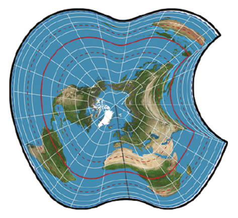
Cymek said:
I wonder why the Southern hemisphere is lacking in land mass compared to the Northern hemisphere
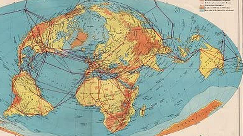
Because Gondwana exploded. South at top world maps exist. Here’s a detail from one of them.
Date: 28/08/2020 15:19:25
From: PermeateFree
ID: 1611420
Subject: re: Map projections
esselte said:
The main thing I don’t like about flat global map projections is that none of them convey very well the how big the Pacific Ocean is.
Goes to show the extent of our emissions to be able to influence such a large body of water. And shhh, there’s even more water on the other side!
Date: 28/08/2020 15:19:38
From: furious
ID: 1611421
Subject: re: Map projections
- I wonder why the Southern hemisphere is lacking in land mass compared to the Northern hemisphere
Isn’t that how they found Australia (probably not) because they figured there must be a large land mass in the south to balance out the world?
Date: 28/08/2020 15:21:49
From: The Rev Dodgson
ID: 1611423
Subject: re: Map projections
mollwollfumble said:
Cymek said:
I wonder why the Southern hemisphere is lacking in land mass compared to the Northern hemisphere
Because Gondwana exploded. South at top world maps exist. Here’s a detail from one of them.
At my one go at giving a welcome speech at an international conference I started with a South on top map, just so I could confuse everybody by saying welcome to Down Under.
Date: 28/08/2020 15:24:45
From: PermeateFree
ID: 1611425
Subject: re: Map projections
The Rev Dodgson said:
mollwollfumble said:
Cymek said:
I wonder why the Southern hemisphere is lacking in land mass compared to the Northern hemisphere
Because Gondwana exploded. South at top world maps exist. Here’s a detail from one of them.
At my one go at giving a welcome speech at an international conference I started with a South on top map, just so I could confuse everybody by saying welcome to Down Under.
You survived I see.
Date: 28/08/2020 15:31:32
From: Arts
ID: 1611427
Subject: re: Map projections
furious said:
- I wonder why the Southern hemisphere is lacking in land mass compared to the Northern hemisphere
Isn’t that how they found Australia (probably not) because they figured there must be a large land mass in the south to balance out the world?
why would a flat disc need balancing?
Date: 28/08/2020 15:32:54
From: ChrispenEvan
ID: 1611428
Subject: re: Map projections
Arts said:
furious said:
- I wonder why the Southern hemisphere is lacking in land mass compared to the Northern hemisphere
Isn’t that how they found Australia (probably not) because they figured there must be a large land mass in the south to balance out the world?
why would a flat disc need balancing?
same reason a globe shaped disk does.
Date: 28/08/2020 15:35:38
From: Arts
ID: 1611429
Subject: re: Map projections
ChrispenEvan said:
Arts said:
furious said:
- I wonder why the Southern hemisphere is lacking in land mass compared to the Northern hemisphere
Isn’t that how they found Australia (probably not) because they figured there must be a large land mass in the south to balance out the world?
why would a flat disc need balancing?
same reason a globe shaped disk does.
you are obviously working for ‘them’
Date: 28/08/2020 15:36:20
From: sibeen
ID: 1611430
Subject: re: Map projections
Arts said:
furious said:
- I wonder why the Southern hemisphere is lacking in land mass compared to the Northern hemisphere
Isn’t that how they found Australia (probably not) because they figured there must be a large land mass in the south to balance out the world?
why would a flat disc need balancing?
A turtle’s back isn’t the most stable of points.
Date: 28/08/2020 22:29:31
From: mollwollfumble
ID: 1611668
Subject: re: Map projections
mollwollfumble said:
I have a lot of new map projections I want to try out.
- My favourite one that needs inventing is “Best equal area in a rectangle”. The idea here is that maps in atlases are rectangular. Given an area (in sq km) of Earth to be shown in a rectangle, what is the unique equal are one that least-square minimises deviations from conformality. A conformal map is one that maps a small circle to a circle, equal area maps map a small circle to an ellipse. So this map projection makes these ellipses as circular as possible. Net necessarily suitable for whole Earth.
- A second one that needs inventing is “rubber sheet continent”. Here, applying the well known laws of elasticity, deform an irregular shape on a sphere onto a flat surface. The irregular shape can be a continent, large country, group of continents, ocean, where we desire the greatest fidelity. Excellent for odd shapes. The odder the shape, the better the improvement over other map projections. Perfect for ‘Tee-shaped’ continents.
- A third one that needs inventing, I could call “Pangea”. Ignore the oceans and place the Americas next to Europe-Africa. Place Antarctica next to Australia and India. Individual continents could be done using something like Lambert azimuthal equal area. Fitting them together gives a map that is ideal for land-based illustrations including world geology, vegetation and sociology.
- A fourth map projection that needs inventing would map all the oceans of the world together to maximum accuracy, ignoring the land. Land area on this world map would shrink as it is pushed in by the edges of the oceans.
Now for some fun. Vote for your favourite map projection. One of these, perhaps.
Dang it. I have another that I really like, but Google can’t find it.
> A third one that needs inventing, I could call “Pangea”. Ignore the oceans and place the Americas next to Europe-Africa. Place Antarctica next to Australia and India. Individual continents could be done using something like Lambert azimuthal equal area. Fitting them together gives a map that is ideal for land-based illustrations including world geology, vegetation and sociology.
A half-decent version of this already exists. I could probably improve it using rubber sheet elasticity or best projection in a rectangle. From
https://www.visualcapitalist.com/incredible-map-of-pangea-with-modern-borders/
Date: 28/08/2020 22:35:27
From: The Rev Dodgson
ID: 1611672
Subject: re: Map projections
Date: 28/08/2020 23:52:45
From: dv
ID: 1611693
Subject: re: Map projections
Eh I’m easy but I don’t want anything that is not at least fairly equal area.
Date: 29/08/2020 00:01:29
From: dv
ID: 1611695
Subject: re: Map projections
But I do quite like the Lambert Equal Area projection centred on, say, Dubai. The Persian Gulf is somewhat central to the populated world in that none of the major population centres are more than 14000 km away (because it is opposite a lightly population region of the world, the South Pacific. )
Date: 29/08/2020 09:08:19
From: mollwollfumble
ID: 1611735
Subject: re: Map projections
Ditto on Pangea, but for modern times I’d split Eurasia off from Canada and reattach it to Tibet. Then recentre and tilt to keep N-S axis as vertical as possible.
Ditto on equal area
dv said:
But I do quite like the Lambert Equal Area projection centred on, say, Dubai. The Persian Gulf is somewhat central to the populated world in that none of the major population centres are more than 14000 km away (because it is opposite a lightly population region of the world, the South Pacific. )
Nice.
The Lambert Equal Area projection is about as good as it’s possible to get for a hemisphere, but gets wonky outside that. Since the Pacific is nearly a hemisphere, using Dubai as a centre should work really well.
> My favourite one that needs inventing is “Best equal area in a rectangle”. The idea here is that maps in atlases are rectangular. Given an area (in sq km) of Earth to be shown in a rectangle, what is the unique equal are one that least-square minimises deviations from conformality. A conformal map is one that maps a small circle to a circle, equal area maps map a small circle to an ellipse. So this map projection makes these ellipses as circular as possible. Net necessarily suitable for whole Earth.
I’ve got an algorithm for this now – almost.
Given x,y on the map, use a general inverse projection of the form
Longitude = a1*y + a2*y^3 + a3*x^2*y + a4*y^5 + a5*x^2*y^3 + a6*x^4*y + …
Latitude = b1*x + b2*x^3 + b3*y^2*x + b4*x^5 + b5*y^2*x^3 + b6*y^4*x + …
Then from tiny squares on the map to tiny latitude-longitude quadrilaterals on the sphere. Get 3-D cartesian coordinates of corners of the quadrilateral on the sphere. Calculate the deviations from equal area and from conformality using edge lengths of each quadrilateral. Sum the squares of the errors. Modify parameters to minimise least square errors.
Slight problem there is how to ensure equal area while minimising deviations from conformality. I’d be trying to minimise two incompatible criteria simultaneously. It may end up being something like trying to minimise a multidimensional https://en.wikipedia.org/wiki/Rosenbrock_function – ie. difficult but not impossible. Perhaps if I start by minimising say “error_equal_area + error_conformality” then use that in turn as a starting state for minimising “2^n * error_equal_area + error_conformality” for stepwise increasing “n”. This will tend towards minimum error in conformality for exact equal area.
After all is said and done a 3-D rotation to recentre.
Date: 29/08/2020 09:12:08
From: mollwollfumble
ID: 1611736
Subject: re: Map projections
mollwollfumble said:
Ditto on Pangea, but for modern times I’d split Eurasia off from Canada and reattach it to Tibet. Then recentre and tilt to keep N-S axis as vertical as possible.
Ditto on equal area
dv said:
But I do quite like the Lambert Equal Area projection centred on, say, Dubai. The Persian Gulf is somewhat central to the populated world in that none of the major population centres are more than 14000 km away (because it is opposite a lightly population region of the world, the South Pacific. )
Nice.
The Lambert Equal Area projection is about as good as it’s possible to get for a hemisphere, but gets wonky outside that. Since the Pacific is nearly a hemisphere, using Dubai as a centre should work really well.
> My favourite one that needs inventing is “Best equal area in a rectangle”. The idea here is that maps in atlases are rectangular. Given an area (in sq km) of Earth to be shown in a rectangle, what is the unique equal are one that least-square minimises deviations from conformality. A conformal map is one that maps a small circle to a circle, equal area maps map a small circle to an ellipse. So this map projection makes these ellipses as circular as possible. Net necessarily suitable for whole Earth.
I’ve got an algorithm for this now – almost.
Given x,y on the map, use a general inverse projection of the form
Longitude = a1*y + a2*y^3 + a3*x^2*y + a4*y^5 + a5*x^2*y^3 + a6*x^4*y + …
Latitude = b1*x + b2*x^3 + b3*y^2*x + b4*x^5 + b5*y^2*x^3 + b6*y^4*x + …
Then from tiny squares on the map to tiny latitude-longitude quadrilaterals on the sphere. Get 3-D cartesian coordinates of corners of the quadrilateral on the sphere. Calculate the deviations from equal area and from conformality using edge lengths of each quadrilateral. Sum the squares of the errors. Modify parameters to minimise least square errors.
Slight problem there is how to ensure equal area while minimising deviations from conformality. I’d be trying to minimise two incompatible criteria simultaneously. It may end up being something like trying to minimise a multidimensional https://en.wikipedia.org/wiki/Rosenbrock_function – ie. difficult but not impossible. Perhaps if I start by minimising say “error_equal_area + error_conformality” then use that in turn as a starting state for minimising “2^n * error_equal_area + error_conformality” for stepwise increasing “n”. This will tend towards minimum error in conformality for exact equal area.
After all is said and done a 3-D rotation to recentre.
(Aagh. I wish I could stop making this mistake). Correction:
Given x,y on the map, use a general inverse projection of the form
Latitude = a1*y + a2*y^3 + a3*x^2*y + a4*y^5 + a5*x^2*y^3 + a6*x^4*y + …
Longitude = b1*x + b2*x^3 + b3*y^2*x + b4*x^5 + b5*y^2*x^3 + b6*y^4*x + …
Date: 31/08/2020 04:20:52
From: mollwollfumble
ID: 1612293
Subject: re: Map projections
Slowly creaking my way forward using Excel.
Eurasia Map 1.
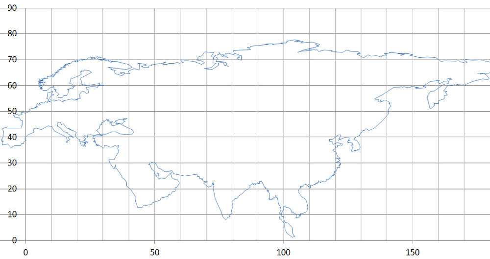
Eurasia Map 2. Not equal area yet.
Date: 31/08/2020 09:57:30
From: mollwollfumble
ID: 1612330
Subject: re: Map projections
mollwollfumble said:
Slowly creaking my way forward using Excel.
Eurasia Map 2. Not equal area yet.
Lambert Azimuthal Equal Area. Doesn’t seem like much change but suddenly Sweden, Spain, Arabia, India, Malaysia and Korea look much better.
Or I can take a Lambert Azimuthal Equal Area from a different starting point to get less curvature of the lines of latitude. This is better for Arabia, India, Malaysia. Not as good for Sweden and Spain.
Date: 31/08/2020 10:42:50
From: dv
ID: 1612367
Subject: re: Map projections
mollwollfumble said:
mollwollfumble said:
Slowly creaking my way forward using Excel.
Eurasia Map 2. Not equal area yet.
Lambert Azimuthal Equal Area. Doesn’t seem like much change but suddenly Sweden, Spain, Arabia, India, Malaysia and Korea look much better.
Or I can take a Lambert Azimuthal Equal Area from a different starting point to get less curvature of the lines of latitude. This is better for Arabia, India, Malaysia. Not as good for Sweden and Spain.
nice
Date: 31/08/2020 11:49:52
From: mollwollfumble
ID: 1612403
Subject: re: Map projections
dv said:
mollwollfumble said:
Lambert Azimuthal Equal Area. Doesn’t seem like much change but suddenly Sweden, Spain, Arabia, India, Malaysia and Korea look much better.
Or I can take a Lambert Azimuthal Equal Area from a different starting point to get less curvature of the lines of latitude. This is better for Arabia, India, Malaysia. Not as good for Sweden and Spain.
nice
:-)
I’ve occasionally wondered what East Asia really looks like. Lambert Equal Area again.
In the past, all the maps I’ve seen have had the eastern tip of Russia either too far east, too far west, too far north or too far south.
This is starting to look more realistic. The coast from the tip of the Malaysia to the far eastern tip of Russia is not far off a straight line between the two points.
Date: 31/08/2020 12:04:13
From: Bubblecar
ID: 1612413
Subject: re: Map projections
>I’ve occasionally wondered what East Asia really looks like.
Get yourself a globe of the world. I have a big one on top of my fridge (nowhere else to put it).
Date: 31/08/2020 12:47:12
From: mollwollfumble
ID: 1612429
Subject: re: Map projections
Bubblecar said:
>I’ve occasionally wondered what East Asia really looks like.
Get yourself a globe of the world. I have a big one on top of my fridge (nowhere else to put it).
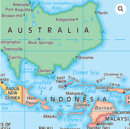
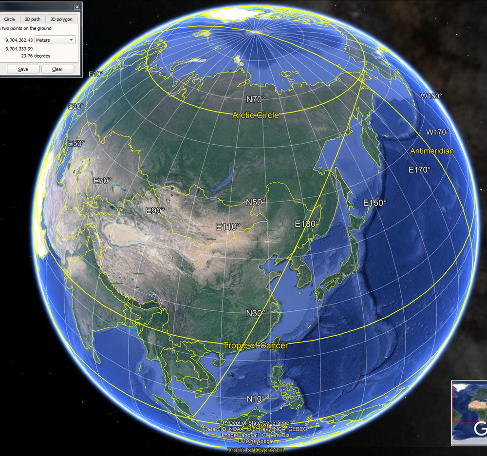
Can you confirm from your globe on top of the fridge that the great circle from Singapore to the eastern tip of Russia passes half way between Pyongyang and Beijing? Please.
The last (and biggest globe) I had was a blow up one. It developed a puncture.
My hall is filled with an up to date map of the world. Which is no use at all in this instance. Neither is Google Earth, unfortunately.
Date: 31/08/2020 12:49:01
From: The Rev Dodgson
ID: 1612431
Subject: re: Map projections
mollwollfumble said:
Neither is Google Earth, unfortunately.
Why isn’t it?
Date: 31/08/2020 12:53:50
From: sibeen
ID: 1612433
Subject: re: Map projections
mollwollfumble said:
Bubblecar said:
>I’ve occasionally wondered what East Asia really looks like.
Get yourself a globe of the world. I have a big one on top of my fridge (nowhere else to put it).
Can you confirm from your globe on top of the fridge that the great circle from Singapore to the eastern tip of Russia passes half way between Pyongyang and Beijing? Please.
The last (and biggest globe) I had was a blow up one. It developed a puncture.
My hall is filled with an up to date map of the world. Which is no use at all in this instance. Neither is Google Earth, unfortunately.
I just got a piece of string and went between Singapore and the bit of Russia that touches the Berring strait and it basically passes over the top of Pyongyang.
Date: 31/08/2020 12:54:12
From: party_pants
ID: 1612434
Subject: re: Map projections
mollwollfumble said:
Bubblecar said:
>I’ve occasionally wondered what East Asia really looks like.
Get yourself a globe of the world. I have a big one on top of my fridge (nowhere else to put it).
Can you confirm from your globe on top of the fridge that the great circle from Singapore to the eastern tip of Russia passes half way between Pyongyang and Beijing? Please.
The last (and biggest globe) I had was a blow up one. It developed a puncture.
My hall is filled with an up to date map of the world. Which is no use at all in this instance. Neither is Google Earth, unfortunately.
Google Earth should give you the great circle line if you draw a straight line between two points using the measuring tool…
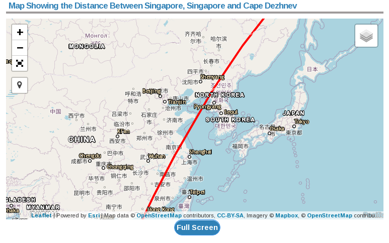
Date: 31/08/2020 12:58:04
From: mollwollfumble
ID: 1612437
Subject: re: Map projections
The Rev Dodgson said:
mollwollfumble said:
Neither is Google Earth, unfortunately.
Why isn’t it?
My apologies. It is. I thought it wasn’t because it falls well short of seeing a full hemisphere. And because the first answer on the website https://forums.ybw.com/index.php?threads/google-earth-great-circle.232893/ says it isn’t.
This is the Google Earth plot. If this is a Great Circle then it passes a whisker to the East of that, almost directly through Pyongyang.
Date: 31/08/2020 12:59:05
From: Bubblecar
ID: 1612440
Subject: re: Map projections
mollwollfumble said:
Bubblecar said:
>I’ve occasionally wondered what East Asia really looks like.
Get yourself a globe of the world. I have a big one on top of my fridge (nowhere else to put it).
Can you confirm from your globe on top of the fridge that the great circle from Singapore to the eastern tip of Russia passes half way between Pyongyang and Beijing? Please.
The last (and biggest globe) I had was a blow up one. It developed a puncture.
My hall is filled with an up to date map of the world. Which is no use at all in this instance. Neither is Google Earth, unfortunately.
Approximately right, probably closer to Pyongyang.
Date: 31/08/2020 12:59:22
From: mollwollfumble
ID: 1612441
Subject: re: Map projections
sibeen said:
mollwollfumble said:
Bubblecar said:
>I’ve occasionally wondered what East Asia really looks like.
Get yourself a globe of the world. I have a big one on top of my fridge (nowhere else to put it).
Can you confirm from your globe on top of the fridge that the great circle from Singapore to the eastern tip of Russia passes half way between Pyongyang and Beijing? Please.
The last (and biggest globe) I had was a blow up one. It developed a puncture.
My hall is filled with an up to date map of the world. Which is no use at all in this instance. Neither is Google Earth, unfortunately.
I just got a piece of string and went between Singapore and the bit of Russia that touches the Berring strait and it basically passes over the top of Pyongyang.
Thanks.
Date: 31/08/2020 13:01:57
From: dv
ID: 1612442
Subject: re: Map projections
Bubblecar said:
mollwollfumble said:
Bubblecar said:
>I’ve occasionally wondered what East Asia really looks like.
Get yourself a globe of the world. I have a big one on top of my fridge (nowhere else to put it).
Can you confirm from your globe on top of the fridge that the great circle from Singapore to the eastern tip of Russia passes half way between Pyongyang and Beijing? Please.
The last (and biggest globe) I had was a blow up one. It developed a puncture.
My hall is filled with an up to date map of the world. Which is no use at all in this instance. Neither is Google Earth, unfortunately.
Approximately right, probably closer to Pyongyang.
Date: 31/08/2020 13:02:26
From: Bubblecar
ID: 1612445
Subject: re: Map projections
sibeen said:
mollwollfumble said:
Bubblecar said:
>I’ve occasionally wondered what East Asia really looks like.
Get yourself a globe of the world. I have a big one on top of my fridge (nowhere else to put it).
Can you confirm from your globe on top of the fridge that the great circle from Singapore to the eastern tip of Russia passes half way between Pyongyang and Beijing? Please.
The last (and biggest globe) I had was a blow up one. It developed a puncture.
My hall is filled with an up to date map of the world. Which is no use at all in this instance. Neither is Google Earth, unfortunately.
I just got a piece of string and went between Singapore and the bit of Russia that touches the Berring strait and it basically passes over the top of Pyongyang.
I did the same and it’s closer to Pyongyang than Beijing, but doesn’t pass directly over North Korea.
Date: 31/08/2020 13:03:12
From: Bubblecar
ID: 1612446
Subject: re: Map projections
dv said:
Bubblecar said:
mollwollfumble said:
Can you confirm from your globe on top of the fridge that the great circle from Singapore to the eastern tip of Russia passes half way between Pyongyang and Beijing? Please.
The last (and biggest globe) I had was a blow up one. It developed a puncture.
My hall is filled with an up to date map of the world. Which is no use at all in this instance. Neither is Google Earth, unfortunately.
Approximately right, probably closer to Pyongyang.
That’s right, it’s in the water.
Date: 31/08/2020 13:08:02
From: dv
ID: 1612451
Subject: re: Map projections
mollwollfumble said:
dv said:
mollwollfumble said:
Lambert Azimuthal Equal Area. Doesn’t seem like much change but suddenly Sweden, Spain, Arabia, India, Malaysia and Korea look much better.
Or I can take a Lambert Azimuthal Equal Area from a different starting point to get less curvature of the lines of latitude. This is better for Arabia, India, Malaysia. Not as good for Sweden and Spain.
nice
:-)
I’ve occasionally wondered what East Asia really looks like. Lambert Equal Area again.
In the past, all the maps I’ve seen have had the eastern tip of Russia either too far east, too far west, too far north or too far south.
This is starting to look more realistic. The coast from the tip of the Malaysia to the far eastern tip of Russia is not far off a straight line between the two points.
Surely you’ve seen globes before. Any 2-D map of a large area will of course contain distortions.
Date: 1/09/2020 12:28:11
From: mollwollfumble
ID: 1612751
Subject: re: Map projections
dv said:
mollwollfumble said:
dv said:
nice
:-)
I’ve occasionally wondered what East Asia really looks like. Lambert Azimuthal Equal Area again.
In the past, all the maps I’ve seen have had the eastern tip of Russia either too far east, too far west, too far north or too far south.
This is starting to look more realistic. The coast from the tip of the Malaysia to the far eastern tip of Russia is not far off a straight line between the two points.
Surely you’ve seen globes before. Any 2-D map of a large area will of course contain distortions.
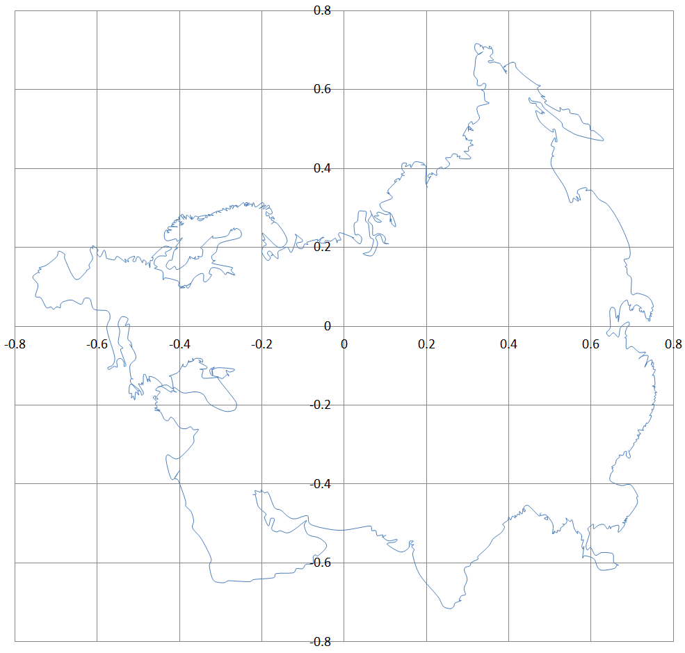
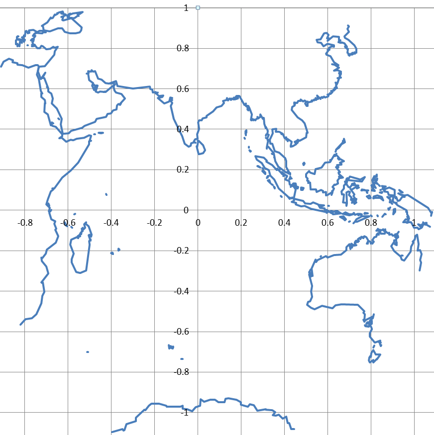
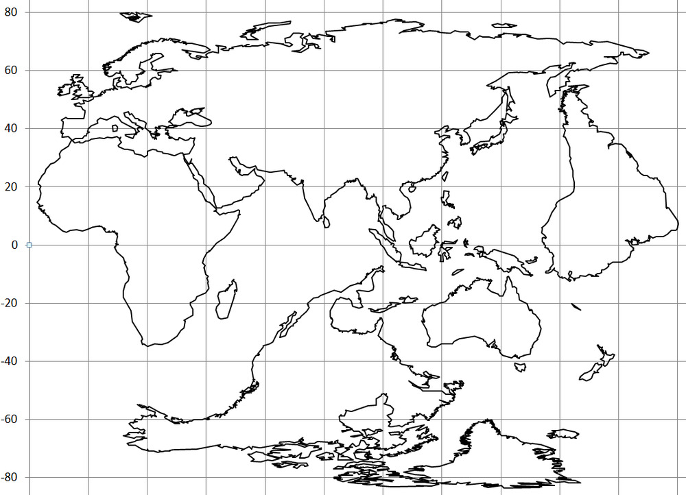
Update. Have now done Lambert Azimuthal Equal Area maps for coastlines of:
- Eurasia, Eastern Asia, Africa, North America, South America and Antarctica.
Antarctica was the most difficult, because I had to manually find the coastline one point at a time. The other continents were in the coastal datafile, but Antarctica wasn’t.
The results don’t look any different from what you’d expect, unless you expect Alaska to be bigger than Mexico.
Still to go. Europe+W.Asia & Australia.
Then look at combining continents eg. Eurafrica.
Then after that smaller islands. Greenland, Madagascar, PNG, Indonesia, Japan, UK, NZ.
Date: 1/09/2020 22:00:39
From: mollwollfumble
ID: 1613031
Subject: re: Map projections
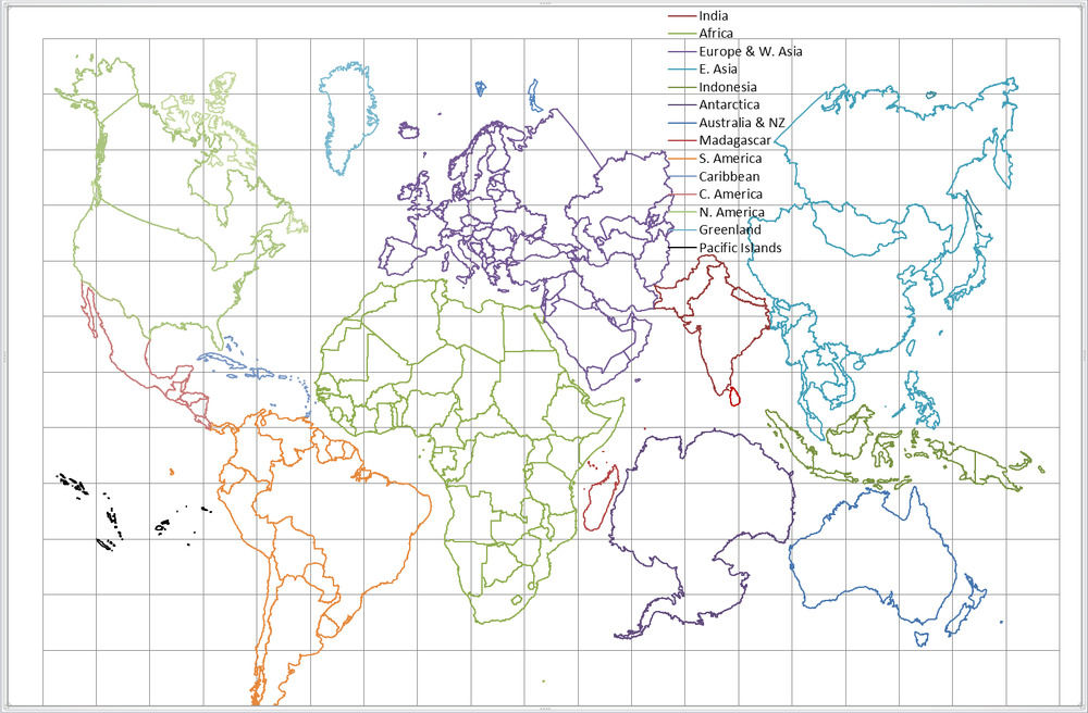
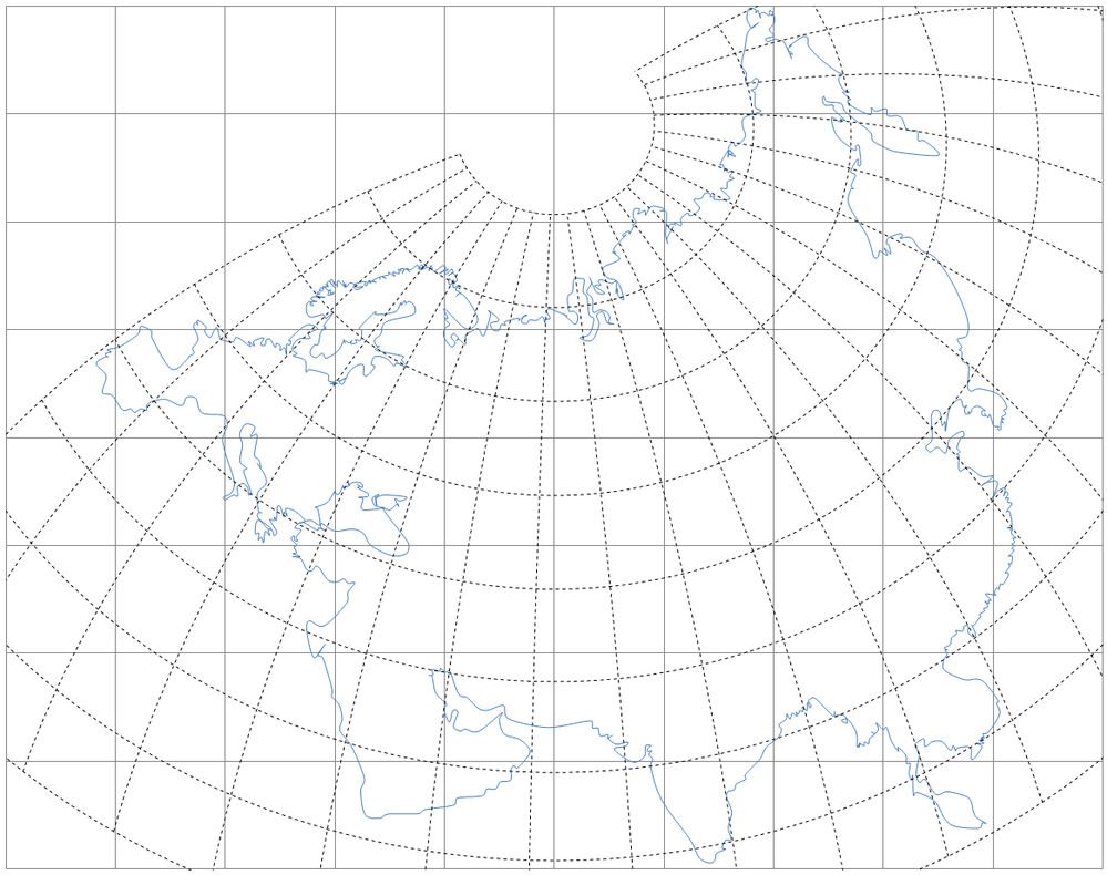
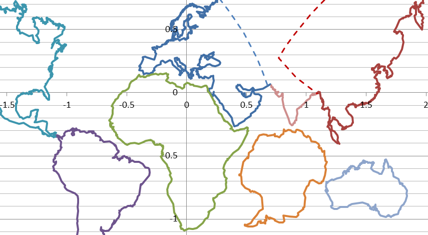
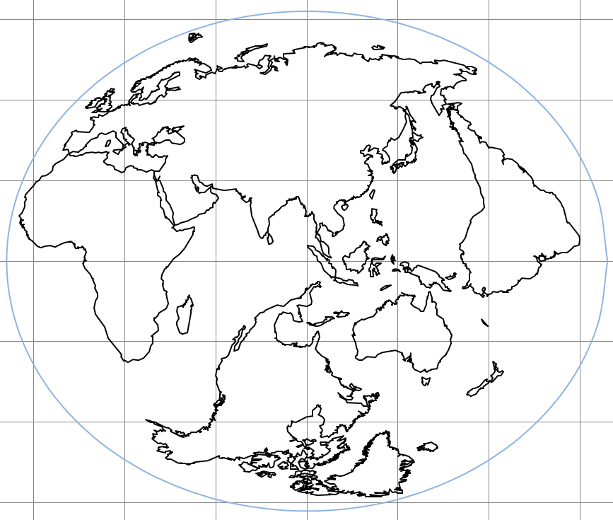
My first attempt at a whole world map. Made from a mosaic of Lambert Azimuthal Equal Area projections.
I call it “Seven continents”. It’s a mosaic of seven maps, one for each continent.
The aim is to put a lot of land area on a small map area.
If used for political regions, it can be trimmed quite a lot at all four of left, right, top and bottom. Though not so much on right because of Japan.
I’m having trouble with India, and I’m not the first person to have trouble with India.
Bartholomew’s “Regional Projection” also needed to have a separate map projection just for India.
I can see now that I have East Asia just a bit too high, it has to come south about 4 degrees of latitude.
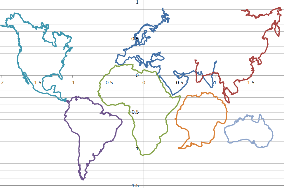
Compare with maps below. The above has bigger relative land areas, and a better Alaska and Antarctica.

Date: 2/09/2020 01:36:31
From: mollwollfumble
ID: 1613083
Subject: re: Map projections
mollwollfumble said:
My first attempt at a whole world map. Made from a mosaic of Lambert Azimuthal Equal Area projections.
I call it “Seven continents”. It’s a mosaic of seven maps, one for each continent.
The aim is to put a lot of land area on a small map area.
If used for political regions, it can be trimmed quite a lot at all four of left, right, top and bottom. Though not so much on right because of Japan.
I’m having trouble with India, and I’m not the first person to have trouble with India.
Bartholomew’s “Regional Projection” also needed to have a separate map projection just for India.
I can see now that I have East Asia just a bit too high, it has to come south about 4 degrees of latitude.
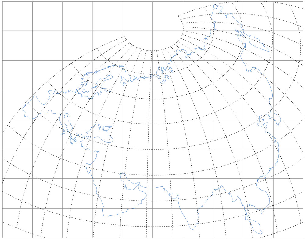
This is better. I had to split Eurasia into three pieces in order to use Lambert Azimuthal Equal Area. But there would be a better projection for Eurasia, I’m sure.
I find it interesting how Africa stands out as clearly the second largest continent.
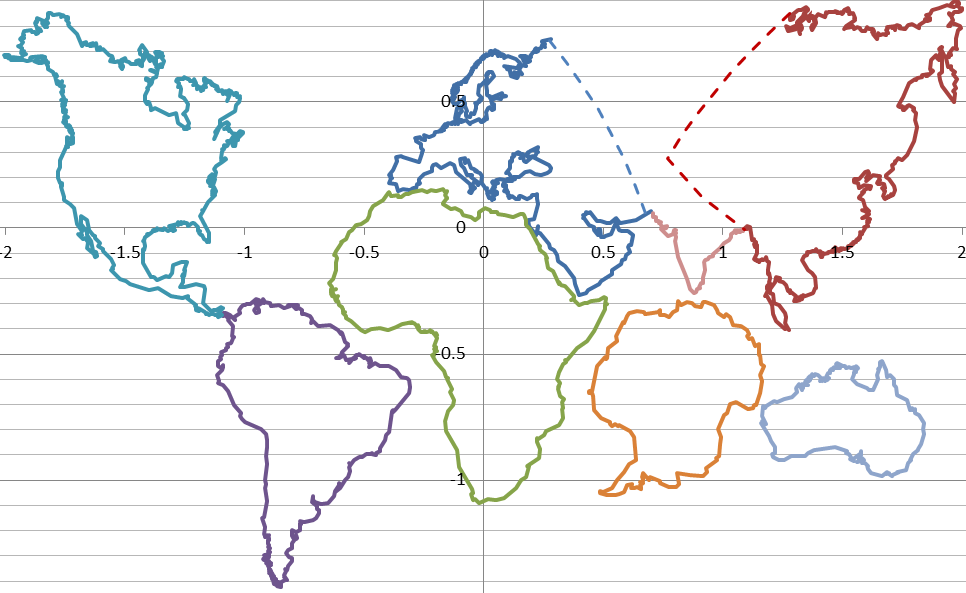
If the only requirement is that a large piece of each country is shown then parts of Canada, USA. Mexico, Argentina, Chile and Russia can be removed to get an even more compact world political map.
Date: 3/09/2020 12:44:55
From: mollwollfumble
ID: 1613809
Subject: re: Map projections
mollwollfumble said:
This is better. I had to split Eurasia into three pieces in order to use Lambert Azimuthal Equal Area. But there would be a better projection for Eurasia, I’m sure.
I find it interesting how Africa stands out as clearly the second largest continent.
If the only requirement is that a large piece of each country is shown then parts of Canada, USA. Mexico, Argentina, Chile and Russia can be removed to get an even more compact world political map.
OK. My first half-decent new map projection.
If the only requirement is that a large piece of each country is shown then I get an even more compact world political map. This map projection is bad news if you live in Kazakhstan, but good news if you live anywhere else. Small island nations can be added as desired.
Date: 3/09/2020 12:46:33
From: dv
ID: 1613815
Subject: re: Map projections
Date: 3/09/2020 14:59:50
From: mollwollfumble
ID: 1613953
Subject: re: Map projections
quote=mollwollfumble
OK. My first half-decent new map projection.
Compare with Winkel-Tripel. Winkel Tripel has much more distortion of land shape, well, everywhere.
If the only requirement is that a large piece of each country is shown then I get an even more compact world political map. This map projection is bad news if you live in Kazakhstan, but good news if you live anywhere else. Small island nations can be added as desired.
end quote
dv said:
I’m not a fan of those
I only call it half decent because I had to cut Eurasia in to three parts.
What’s wrong with equal area, minimum deviation from conformality, and keeping the NS direction as vertical as possible? I even retained the orientation for Antarctica.
Sure it’s not suitable for oceans at all, but most of what maps are used for is land. And I’ve even kept all of Indonesia together as a single unit.
For the political map. Ages ago I did an animation of 20th century wars worldwide, one frame for each year. Now I can’t find the original projection, so I wanted a replacement projection big enough to show Rwanda and Fiji. This one is. Winkel-Tripel isn’t.
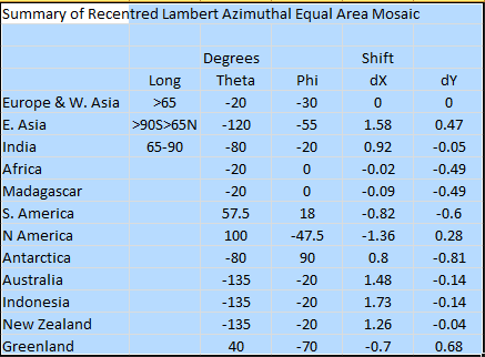
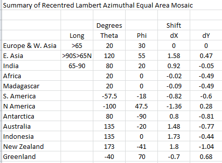
Map projection details. The “degrees” columns are the latitude and longitude of each of the 12 equal area projections. The dX and dY are how each component was shifted to stitch back into a mosaic.
Date: 3/09/2020 17:39:21
From: mollwollfumble
ID: 1614076
Subject: re: Map projections
mollwollfumble said:
OK. My first half-decent new map projection.
dv said:
I’m not a fan of those
I only call it half decent because I had to cut Eurasia in to three parts.
What’s wrong with equal area, minimum deviation from conformality, and keeping the NS direction as vertical as possible? I even retained the orientation for Antarctica.
Sure it’s not suitable for oceans at all, but most of what maps are used for is land. And I’ve even kept all of Indonesia together as a single unit.
For the political map. Ages ago I did an animation of 20th century wars worldwide, one frame for each year. Now I can’t find the original projection, so I wanted a replacement projection big enough to show Rwanda and Fiji. This one is. Winkel-Tripel isn’t.
Map projection details. The “degrees” columns are the latitude and longitude of each of the 12 equal area projections. The dX and dY are how each component was shifted to stitch back into a mosaic.
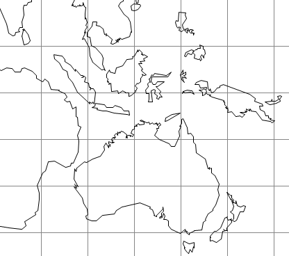
Oops, I’d accidentally set a typical latitude for Australia as 20 deg N instead of 20 deg S, which explains why New Zealand on the above maps was looking quite sick, and why Australia was looking far too wide.
Corrected latitude and longitude and shift for the mosaic components.
Here’s the view of our local area after fixing. Remember, only the shapes of the islands matter here.
Date: 4/09/2020 07:42:52
From: mollwollfumble
ID: 1614314
Subject: re: Map projections
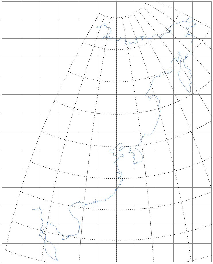
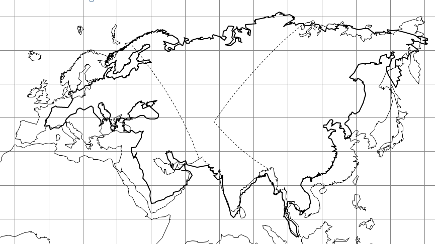
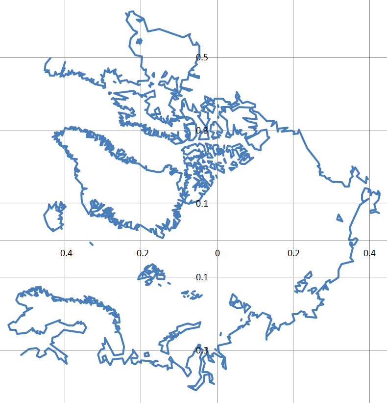
The three part Lambert Azimuthal Eurasia, with a single part Winkel-Tripel overlay.
The Winkel-Tripel is actually not too bad, actually pretty marvellous for a single part projection, but Europe needs a definite improvement.
Date: 4/09/2020 08:53:27
From: mollwollfumble
ID: 1614324
Subject: re: Map projections
mollwollfumble said:
The three part Lambert Azimuthal Eurasia, with a single part Winkel-Tripel overlay.
The Winkel-Tripel is actually not too bad, actually pretty marvellous for a single part projection, but Europe needs a definite improvement.
Another attempt to improve Eurasia with a single part projection. In this case 60% Winkel-Tipel and 40% straight latitude-longitude. Nowhere near Equal Area of course, but it does nearly fix Europe. The remaining problems are Saudi Arabia’s interference with Africa, and the eastern tip of Russia. Perhaps if I rethink Africa a bit to shrink the top. Or do a slight latitude trade-off of India against the tip of Siberia.

Date: 6/09/2020 01:50:43
From: mollwollfumble
ID: 1615219
Subject: re: Map projections
mollwollfumble said:
mollwollfumble said:
The three part Lambert Azimuthal Eurasia, with a single part Winkel-Tripel overlay.
The Winkel-Tripel is actually not too bad, actually pretty marvellous for a single part projection, but Europe needs a definite improvement.
Another attempt to improve Eurasia with a single part projection. In this case 60% Winkel-Tipel and 40% straight latitude-longitude. Nowhere near Equal Area of course, but it does nearly fix Europe. The remaining problems are Saudi Arabia’s interference with Africa, and the eastern tip of Russia. Perhaps if I rethink Africa a bit to shrink the top. Or do a slight latitude trade-off of India against the tip of Siberia.
I’ve started on the worlds oceans. Nothing new here so far, I’m just warming up. Both are Lambert Azimuthal Equal Area. Both are centred on 10 degrees south. I’m hoping that keeping the latitude the same for all three of Pacific, Indian and Atlantic will help me stitch the three projections together.
Date: 6/09/2020 08:33:51
From: mollwollfumble
ID: 1615248
Subject: re: Map projections
mollwollfumble said:
I’ve started on the worlds oceans. Nothing new here so far, I’m just warming up. Both are Lambert Azimuthal Equal Area. Both are centred on 10 degrees south. I’m hoping that keeping the latitude the same for all three of Pacific, Indian and Atlantic will help me stitch the three (or more) projections together.
Arctic Ocean. Again, bog standard map projection. The rotation is 80 degrees to align it with India. Don’t ask me why, yet, I’ll probably end up switching it back to normal orientation.
Date: 6/09/2020 09:45:53
From: The Rev Dodgson
ID: 1615270
Subject: re: Map projections
Moll (and others) may enjoy this:
https://www.quora.com/What-are-the-closest-points-between-all-the-continents
Closest points for all 21 continent pairs, including maps.
A few surprises in there.
Date: 6/09/2020 19:44:39
From: mollwollfumble
ID: 1615481
Subject: re: Map projections
The Rev Dodgson said:
Moll (and others) may enjoy this:
https://www.quora.com/What-are-the-closest-points-between-all-the-continents
Closest points for all 21 continent pairs, including maps.
A few surprises in there.
Thanks. Looking that up now.
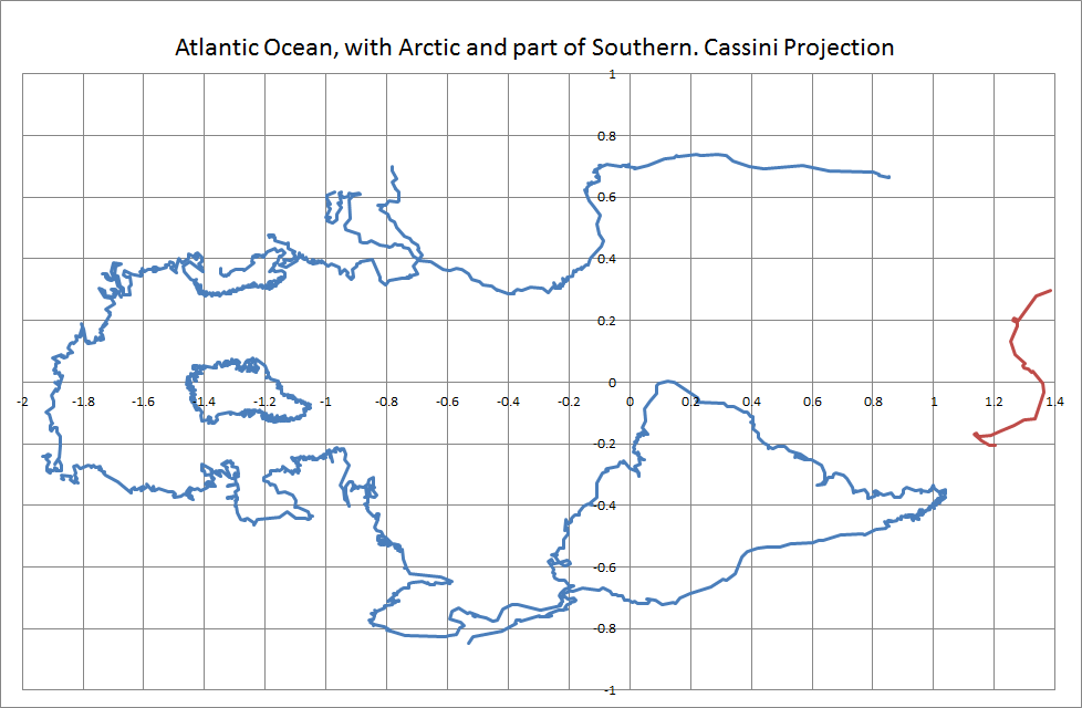
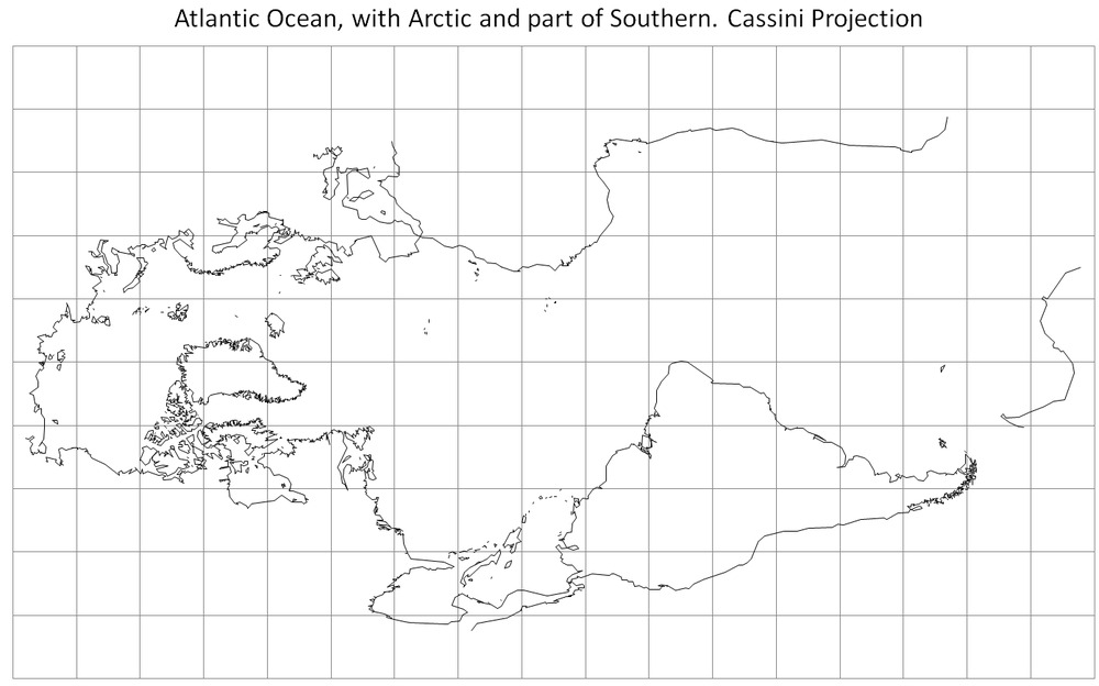
Here’s a map of the Atlantic Ocean. See the world differently.
This is actually pretty well a bog standard map projection, actually invented by Cassini, it’s just a map projection that you won’t see very often.
I haven’t added the islands in yet.
Date: 7/09/2020 06:07:52
From: mollwollfumble
ID: 1615564
Subject: re: Map projections
The Rev Dodgson said:
Moll (and others) may enjoy this:
https://www.quora.com/What-are-the-closest-points-between-all-the-continents
Closest points for all 21 continent pairs, including maps.
A few surprises in there.
Thanks. I didn’t know closest points for Europe.
Here’s a map of the Atlantic Ocean. See the world differently.
This is actually pretty well a bog standard map projection, actually invented by Cassini, it’s just a map projection that you won’t see very often.
Final version.
Date: 7/09/2020 11:33:13
From: mollwollfumble
ID: 1615675
Subject: re: Map projections
mollwollfumble said:
The Rev Dodgson said:
Moll (and others) may enjoy this:
https://www.quora.com/What-are-the-closest-points-between-all-the-continents
Closest points for all 21 continent pairs, including maps.
A few surprises in there.
Thanks. I didn’t know closest points for Europe.
Here’s a map of the Atlantic Ocean. See the world differently.
This is actually pretty well a bog standard map projection, actually invented by Cassini, it’s just a map projection that you won’t see very often.
Final version.
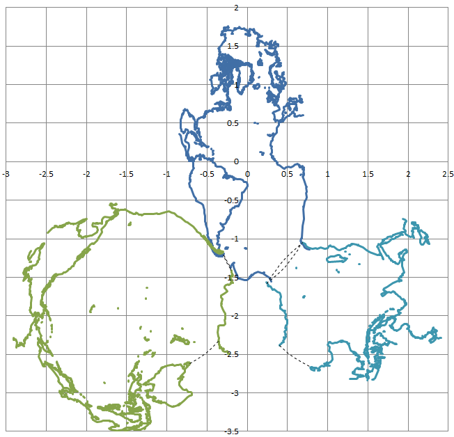
I composed this map projection of all the worlds oceans as a proof of concept. I think I’ve proved that it’s rubbish.
Would you agree?
Date: 7/09/2020 12:15:47
From: mollwollfumble
ID: 1615708
Subject: re: Map projections
mollwollfumble said:
mollwollfumble said:
The Rev Dodgson said:
Moll (and others) may enjoy this:
https://www.quora.com/What-are-the-closest-points-between-all-the-continents
Closest points for all 21 continent pairs, including maps.
A few surprises in there.
Thanks. I didn’t know closest points for Europe.
Here’s a map of the Atlantic Ocean. See the world differently.
This is actually pretty well a bog standard map projection, actually invented by Cassini, it’s just a map projection that you won’t see very often.
Final version.
I composed this map projection of all the worlds oceans as a proof of concept. I think I’ve proved that it’s rubbish.
Would you agree?
Another go at world oceans.
Also rubbish, but a bit better.
Date: 8/09/2020 11:29:52
From: mollwollfumble
ID: 1616088
Subject: re: Map projections
I’m up to working on the third of my four map projection projects. My BEAR projection. Best equal area in a rectangle.
‘Ello ‘ello. This looks fascinating.
https://www.researchgate.net/publication/324252646_A_bevy_of_area-preserving_transforms_for_map_projection_designers
And, from me, here is a list of some inverse mappings for well-known equal area projections.
Date: 8/09/2020 11:40:40
From: Divine Angel
ID: 1616090
Subject: re: Map projections
So the Earth’s not flat, it’s kiss shaped?
Date: 8/09/2020 11:51:57
From: Michael V
ID: 1616092
Subject: re: Map projections
It is impossible to preserve both angles and area on a single projection of a spherical object onto a plane.
Wulff Net projection preserves angles.
Schmidt Net projection preserves area.
Date: 8/09/2020 14:07:59
From: mollwollfumble
ID: 1616149
Subject: re: Map projections
mollwollfumble said:
I’m up to working on the third of my four map projection projects. My BEAR projection. Best equal area in a rectangle.
‘Ello ‘ello. This looks fascinating.
https://www.researchgate.net/publication/324252646_A_bevy_of_area-preserving_transforms_for_map_projection_designers
And, from me, here is a list of some inverse mappings for well-known equal area projections.
First look at Hammer projection. In the following chart, Hammer and Lambert Azimuthal are equal area. Equidistant is not. This not necessarily the best central point for the three projections. I’ve chosen a low central latitude (29 degrees N) to keep Spain from drifting too far north.
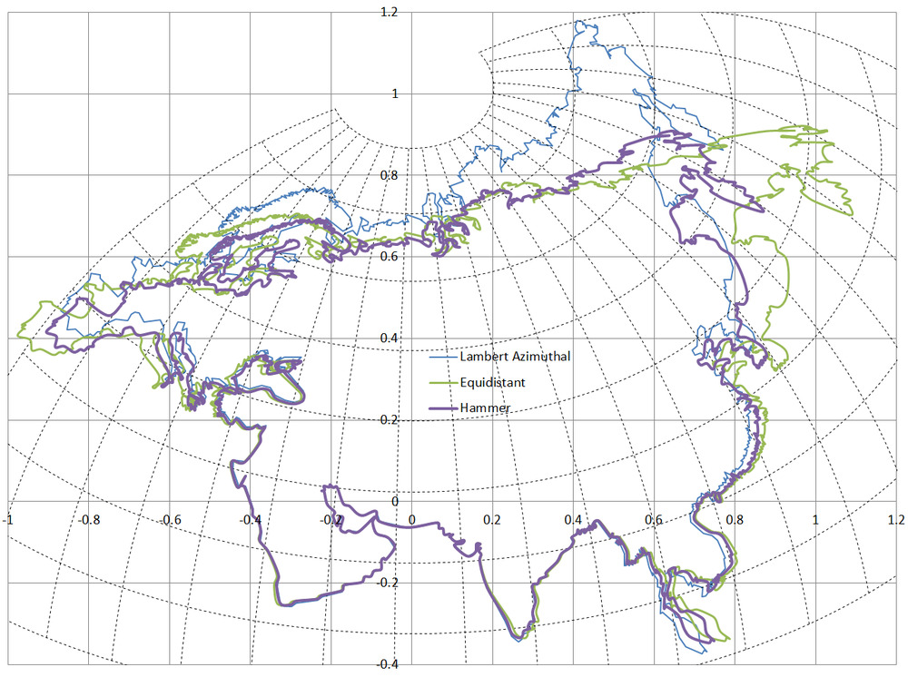
The same but with a central point closer to the centre of Eurasia (50 degrees N). The latitude and longitude lines are for Lambert Azimuthal.
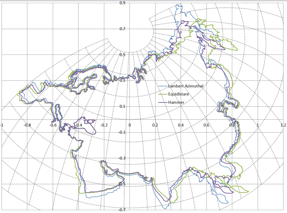
I must say I expected the Hammer projection to look better. Could it be that Eurasia isn’t as long and thin as I think.
Check:
Length of Eurasia from Portugal to tip of Russia. That’s not going to work, the shortest route is over the north pole.
Portugal to Chinese coast is 10,000 km. Tip of India to Arctic Ocean is 7,100 km. That’s the problem. Hammer works best on areas with an aspect ratio of 2:1. Lambert Azimuthal works best on continents with an aspect ratio of 1:1. So I can’t expect Hammer to be much better than Lambert Azimuthal for Eurasia.
Date: 10/09/2020 11:11:35
From: mollwollfumble
ID: 1617143
Subject: re: Map projections
Do you like this map projection?
Inspired by the difficulty in finding capital cities that have land on the opposite side of the Earth. There aren’t many.
Consider if South America was out of the way.
Date: 10/09/2020 11:12:53
From: SCIENCE
ID: 1617145
Subject: re: Map projections
mollwollfumble said:
Do you like this map projection?
Inspired by the difficulty in finding capital cities that have land on the opposite side of the Earth. There aren’t many.
Consider if South America was out of the way.
or one could say, looks like it’s CHINA’S fault
Date: 10/09/2020 11:14:44
From: Witty Rejoinder
ID: 1617146
Subject: re: Map projections
mollwollfumble said:
Do you like this map projection?
Inspired by the difficulty in finding capital cities that have land on the opposite side of the Earth. There aren’t many.
Consider if South America was out of the way.
They are not the same. One is centered on the Pacific and the other not.
Date: 10/09/2020 15:05:12
From: mollwollfumble
ID: 1617324
Subject: re: Map projections
Witty Rejoinder said:
mollwollfumble said:
Do you like this map projection?
Inspired by the difficulty in finding capital cities that have land on the opposite side of the Earth. There aren’t many.
Consider if South America was out of the way.
They are not the same. One is centered on the Pacific and the other not.
They’re the same. The two are centred on the exact opposite points on the sphere’s surface. But that doesn’t matter, because I’m projecting sphere onto sphere here.
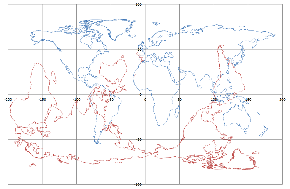
After moving South America 55 degrees east and removing duplicates, I get this.
Please feel free to complain about the distortion at high latitudes. This is simply a mapping from sphere to sphere, before applying any map projection to flatten it with minimal distortion.
Date: 10/09/2020 16:04:05
From: mollwollfumble
ID: 1617344
Subject: re: Map projections
mollwollfumble said:
Witty Rejoinder said:
mollwollfumble said:
Do you like this map projection?
Inspired by the difficulty in finding capital cities that have land on the opposite side of the Earth. There aren’t many.
Consider if South America was out of the way.
They are not the same. One is centered on the Pacific and the other not.
They’re the same. The two are centred on the exact opposite points on the sphere’s surface. But that doesn’t matter, because I’m projecting sphere onto sphere here.
After moving South America 55 degrees east and removing duplicates, I get this.
Please feel free to complain about the distortion at high latitudes. This is simply a mapping from sphere to sphere, before applying any map projection to flatten it with minimal distortion.
As above, replotted as Winkel-Tripel.
The ellipse is just for show.
Date: 10/09/2020 21:49:36
From: mollwollfumble
ID: 1617454
Subject: re: Map projections
I found a .klm file with country boundaries on https://hub.arcgis.com/datasets/a21fdb46d23e4ef896f31475217cbb08_1 and am trying to bash it into a form that I can use on Excel.
I already know that the file is too big to import into Excel. The import loses some of the boundary of Antarctica for example. I just hope I don’t lose too much. The import method so far is to import with space character delimiter, delete a lot of rubbish (essentially everything other than country names and latitude-longitude pairs). Then I plan to copy-paste transpose and text to column using comma delimeter.
Date: 11/09/2020 10:03:13
From: mollwollfumble
ID: 1617575
Subject: re: Map projections
mollwollfumble said:
I found a .klm file with country boundaries on https://hub.arcgis.com/datasets/a21fdb46d23e4ef896f31475217cbb08_1 and am trying to bash it into a form that I can use on Excel.
I already know that the file is too big to import into Excel. The import loses some of the boundary of Antarctica for example. I just hope I don’t lose too much. The import method so far is to import with space character delimiter, delete a lot of rubbish (essentially everything other than country names and latitude-longitude pairs). Then I plan to copy-paste transpose and text to column using comma delimeter.
Data from klm file looks good.
Date: 11/09/2020 10:18:12
From: The Rev Dodgson
ID: 1617586
Subject: re: Map projections
Watch out using transpose:
https://newtonexcelbach.com/2016/01/01/worksheetfunction-transpose-changed-behaviour-in-excel-2013-and-2016/
Date: 12/09/2020 05:38:49
From: mollwollfumble
ID: 1617986
Subject: re: Map projections
mollwollfumble said:
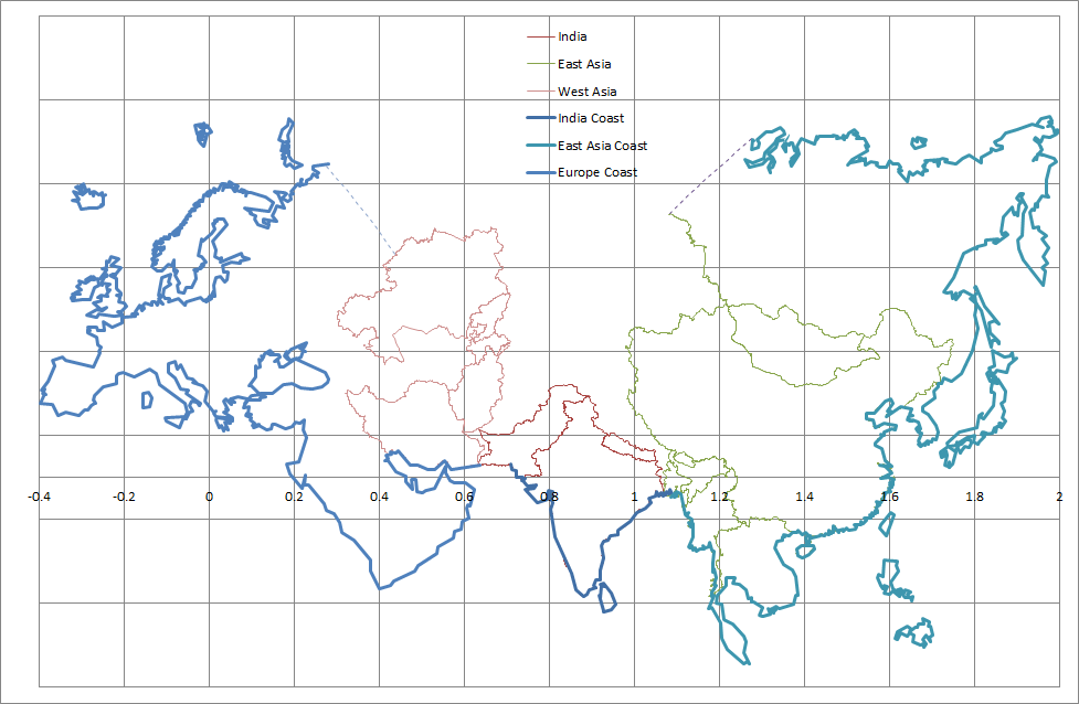
This is better. I had to split Eurasia into three pieces in order to use Lambert Azimuthal Equal Area. But there would be a better projection for Eurasia, I’m sure.
I find it interesting how Africa stands out as clearly the second largest continent.
If the only requirement is that a large piece of each country is shown then parts of Canada, USA. Mexico, Argentina, Chile and Russia can be removed to get an even more compact world political map.
> “I don’t like it”
You has a point, Rev.
(Warning, joke approaching)
This projection doesn’t work as a political map.
It’s too accurate. It has a border conflict between India and China.
It also has a minor border conflict between Pakistan and Afghanistan
But that’s easily solved by moving everything east of Pakistan a little further south.
The original projection. It’s still OK for landforms.
Border conflicts appear when I add country boundaries.
Date: 12/09/2020 09:10:21
From: The Rev Dodgson
ID: 1618004
Subject: re: Map projections
mollwollfumble said:
> “I don’t like it”
You has a point, Rev.
Did I say that?
You should tell me not to be so judgemental.
How you going importing data from the link you posted the other day?
I’m a bit busy at the moment, but I could look at some VBA to do it when I have time, unless you have it all sorted.
Date: 12/09/2020 11:32:23
From: mollwollfumble
ID: 1618103
Subject: re: Map projections
mollwollfumble said:
mollwollfumble said:
This is better. I had to split Eurasia into three pieces in order to use Lambert Azimuthal Equal Area. But there would be a better projection for Eurasia, I’m sure.
I find it interesting how Africa stands out as clearly the second largest continent.
If the only requirement is that a large piece of each country is shown then parts of Canada, USA. Mexico, Argentina, Chile and Russia can be removed to get an even more compact world political map.
> “I don’t like it”
You has a point, Rev.
(Warning, joke approaching)
This projection doesn’t work as a political map.
It’s too accurate. It has a border conflict between India and China.
It also has a minor border conflict between Pakistan and Afghanistan
But that’s easily solved by moving everything east of Pakistan a little further south.
The original projection. It’s still OK for landforms.
Border conflicts appear when I add country boundaries.
Got it.
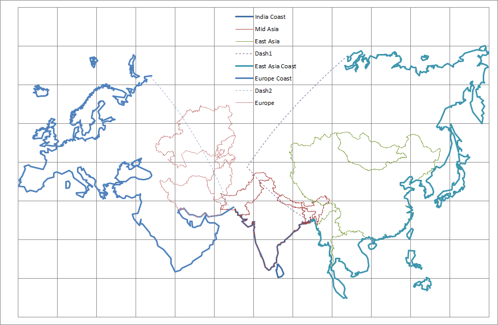
I moved Kashmir and Bangladesh into East Asia and jiggled the positions of the projections slightly relative to each other to get an exact match at the coast. Now I have a political map of Eurasia with no boundary conflicts. Russia is split at longitude 65 deg E. Three Lambert Azimuthal equal area projections.
Kazakhstan had been my major worry. In this final version it is quite tilted, but not out of shape. This is better than attaching it to India or cutting it in half.
Date: 12/09/2020 11:59:57
From: mollwollfumble
ID: 1618111
Subject: re: Map projections
mollwollfumble said:
I found a .klm file with country boundaries on https://hub.arcgis.com/datasets/a21fdb46d23e4ef896f31475217cbb08_1 and am trying to bash it into a form that I can use on Excel.
I already know that the file is too big to import into Excel. The import loses some of the boundary of Antarctica for example. I just hope I don’t lose too much. The import method so far is to import with space character delimiter, delete a lot of rubbish (essentially everything other than country names and latitude-longitude pairs). Then I plan to copy-paste transpose and text to column using comma delimeter.
The Rev Dodgson said:
Watch out using transpose:
https://newtonexcelbach.com/2016/01/01/worksheetfunction-transpose-changed-behaviour-in-excel-2013-and-2016/
That 65,536 is way more than the number of columns I can get in my old Excel from Office 2010.
My computer is only 32 bit.
The Rev Dodgson said:
mollwollfumble said:
> “I don’t like it”
You has a point, Rev.
Did I say that?
You should tell me not to be so judgemental.
How you going importing data from the link you posted the other day?
I’m a bit busy at the moment, but I could look at some VBA to do it when I have time, unless you have it all sorted.
I’ve got enough of the data sorted from the .klm file. But not anywhere near all of it.
The method I used was to import it using ‘ ‘ and ‘<’ as the delimiters, which caused four countries to exceed the maximum number of columns that Excel could import. Antarctica, Canada, Greenland and Russia.
My (old) version of Excel (from Office 2010) will only import a maximum of 8190 columns. I’d need more than twice that for all of Canada.
I lost all of the mainland of Canada, some of the mainland of Russia, none of the mainland of Antarctica only some of its islands, and I haven’t looked at Greenland.
Going back, I found where Excel quit for Russia and Canada and manually copied across all of the rest of the mainland for them and a few of the larger islands. So I’m still missing islands of all four countries.
Once imported, I transposed the data, no problem with number of rows, and replaced all the unwanted klm tags with blanks. Leaving only country names and longitude, latitude pairs. Then I split the longitude pairs using ‘,’ delimiter.
What I have now is adequate, but if you could improve it then that would be a great help.
> I’m a bit busy at the moment, but I could look at some VBA to do it when I have time, unless you have it all sorted.
Yes, please.
Date: 12/09/2020 12:21:06
From: The Rev Dodgson
ID: 1618116
Subject: re: Map projections
Regarding columns in Excel:
My version has 16384 columns (2^14). It’s 64 bit, but I’m pretty sure latest 32 versions are the same.
As you noted, the transpose bug is not an issue if you are working entirely in Excel, because you can’t transpose more than 16,384 columns anyway.
In VBA the column limit is not a problem because you can extract the values from text, and assign to an array with up to 1 million+ rows, and write that to the spreadsheet (and create more than one array if you have more than 1 million rows).
I have to finish current urgent work by Monday, so I’ll try and have a look next week.
Date: 12/09/2020 19:49:26
From: mollwollfumble
ID: 1618287
Subject: re: Map projections
The Rev Dodgson said:
Regarding columns in Excel:
My version has 16384 columns (2^14). It’s 64 bit, but I’m pretty sure latest 32 versions are the same.
As you noted, the transpose bug is not an issue if you are working entirely in Excel, because you can’t transpose more than 16,384 columns anyway.
In VBA the column limit is not a problem because you can extract the values from text, and assign to an array with up to 1 million+ rows, and write that to the spreadsheet (and create more than one array if you have more than 1 million rows).
I have to finish current urgent work by Monday, so I’ll try and have a look next week.
Have a go at renaming the .kml file as .txt
And importing it in one go into Excel with space as a delimiter. Let me know if this step works.
Then transposing it.
When I try importing it I get the “file not completely loaded” error. If you can import it and not get that error then please let me know.
I’ve managed to import the whole of Canada into Excel now, but it was a heck of a lot of work. I opened it in Notepad. The cut and paste the Canada data from Notepad to Excel. Instead of a single row it came in as a collection of rows cut at arbitrary locations, like in the middle of a number.
No row on import was more than 944 columns long, and there were 33,000 entries (each entry a longitude-latitude pair) in all so this was a lot of rows to be combined into a single array. Then I had to manually find and fix the start of each island – and Canada has a friggin lot of islands.
Still to get Antarctica, Russia and Greenland right.
Date: 14/09/2020 13:34:48
From: mollwollfumble
ID: 1618864
Subject: re: Map projections
mollwollfumble said:
The Rev Dodgson said:
Regarding columns in Excel:
My version has 16384 columns (2^14). It’s 64 bit, but I’m pretty sure latest 32 versions are the same.
As you noted, the transpose bug is not an issue if you are working entirely in Excel, because you can’t transpose more than 16,384 columns anyway.
In VBA the column limit is not a problem because you can extract the values from text, and assign to an array with up to 1 million+ rows, and write that to the spreadsheet (and create more than one array if you have more than 1 million rows).
I have to finish current urgent work by Monday, so I’ll try and have a look next week.
Have a go at renaming the .kml file as .txt
And importing it in one go into Excel with space as a delimiter. Let me know if this step works.
Then transposing it.
When I try importing it I get the “file not completely loaded” error. If you can import it and not get that error then please let me know.
I’ve managed to import the whole of Canada into Excel now, but it was a heck of a lot of work. I opened it in Notepad. The cut and paste the Canada data from Notepad to Excel. Instead of a single row it came in as a collection of rows cut at arbitrary locations, like in the middle of a number.
No row on import was more than 944 columns long, and there were 33,000 entries (each entry a longitude-latitude pair) in all so this was a lot of rows to be combined into a single array. Then I had to manually find and fix the start of each island – and Canada has a friggin lot of islands.
Still to get Antarctica, Russia and Greenland right.
I’m slowly adding countries to the map.
Not bad for four different map projections on the same chart.

Date: 14/09/2020 13:37:20
From: boppa
ID: 1618866
Subject: re: Map projections
“I’ve managed to import the whole of Canada into Excel now”
So you have managed to put all Canadians into cells….
:-O
Date: 14/09/2020 19:28:38
From: mollwollfumble
ID: 1619072
Subject: re: Map projections
mollwollfumble said:
mollwollfumble said:
The Rev Dodgson said:
Regarding columns in Excel:
My version has 16384 columns (2^14). It’s 64 bit, but I’m pretty sure latest 32 versions are the same.
As you noted, the transpose bug is not an issue if you are working entirely in Excel, because you can’t transpose more than 16,384 columns anyway.
In VBA the column limit is not a problem because you can extract the values from text, and assign to an array with up to 1 million+ rows, and write that to the spreadsheet (and create more than one array if you have more than 1 million rows).
I have to finish current urgent work by Monday, so I’ll try and have a look next week.
Have a go at renaming the .kml file as .txt
And importing it in one go into Excel with space as a delimiter. Let me know if this step works.
Then transposing it.
When I try importing it I get the “file not completely loaded” error. If you can import it and not get that error then please let me know.
I’ve managed to import the whole of Canada into Excel now, but it was a heck of a lot of work. I opened it in Notepad. The cut and paste the Canada data from Notepad to Excel. Instead of a single row it came in as a collection of rows cut at arbitrary locations, like in the middle of a number.
No row on import was more than 944 columns long, and there were 33,000 entries (each entry a longitude-latitude pair) in all so this was a lot of rows to be combined into a single array. Then I had to manually find and fix the start of each island – and Canada has a friggin lot of islands.
Still to get Antarctica, Russia and Greenland right.
I’m slowly adding countries to the map.
Not bad for four different map projections on the same chart.
boppa said:
“I’ve managed to import the whole of Canada into Excel now”
So you have managed to put all Canadians into cells….
:-O
LOL. But it’s not such good news for Canada. I have to get rid of most of the bl*()0! islands or spend the rest of my days projecting them one at a time. I’ve already got rid of most of the islands of Russia, Norway, Svalbard (DON’T talk to me about Svalbard), Indonesia, Philippines, Greece, UK, etc.
But I have held onto the largest islands of such places as Estonia, Netherlands, Madagascar, Yemen, Portugal, to see if they cause any problems.
Map of the old world. With every country correct shape and size (not necessarily correct rotation). With shrunken oceans. At this scale, Luxembourg is just visible.
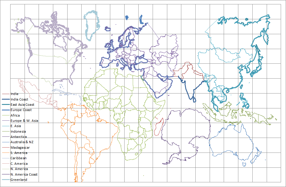
Date: 15/09/2020 14:49:42
From: mollwollfumble
ID: 1619374
Subject: re: Map projections
mollwollfumble said:
mollwollfumble said:
I’m slowly adding countries to the map.
Not bad for four different map projections on the same chart.
boppa said:
“I’ve managed to import the whole of Canada into Excel now”
So you have managed to put all Canadians into cells….
:-O
LOL. But it’s not such good news for Canada. I have to get rid of most of the bl*()0! islands or spend the rest of my days projecting them one at a time. I’ve already got rid of most of the islands of Russia, Norway, Svalbard (DON’T talk to me about Svalbard), Indonesia, Philippines, Greece, UK, etc.
But I have held onto the largest islands of such places as Estonia, Netherlands, Madagascar, Yemen, Portugal, to see if they cause any problems.
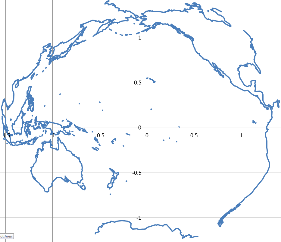
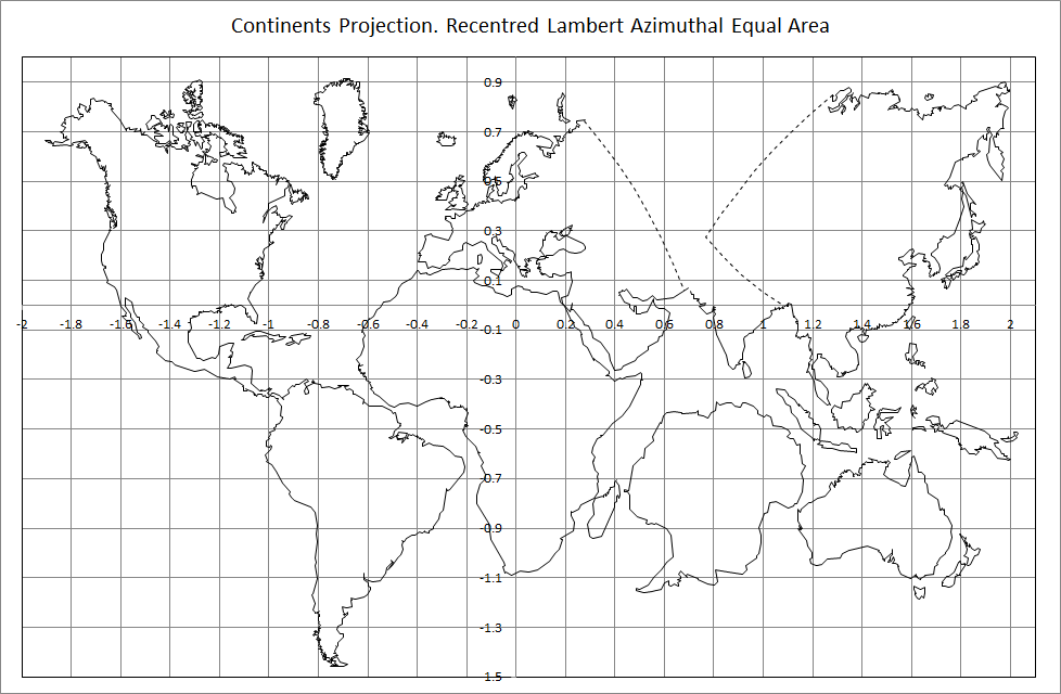
Map of the old world. With every country correct shape and size (not necessarily correct rotation). With shrunken oceans. At this scale, Luxembourg is just visible.
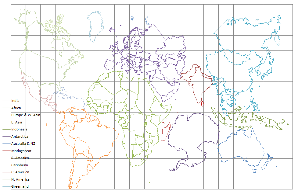
All the world’s counties. Recentred Lambert Azimuthal Equal Area.
Less than ideal.
A footnote, the lines marked thickly come from a lower resolution dataset. They are included because my plots for the higher resolution dataset are incomplete for Greenland, Svalbard, and the Islands of Russia and Canada. The high resolution dataset had way too much detail for all four of those locations.
Date: 17/09/2020 15:54:03
From: mollwollfumble
ID: 1620282
Subject: re: Map projections
mollwollfumble said:
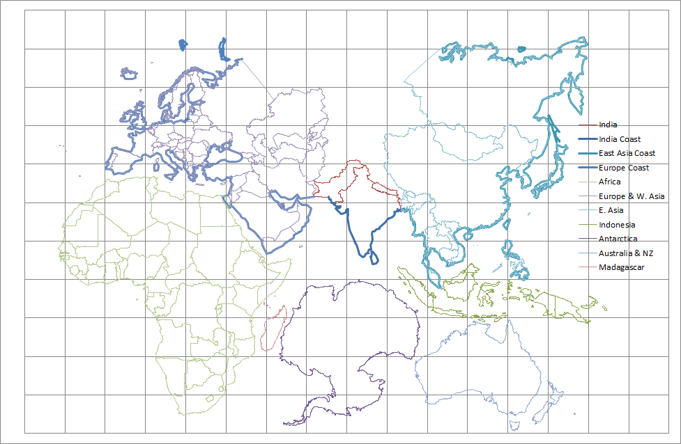
mollwollfumble said:
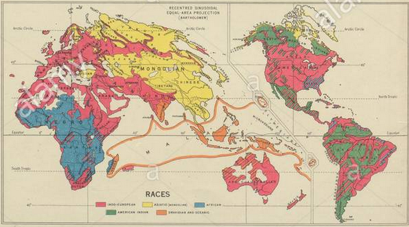
- A third one that needs inventing, I could call “Pangea”. Ignore the oceans and place the Americas next to Europe-Africa. Place Antarctica next to Australia and India. Individual continents could be done using something like Lambert azimuthal equal area. Fitting them together gives a map that is ideal for land-based illustrations including world geology, vegetation and sociology.
All the world’s counties. Recentred Lambert Azimuthal Equal Area.
Less than ideal.
A footnote, the lines marked thickly come from a lower resolution dataset. They are included because my plots for the higher resolution dataset are incomplete for Greenland, Svalbard, and the Islands of Russia and Canada. The high resolution dataset had way too much detail for all four of those locations.
I’ve reattached the USA to Mexico, mostly by setting the centre of the North America projection to the East coast of the continent rather than the centre. So Alaska is now quite rotated, but otherwise not too badly out of shape.
Just a few more tweaks (eg. adding islands from the mid Pacific) and I’ll be able to plot Covid-19 data on the map.
Date: 17/09/2020 15:59:08
From: Bubblecar
ID: 1620284
Subject: re: Map projections
mollwollfumble said:
mollwollfumble said:
mollwollfumble said:
- A third one that needs inventing, I could call “Pangea”. Ignore the oceans and place the Americas next to Europe-Africa. Place Antarctica next to Australia and India. Individual continents could be done using something like Lambert azimuthal equal area. Fitting them together gives a map that is ideal for land-based illustrations including world geology, vegetation and sociology.
All the world’s counties. Recentred Lambert Azimuthal Equal Area.
Less than ideal.
A footnote, the lines marked thickly come from a lower resolution dataset. They are included because my plots for the higher resolution dataset are incomplete for Greenland, Svalbard, and the Islands of Russia and Canada. The high resolution dataset had way too much detail for all four of those locations.
I’ve reattached the USA to Mexico, mostly by setting the centre of the North America projection to the East coast of the continent rather than the centre. So Alaska is now quite rotated, but otherwise not too badly out of shape.
Just a few more tweaks (eg. adding islands from the mid Pacific) and I’ll be able to plot Covid-19 data on the map.
Looks like you’re trying to barbecue the lot in the one pan, when it might be better to do them in stages.
Date: 17/09/2020 16:06:01
From: mollwollfumble
ID: 1620286
Subject: re: Map projections
Bubblecar said:
mollwollfumble said:
mollwollfumble said:
All the world’s counties. Recentred Lambert Azimuthal Equal Area.
Less than ideal.
A footnote, the lines marked thickly come from a lower resolution dataset. They are included because my plots for the higher resolution dataset are incomplete for Greenland, Svalbard, and the Islands of Russia and Canada. The high resolution dataset had way too much detail for all four of those locations.
I’ve reattached the USA to Mexico, mostly by setting the centre of the North America projection to the East coast of the continent rather than the centre. So Alaska is now quite rotated, but otherwise not too badly out of shape.
Just a few more tweaks (eg. adding islands from the mid Pacific) and I’ll be able to plot Covid-19 data on the map.
Looks like you’re trying to barbecue the lot in the one pan, when it might be better to do them in stages.
Am trying to get rid of the oceans, without getting rid of the islands.
I’m not quite sure what you mean by stages?
Date: 17/09/2020 16:07:42
From: Peak Warming Man
ID: 1620287
Subject: re: Map projections
>>I’ve reattached the USA to Mexico
Good good, is the Rio Grande OK?
Date: 17/09/2020 16:12:02
From: Bubblecar
ID: 1620288
Subject: re: Map projections
mollwollfumble said:
Bubblecar said:
mollwollfumble said:
I’ve reattached the USA to Mexico, mostly by setting the centre of the North America projection to the East coast of the continent rather than the centre. So Alaska is now quite rotated, but otherwise not too badly out of shape.
Just a few more tweaks (eg. adding islands from the mid Pacific) and I’ll be able to plot Covid-19 data on the map.
Looks like you’re trying to barbecue the lot in the one pan, when it might be better to do them in stages.
Am trying to get rid of the oceans, without getting rid of the islands.
I’m not quite sure what you mean by stages?
Never mind, carry on. It’s just that the position of some items ends up looking a bit arbitrary.
Date: 19/09/2020 11:29:25
From: mollwollfumble
ID: 1621052
Subject: re: Map projections
Bubblecar said:
mollwollfumble said:
Bubblecar said:
Looks like you’re trying to barbecue the lot in the one pan, when it might be better to do them in stages.
Am trying to get rid of the oceans, without getting rid of the islands.
I’m not quite sure what you mean by stages?
Never mind, carry on. It’s just that the position of some items ends up looking a bit arbitrary.
Yeah, that’s a problem. I did my darnedest to keep the latitude of South America and Africa the same, but didn’t quite manage it. South America is about 5 degrees south of where it should be. The northern edge of South America should line up with the horn of Africa. It would look a lot better if I latitude-matched South America to Africa. I did succeed in matching latitude from Africa to East Asia.
I’ve added the main Pacific Island groups in. Solomon Islands, Fiji, New Caledonia, Tonga, Wallis and Fortuna, Vanuatu, Samoa.