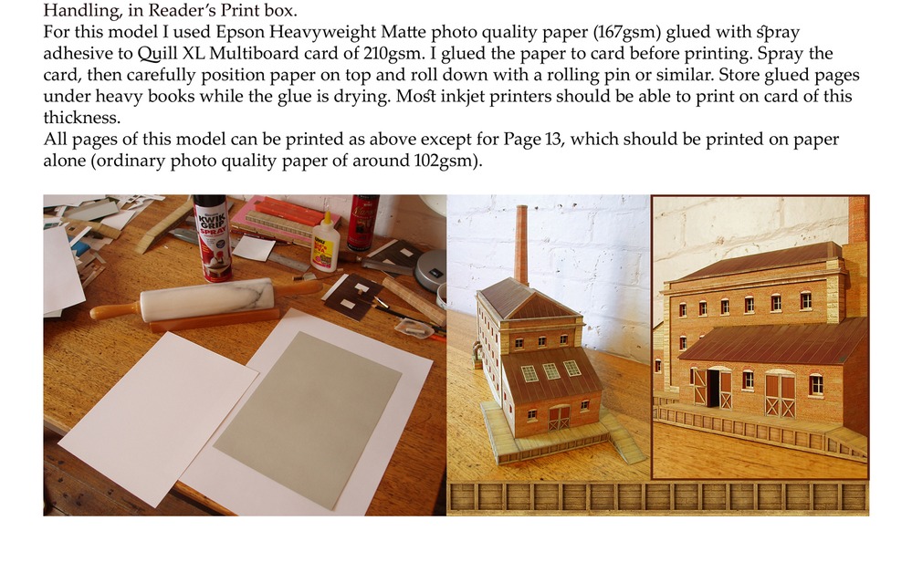
Here’s a really weird discovery.
Looking through about 15 non-science non-fiction books published in 2020-2021. Mostly biographies but ranging from native Australians to Rock Bands, from Self Help to Art history.
The weird thing is that they all has 31 or 32 lines per page, and averaged 11 or 12 words per line.
I ought to be able to get font size and line spacing from that.
ie., They all had the same number of words per page, about 360 words per page.
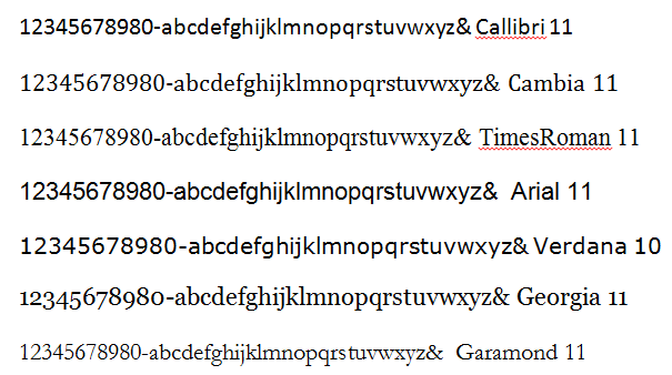
Also, all had a similar serif font (never sans serif), narrow margins, small first line indents, no space between paragraphs, single column justified text. In other words, a startling uniformity.
And a very long way from Word standard layout.
This uniformity is even more strange than all Mills & Boone books having the exact same number of pages. These non-sci books have wildly differeing numbers of pages, and only about half are paperbacks.
They did have different ways of handling long quotes so, as what I’m typing is almost all long quotes, I’ll have to think about that.
One cute way was to keep the text font identical but have a pale imprint of imitation blotting paper as background. Another cute way was to put corner angles around big quotes. Most had some sort of indent for quotes, most had a slightly smaller font in the quotes, but there were many exceptions.
Handling of chapter headings was simetimes similar, sometimes different, but every one had chapter headings a very long way down from the top of the page.