Date: 21/04/2013 08:58:40
From: The Rev Dodgson
ID: 298620
Subject: Human Perception of Colour
I’m reading a book about the history of science in art, which makes me realise that my knowledge of how we perceive colours is pretty bloody basic.
I “know” that we have three types of “cone” receptors at the back of the eye, that respond to different wavelengths. Wikipedia has the diagram below:
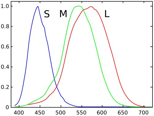
http://en.wikipedia.org/wiki/File:Cones_SMJ2_E.svg
My questions (for a start) are:
- How is this response curve measured?
- When did this theory first achieve theory status?
- How did they measure the response curve way back then?
- How much variation is there in the response of cones of nominally the same type in one individual?
- Are there some cones which cannot be allocated a definite type; mid-way between M and L for instance?
- How much variation between individuals? Do some people have a red curve further to the left than other people’s green curve?
- How does the brain know what type of cone the signal is coming from? Do they connect to different areas of the brain, or are the signals different, or what?
- How come green and red look so different when there is such a large overlap in the response curves?
Date: 21/04/2013 09:01:37
From: buffy
ID: 298622
Subject: re: Human Perception of Colour
Oh my goodness…..that is a whole area of research! I’ve got to go to dog training. I’ll have a quick flick around for some background stuff now, but I’ll try to come back this afternoon.
Date: 21/04/2013 09:03:44
From: buffy
ID: 298623
Subject: re: Human Perception of Colour
Here is one paper:
http://www.ncbi.nlm.nih.gov/pmc/articles/PMC2121835/
Has a history section somewhere.
Date: 21/04/2013 09:04:58
From: buffy
ID: 298624
Subject: re: Human Perception of Colour
Try this one. I trained with Mike Kalloniatis (the author). Looks like he’s done a pretty thorough overview
http://webvision.med.utah.edu/book/part-viii-gabac-receptors/color-perception/
Note – I skimmed very quickly.
Date: 21/04/2013 09:05:12
From: The Rev Dodgson
ID: 298625
Subject: re: Human Perception of Colour
buffy said:
Oh my goodness…..that is a whole area of research! I’ve got to go to dog training. I’ll have a quick flick around for some background stuff now, but I’ll try to come back this afternoon.
Thanks buffy. I just jotted down questions as they came to me.
Date: 21/04/2013 09:07:10
From: buffy
ID: 298626
Subject: re: Human Perception of Colour
It’s called the Trichromatic Theory of Colour Vision. If you want to do some more searching. It always helps to be in the know about the terminology for more accurate searching.
:)
Date: 21/04/2013 09:07:35
From: The Rev Dodgson
ID: 298627
Subject: re: Human Perception of Colour
Hmm, I probably shouldn’t have started this when I’ve got a pile of work that needs doing by the end of the week :)
(Not to mention the dreaded BAS :()
Date: 21/04/2013 09:13:24
From: The Rev Dodgson
ID: 298628
Subject: re: Human Perception of Colour
Thanks again buffy, look like good links.
I’ll see if I can answer my questions :)
Date: 21/04/2013 09:16:11
From: The Rev Dodgson
ID: 298629
Subject: re: Human Perception of Colour
One final question:
Considering the large overlap between the red and green cones, how come there is no such colour as “reddy-green”?
Date: 21/04/2013 09:17:15
From: The Rev Dodgson
ID: 298630
Subject: re: Human Perception of Colour
The Rev Dodgson said:
One final question:
Considering the large overlap between the red and green cones, how come there is no such colour as “reddy-green”?
And if there was, what colour would it be in the dark?
Date: 21/04/2013 10:02:09
From: jjjust moi
ID: 298632
Subject: re: Human Perception of Colour
The Rev Dodgson said:
The Rev Dodgson said:
One final question:
Considering the large overlap between the red and green cones, how come there is no such colour as “reddy-green”?
And if there was, what colour would it be in the dark?
Perhaps because green is not a primary colour?
Date: 21/04/2013 10:14:57
From: The Rev Dodgson
ID: 298633
Subject: re: Human Perception of Colour
jjjust moi said:
The Rev Dodgson said:
The Rev Dodgson said:
One final question:
Considering the large overlap between the red and green cones, how come there is no such colour as “reddy-green”?
And if there was, what colour would it be in the dark?
Perhaps because green is not a primary colour?
But it is. Our cone receptors have peak response to Red, Green and Blue, and these are the three colours used to make projected colour images.
Date: 21/04/2013 16:55:54
From: KJW
ID: 298750
Subject: re: Human Perception of Colour
The Rev Dodgson said:
Considering the large overlap between the red and green cones, how come there is no such colour as “reddy-green”?
There is, actually. It’s called “yellow”.
Date: 21/04/2013 17:22:00
From: buffy
ID: 298752
Subject: re: Human Perception of Colour
Another person to follow up would be Professor Barry L. Cole. Lots of colour vision research, including stuff relating it to real life.
Date: 21/04/2013 17:29:38
From: KJW
ID: 298753
Subject: re: Human Perception of Colour
The Rev Dodgson said:
- How come green and red look so different when there is such a large overlap in the response curves?
A complete answer to this question would involve the nature of consciousness. But if we restrict ourselves to the purely physical, then one can view colour as being a direction in a three-dimensional colour space. Mathematically, this colour space isn’t a vector space, but it is useful to visualise it as a three-dimensional vector space. The overlap between the response curves would suggest that the directions represented by the cones themselves are not orthogonal in this colour space. But the differences between the response curves means that the directions are linearly independent, and thus one can diagonalise the matrix of basis vectors so that they are orthogonal. Nevertheless, we are unable to distinguish between spectral yellow (a pure wavelength) and RGB yellow (a mixture of red and green wavelengths).
Date: 21/04/2013 17:46:52
From: The Rev Dodgson
ID: 298754
Subject: re: Human Perception of Colour
KJW said:
The Rev Dodgson said:
Considering the large overlap between the red and green cones, how come there is no such colour as “reddy-green”?
There is, actually. It’s called “yellow”.
But it’s called “yellow” because it doesn’t look like red or green, so calling it “reddy-green”? wouldn’t make sense.
This is different to “bluey-green” which looks like it is halfway between blue and green.
Date: 21/04/2013 17:52:49
From: The Rev Dodgson
ID: 298755
Subject: re: Human Perception of Colour
KJW said:
The Rev Dodgson said:
- How come green and red look so different when there is such a large overlap in the response curves?
But the differences between the response curves means that the directions are linearly independent, and thus one can diagonalise the matrix of basis vectors so that they are orthogonal.
Could you explain that further please.
Date: 21/04/2013 18:02:45
From: KJW
ID: 298756
Subject: re: Human Perception of Colour
The Rev Dodgson said:
KJW said:
The Rev Dodgson said:
Considering the large overlap between the red and green cones, how come there is no such colour as “reddy-green”?
There is, actually. It’s called “yellow”.
But it’s called “yellow” because it doesn’t look like red or green.
Doesn’t it? Smoothly transition from RGB to RGB and one will see that the transition is perceptually smooth.
Date: 21/04/2013 18:06:02
From: KJW
ID: 298757
Subject: re: Human Perception of Colour
The Rev Dodgson said:
KJW said:
There is, actually. It’s called “yellow”.
But it’s called “yellow” because it doesn’t look like red or green.
Doesn’t it? Smoothly transition from RGB(255,0,0) to RGB(0,255,0) and one will see that the transition is perceptually smooth.
(I don’t know why the RGB arguments didn’t display)
Date: 21/04/2013 18:06:55
From: Bubblecar
ID: 298758
Subject: re: Human Perception of Colour
>This is different to “bluey-green” which looks like it is halfway between blue and green.
There are combinations of red and green which can be described as “reddy green” or “greeny red”, but such terms aren’t often used. The blue-green designation is more familiar possibly because such colour blends are more popular.
Date: 21/04/2013 18:18:19
From: The Rev Dodgson
ID: 298760
Subject: re: Human Perception of Colour
Bubblecar said:
>This is different to “bluey-green” which looks like it is halfway between blue and green.
There are combinations of red and green which can be described as “reddy green” or “greeny red”, but such terms aren’t often used. The blue-green designation is more familiar possibly because such colour blends are more popular.
Could you post an example?
Another way of putting this question is why when we go from blue to green there is no point on the spectrum where the colour does not have a certain bluishness, or a certain greenishness, or both.
Yellow on the other hand is neither greenish or reddish, it is a different colour between yellowish-red and yellowish-green.
That’s how I see it anyway.
Date: 21/04/2013 18:36:08
From: KJW
ID: 298762
Subject: re: Human Perception of Colour
The Rev Dodgson said:
Another way of putting this question is why when we go from blue to green there is no point on the spectrum where the colour does not have a certain bluishness, or a certain greenishness, or both.
Yellow on the other hand is neither greenish or reddish, it is a different colour between yellowish-red and yellowish-green.
That’s how I see it anyway.
I suppose the pertinent question is what you would expect red-green to look like if not yellow.
Date: 21/04/2013 18:41:38
From: The Rev Dodgson
ID: 298764
Subject: re: Human Perception of Colour
KJW said:
The Rev Dodgson said:
Another way of putting this question is why when we go from blue to green there is no point on the spectrum where the colour does not have a certain bluishness, or a certain greenishness, or both.
Yellow on the other hand is neither greenish or reddish, it is a different colour between yellowish-red and yellowish-green.
That’s how I see it anyway.
I suppose the pertinent question is what you would expect red-green to look like if not yellow.
I’d expect it to look like a combination of green and red, in the same way that cyan looks like a combination of blue and green, and magenta looks like a combination of red and blue.
It may be significant that yellow was the only one of the subtractive primaries that was recognised in traditional artists colour theory (and still is for that matter). Magenta was sufficiently red to be called red, and cyan was sufficiently blue to be called blue, but there is no way you could call yellow either red or green.
Date: 21/04/2013 18:43:06
From: Bubblecar
ID: 298765
Subject: re: Human Perception of Colour
Between the edges here you get various greeny reds or reddish greens:

Date: 21/04/2013 18:43:35
From: The Rev Dodgson
ID: 298766
Subject: re: Human Perception of Colour
I’m particularly interested in whether this is entirely inside our (or at least my) brains, or whether there is some physical basis in the eye for it.
Date: 21/04/2013 18:45:31
From: Bubblecar
ID: 298767
Subject: re: Human Perception of Colour
(Actually you keep getting them from the second gradation on the left to the other end, because I ran out of space :))
Date: 21/04/2013 18:45:50
From: The Rev Dodgson
ID: 298768
Subject: re: Human Perception of Colour
Bubblecar said:
Between the edges here you get various greeny reds or reddish greens:
OK, so what is going on there?; it doesn’t go through yellow (or orange).
Date: 21/04/2013 18:47:08
From: neomyrtus_
ID: 298769
Subject: re: Human Perception of Colour
The Rev Dodgson said:
I’m particularly interested in whether this is entirely inside our (or at least my) brains, or whether there is some physical basis in the eye for it.
I’ve only popped in – did any of Buffy’s links answer this. There is a lot (A LOT) of neurological processing involved in perceiving colour. Contrast and context and even physiological state will affect colour perception.
There are also tetrachromat humans- a few women have two opsin types for red colour (sex linked trait). But they need training to actually perceive the difference, and some artist men trained in colour theory will also perceive a difference albeit without the red opsin variant.
Date: 21/04/2013 18:48:07
From: neomyrtus_
ID: 298770
Subject: re: Human Perception of Colour
worth a podcast and listen
http://www.radiolab.org/2012/may/21/
To what extent is color a physical thing in the physical world, and to what extent is it created in our minds? We start with Sir Isaac Newton, who was so eager to solve this very mystery, he stuck a knife in his eye to pinpoint the answer. Then, we meet a sea creature that sees a rainbow way beyond anything humans can experience, and we track down a woman who we’re pretty sure can see thousands (maybe even millions) more colors than the rest of us. And we end with an age-old question, that, it turns out, never even occurred to most humans until very recently: why is the sky blue?
Date: 21/04/2013 18:51:32
From: Skunkworks
ID: 298771
Subject: re: Human Perception of Colour
neomyrtus_ said:
And we end with an age-old question, that, it turns out, never even occurred to most humans until very recently: why is the sky blue?
I thought that was a question that the vast majority of people asked at a certain stage when they were young. And it is considered in that statement to be a recent question? I don’t see why it would be.
Date: 21/04/2013 18:51:35
From: Bubblecar
ID: 298772
Subject: re: Human Perception of Colour
>OK, so what is going on there?; it doesn’t go through yellow (or orange).
It’s just a red selected from the Photoshop colour picker on one 600 × 800 frame, and a green selected on another, with the green added as a 10% opaque new layer 11 times onto the original.
Date: 21/04/2013 18:52:17
From: neomyrtus_
ID: 298773
Subject: re: Human Perception of Colour
http://discovermagazine.com/2012/jul-aug/06-humans-with-super-human-vision#.UXOn6kogb5w
http://nexthumanproject.com/references/Tetrachromats.pdf
hypnosis and loss / addition of colour perception
http://www.news.harvard.edu/gazette/2000/08.21/hypnosis.html
http://ajp.psychiatryonline.org/article.aspx?articleID=174269
http://www.ncbi.nlm.nih.gov/pubmed/10910791
http://mindhacks.com/2008/10/26/synaesthesia-induced-by-hypnosis/
Date: 21/04/2013 18:53:29
From: neomyrtus_
ID: 298774
Subject: re: Human Perception of Colour
Skunkworks said:
neomyrtus_ said:
And we end with an age-old question, that, it turns out, never even occurred to most humans until very recently: why is the sky blue?
I thought that was a question that the vast majority of people asked at a certain stage when they were young. And it is considered in that statement to be a recent question? I don’t see why it would be.
listen to the podcast – there are cultural groups of people who don’t register blue. Also historical (ancient Greek) references to a red sky.
Date: 21/04/2013 18:54:28
From: neomyrtus_
ID: 298775
Subject: re: Human Perception of Colour
http://webvision.med.utah.edu/book/part-vii-color-vision/color-vision/
Date: 21/04/2013 18:56:02
From: Skunkworks
ID: 298776
Subject: re: Human Perception of Colour
neomyrtus_ said:
listen to the podcast – there are cultural groups of people who don’t register blue. Also historical (ancient Greek) references to a red sky.
But kiddies would still have asked why is they sky x colour?
Date: 21/04/2013 18:58:14
From: neomyrtus_
ID: 298779
Subject: re: Human Perception of Colour
Skunkworks said:
neomyrtus_ said:
listen to the podcast – there are cultural groups of people who don’t register blue. Also historical (ancient Greek) references to a red sky.
But kiddies would still have asked why is they sky x colour?
a naive child in the program called the sky white (IIRC).
Date: 21/04/2013 19:01:50
From: Skunkworks
ID: 298780
Subject: re: Human Perception of Colour
neomyrtus_ said:
Skunkworks said:
neomyrtus_ said:
listen to the podcast – there are cultural groups of people who don’t register blue. Also historical (ancient Greek) references to a red sky.
But kiddies would still have asked why is they sky x colour?
a naive child in the program called the sky white (IIRC).
Maybe, I am disagreeing that it is a rare and modern thing to consider.
Date: 21/04/2013 19:02:11
From: wookiemeister
ID: 298781
Subject: re: Human Perception of Colour
the greeks referred to a bronze sky
dawn sat on her golden throne
Date: 21/04/2013 19:02:43
From: neomyrtus_
ID: 298782
Subject: re: Human Perception of Colour
http://www.bbc.co.uk/blogs/tv/2011/08/horizon.shtml
Date: 21/04/2013 19:03:30
From: Mr Ironic
ID: 298783
Subject: re: Human Perception of Colour
OK, so what is going on there?; it doesn’t go through yellow (or orange).
——————————————-
You canna display RGB on a computer screen…
Date: 21/04/2013 19:03:43
From: neomyrtus_
ID: 298784
Subject: re: Human Perception of Colour
Skunkworks said:
Maybe, I am disagreeing that it is a rare and modern thing to consider.
do what you like – I just drew attention to a program which discusses that what may be obvious to us ain’t always obvious to others.
Date: 21/04/2013 19:18:40
From: The Rev Dodgson
ID: 298808
Subject: re: Human Perception of Colour
Mr Ironic said:
OK, so what is going on there?; it doesn’t go through yellow (or orange).
——————————————-
You canna display RGB on a computer screen…
Not sure what you mean.
Date: 21/04/2013 19:21:36
From: buffy
ID: 298811
Subject: re: Human Perception of Colour
How detailed do you want to get. This is getting a bit complicated for me (and I’ve got a fair grasp) but you might want to go into the finer stuff. And maybe follow up some of the references.
http://onlinelibrary.wiley.com/doi/10.1113/jphysiol.2010.192658/full
There are quite a lot of rather old papers around, but this one seems to be a fair representation of the state of play. It comes down to “Bless you! We don’t really know!”
Date: 21/04/2013 19:23:49
From: buffy
ID: 298814
Subject: re: Human Perception of Colour
Mr buffy here…..have you done that BAS yet?
;)
Date: 21/04/2013 19:36:30
From: The Rev Dodgson
ID: 298823
Subject: re: Human Perception of Colour
buffy said:
Mr buffy here…..have you done that BAS yet?
;)
Standard practice here is to submit at about 5 mins to midnight on the last day :)
Date: 21/04/2013 19:42:09
From: The Rev Dodgson
ID: 298828
Subject: re: Human Perception of Colour
buffy said:
How detailed do you want to get. This is getting a bit complicated for me (and I’ve got a fair grasp) but you might want to go into the finer stuff. And maybe follow up some of the references.
http://onlinelibrary.wiley.com/doi/10.1113/jphysiol.2010.192658/full
There are quite a lot of rather old papers around, but this one seems to be a fair representation of the state of play. It comes down to “Bless you! We don’t really know!”
Not too detailed!
I will follow up the references, but it looks like there’s a pretty big gap between the academic stuff and the dumbed down stuff for the rest of us.
Date: 21/04/2013 19:43:56
From: Mr Ironic
ID: 298831
Subject: re: Human Perception of Colour
Not sure what you mean.
———————————————
Well all human manufactured colours are wrong…
CMYK is a close apoximation of the theory, on paper, however we cannot produce the colours exacty. Hence the K.
With computer screens we end up with vinyetts, graduated screens, that give a poor example of the colours aimed for.
Never mind everyones screen is set to different setting settings on differing grades.
Date: 21/04/2013 19:46:16
From: The Rev Dodgson
ID: 298836
Subject: re: Human Perception of Colour
Mr Ironic said:
Not sure what you mean.
———————————————
Well all human manufactured colours are wrong…
CMYK is a close apoximation of the theory, on paper, however we cannot produce the colours exacty. Hence the K.
With computer screens we end up with vinyetts, graduated screens, that give a poor example of the colours aimed for.
Never mind everyones screen is set to different setting settings on differing grades.
OK, but I don’t think that answers the question.
I mean computer screens are quite capable of adding red and green and showing yellow.
Date: 21/04/2013 19:47:25
From: Boris
ID: 298839
Subject: re: Human Perception of Colour
CMYK is a close apoximation of the theory, on paper, however we cannot produce the colours exacty. Hence the K.
yep, the shadows were never “black” enough. more a really dark brown.
Date: 21/04/2013 19:52:14
From: Glance Fleeting
ID: 298841
Subject: re: Human Perception of Colour
Might be a signal processing thing like musical chords.
http://upload.wikimedia.org/wikipedia/commons/d/d1/Major_triad.svg
Date: 21/04/2013 19:55:31
From: Mr Ironic
ID: 298843
Subject: re: Human Perception of Colour
OK, so what is going on there?; it doesn’t go through yellow (or orange).
————————————————————-
OK, I think the example colour pallet chosen is incorrect.
Date: 21/04/2013 20:16:38
From: Mr Ironic
ID: 298854
Subject: re: Human Perception of Colour
Anyway to add to the debate…
There are no ‘Primary Colurs’…
Yellow, purple and (can’t remember) maybe puce… would do similiar work.
And then women and blokes receptors differ.
And if you live with an artist…
Then give up.
Date: 21/04/2013 20:38:50
From: Skunkworks
ID: 298887
Subject: re: Human Perception of Colour
Bit of perception of colour on now at SBS.
Date: 21/04/2013 20:55:22
From: Bubblecar
ID: 298904
Subject: re: Human Perception of Colour
>OK, I think the example colour pallet chosen is incorrect.
?
He wanted blends of red & green, he got them. 100% correct, right, AOK & check.
Date: 21/04/2013 21:01:48
From: Mr Ironic
ID: 298918
Subject: re: Human Perception of Colour
He wanted blends of red & green, he got them. 100% correct, right, AOK & check.
————————————————————
100 in the cent… No way any day any way.
But (I believe Rev wanted) more like…. red toooo Green.
Date: 21/04/2013 21:02:59
From: Bubblecar
ID: 298919
Subject: re: Human Perception of Colour
>But (I believe Rev wanted) more like…. red toooo Green.
The Rev hasn’t complained about my reddish greens etc, and he’d be a fool to try.
Date: 21/04/2013 21:09:55
From: Mr Ironic
ID: 298933
Subject: re: Human Perception of Colour
The Rev hasn’t complained about my reddish greens etc, and he’d be a fool to try.
————————————————
Well he did question where the yellow was…
Date: 21/04/2013 21:21:45
From: KJW
ID: 298959
Subject: re: Human Perception of Colour

Formed from red and green squares at three different scales. The lower-right is an actual yellow RGB(127,127,0)
Date: 21/04/2013 21:26:46
From: Mr Ironic
ID: 298960
Subject: re: Human Perception of Colour
The lower-right is an actual yellow RGB
———————————————————
Looks like baby shit brown diluted with asparagus urine to me…
Date: 21/04/2013 21:27:05
From: PM 2Ring
ID: 298961
Subject: re: Human Perception of Colour
Mr Ironic said:
Anyway to add to the debate…
There are no ‘Primary Colurs’…
Yellow, purple and (can’t remember) maybe puce… would do similiar work.
Yes, you can choose other sets of colours to act as the basis vectors of a colour space, but some choices are better than others. A poor choice only covers a small subset of all the colours that are visible to normal human vision.
See http://en.wikipedia.org/wiki/Gamut
Date: 21/04/2013 21:28:50
From: dv
ID: 298963
Subject: re: Human Perception of Colour
I think something went wrong there, KJW
Date: 21/04/2013 21:30:49
From: PM 2Ring
ID: 298967
Subject: re: Human Perception of Colour
Mr Ironic said:
The lower-right is an actual yellow RGB (127,127,0)
———————————————————
Looks like baby shit brown diluted with asparagus urine to me…
That’s because it’s got a value of 50%. If we boost it to
RGB (125, 125, 0), then we get a
100% yellow.
Date: 21/04/2013 21:31:32
From: KJW
ID: 298969
Subject: re: Human Perception of Colour
Mr Ironic said:
The lower-right is an actual yellow RGB
———————————————————
Looks like baby shit brown diluted with asparagus urine to me…
Assuming linear response, RGB(127,127,0) is the correct average of RGB(255,0,0) and RGB(0,255,0). However, non-linearity is evident. Also, on LED displays, the viewing angle is also significant.
Date: 21/04/2013 21:32:37
From: PM 2Ring
ID: 298971
Subject: re: Human Perception of Colour
Oops! Sorry about the typo. Let’s try that again…
That’s because it’s got a value of 50%. If we boost it to RGB (255, 255, 0), then we get a 100% yellow.
Date: 21/04/2013 21:36:31
From: Mr Ironic
ID: 298973
Subject: re: Human Perception of Colour
but some choices are better than others. A poor choice only covers a small subset of all the colours that are visible to normal human vision.
—————————————————
Yes, the gamut range is the important factor.
Ease of repoducing it still leaves us with, what, 85% of the visual spectrum?
Metallics and sheen and depth being a by product loss.
Date: 21/04/2013 21:40:21
From: Skunkworks
ID: 298976
Subject: re: Human Perception of Colour
I was watching a car/manufacturing show where they showed a Rolls tester faulting a car for a paint defect that was invisible? I expect there was some hyper-bowl but it is still astonishing, checking for errors than an owner could not detect.
Date: 21/04/2013 21:42:36
From: Mr Ironic
ID: 298978
Subject: re: Human Perception of Colour
That’s because it’s got a value of 50%.
—————————————————-
If it is a solid colour then where are the components?
Date: 21/04/2013 21:52:53
From: PM 2Ring
ID: 298984
Subject: re: Human Perception of Colour
Mr Ironic said:
That’s because it’s got a value of 50%.
—————————————————-
If it is a solid colour then where are the components?
As KJW said “The lower-right is an actual yellow RGB (127,127,0)”
Those colour components range from 0 to 255, so it’s a yellow with a value of (slightly less than) 50%, as I said previously.
Date: 21/04/2013 21:53:03
From: KJW
ID: 298985
Subject: re: Human Perception of Colour
KJW said:
Mr Ironic said:
The lower-right is an actual yellow RGB(127,127,0)
———————————————————
Looks like baby shit brown diluted with asparagus urine to me…
dv said:
I think something went wrong there, KJW
Assuming linear response, RGB(127,127,0) is the correct average of RGB(255,0,0) and RGB(0,255,0). However, non-linearity is evident. Also, on LED displays, the viewing angle is also significant.
Actually, if one considers an RMS-average, the average of RGB(255,0,0) and RGB(0,255,0) is RGB(181,181,0). I initially tried to match the colour by eye, but decided that a mathematical average would be more appropriate, even if it didn’t match the other examples.
Date: 21/04/2013 21:58:33
From: Mr Ironic
ID: 298989
Subject: re: Human Perception of Colour
“The lower-right is an actual yellow RGB (127,127,0)”
———————————————————
No it’s not.
It is an approximation.
Set by a dude, that gets paid to do that stuff.
Date: 21/04/2013 22:00:06
From: PM 2Ring
ID: 298991
Subject: re: Human Perception of Colour
KJW said:
Actually, if one considers an RMS-average, the average of RGB(255,0,0) and RGB(0,255,0) is RGB(181,181,0). I initially tried to match the colour by eye, but decided that a mathematical average would be more appropriate, even if it didn’t match the other examples.
Yeah, an
RMS average isn’t particularly applicable here. A better approach is to convert the colours to a colour space that’s closer to the human colour perceptual space, eg http://en.wikipedia.org/wiki/CIE_1931_color_space
Date: 21/04/2013 22:02:50
From: Mr Ironic
ID: 298993
Subject: re: Human Perception of Colour
decided that a mathematical average would be more appropriate,
——————————————————————————
Hearin lies the problem…
We cannot produce colour with any real sense of accuracy.
Artist’s come the closest.
Date: 21/04/2013 22:08:55
From: PM 2Ring
ID: 298997
Subject: re: Human Perception of Colour
Mr Ironic said:
“The lower-right is an actual yellow RGB (127,127,0)”
———————————————————
No it’s not.
It is an approximation.
Set by a dude, that gets paid to do that stuff.
There is no definitive RGB colour space. So the actual appearance of RGB (127,127,0) depends on the construction of your monitor, and possibly also on settings in your OS / graphics card that you may be able to alter.
100% yellow
50% yellow
Date: 21/04/2013 22:23:30
From: Mr Ironic
ID: 299019
Subject: re: Human Perception of Colour
So the actual appearance of RGB (127,127,0) depends on the construction of your monitor, and possibly also on settings in your OS / graphics card that you may be able to alter.
———————————————————
Yes, so it is open for opinion.
All those dilutions of colours are manufactured into the programs. What represents what is beholden to the limitations of the computer and the voyeur…
But yes, yellow is yellow as long as it hits a daffodil that is purple…
Date: 21/04/2013 22:26:48
From: KJW
ID: 299023
Subject: re: Human Perception of Colour
Mr Ironic said:
“The lower-right is an actual yellow RGB (127,127,0)”
———————————————————
No it’s not.
It is an approximation.
Set by a dude, that gets paid to do that stuff.
Huh?
RGB (127,127,0) was the setting used to create the lower-right corner. The other three corners are actually a mixture of tiny red RGB (255,0,0) and green RGB (0,255,0) squares, not yellow. The point was to show The Rev Dodgson what red-green actually looks like.
Date: 21/04/2013 22:33:21
From: Mr Ironic
ID: 299029
Subject: re: Human Perception of Colour
It is an approximation.
Set by a dude, that gets paid to do that stuff.
Huh?
—————
OK, the math is fine and the theory is OK.
But in practise it is rubbish. We just don’t have the gear.
So we guess.
Date: 21/04/2013 22:42:22
From: Bubblecar
ID: 299035
Subject: re: Human Perception of Colour
I’m an artist. I just chose a red and a green and blended them, and got reddish green and greenish red. I could do the same with blue & green and get blends that the Rev would readily recognise as blue-green etc.
It’s just that reddish green tends to be perceived as a less distinctive, “murkier” blend. Quite why that should be so is an interesting question.
Date: 21/04/2013 22:45:42
From: Bubblecar
ID: 299042
Subject: re: Human Perception of Colour
…and unlike KJW I was specifically looking for colours that could be described, in the way Rev meant, as “reddish green” etc rather than “yellow”.
Date: 21/04/2013 22:48:02
From: Mr Ironic
ID: 299046
Subject: re: Human Perception of Colour
Quite why that should be so is an interesting question.
———————————————————————————
Because adding colours, from the pallet, tends them toward black.
Date: 21/04/2013 22:49:43
From: KJW
ID: 299048
Subject: re: Human Perception of Colour
Bubblecar said:
I’m an artist. I just chose a red and a green and blended them, and got reddish green and greenish red. I could do the same with blue & green and get blends that the Rev would readily recognise as blue-green etc.
It’s just that reddish green tends to be perceived as a less distinctive, “murkier” blend. Quite why that should be so is an interesting question.
When you say you’re an artist, you mean with paints, right? If so, then that’s subtractive mixing, whereas the mixing of red and green on a monitor is additive. Printers mix ink subtractively using cyan, yellow, and magenta, the complements of the additive primary colours red, green, and blue respectively
Date: 21/04/2013 22:50:56
From: Bubblecar
ID: 299050
Subject: re: Human Perception of Colour
Mr Ironic said:
Quite why that should be so is an interesting question.
———————————————————————————
Because adding colours, from the pallet, tends them toward black.
Yes, but blue-greens do tend to be perceived as more vivid than red-greens (unless we’re talking yellow).
Date: 21/04/2013 22:51:55
From: KJW
ID: 299052
Subject: re: Human Perception of Colour
KJW said:
Printers mix ink subtractively using cyan, yellow, and magenta, the complements of the additive primary colours red, green, and blue respectively
Sorry, I meant:
Printers mix ink subtractively using cyan, magenta, and yellow, the complements of the additive primary colours red, green, and blue respectively
Date: 21/04/2013 22:52:24
From: Bubblecar
ID: 299053
Subject: re: Human Perception of Colour
>If so, then that’s subtractive mixing, whereas the mixing of red and green on a monitor is additive.
Yes, but in subtractive mixing, blue-greens are still generally poerceived as more distinctive than red-greens, which I suspect is what the Rev may have been getting at.
Date: 21/04/2013 22:52:41
From: Mr Ironic
ID: 299056
Subject: re: Human Perception of Colour
Printers mix ink subtractively using cyan, yellow, and magenta, the complements of the additive primary colours red, green, and blue respectively
————————————————————————————-
Actinic and sub-actic light, being the difference.
Date: 21/04/2013 22:55:22
From: Mr Ironic
ID: 299060
Subject: re: Human Perception of Colour
Yes, but blue-greens do tend to be perceived as more vivid than red-greens (unless we’re talking yellow).
————————————————
The further apart on the colour wheel…the closer to black.
Try adding yellow to purple, is it lighter or darker?
Date: 21/04/2013 23:00:14
From: KJW
ID: 299065
Subject: re: Human Perception of Colour
On the topic of subtractive mixing, I was taught in primary school that mixing blue with yellow forms green (and I’ve seen that to be the case). Yet, in the theory of subtractive mixing, mixing blue with yellow forms black… ???
Date: 21/04/2013 23:03:01
From: Mr Ironic
ID: 299067
Subject: re: Human Perception of Colour
Yet, in the theory of subtractive mixing, mixing blue with yellow forms black… ???
————————————————————————
What was the light force?
Date: 21/04/2013 23:04:22
From: KJW
ID: 299068
Subject: re: Human Perception of Colour
Bubblecar said:
…and unlike KJW I was specifically looking for colours that could be described, in the way Rev meant, as “reddish green” etc rather than “yellow”.
Actually, my image was inspired by your attempt to produce a red-green.
Date: 21/04/2013 23:14:44
From: Bubblecar
ID: 299071
Subject: re: Human Perception of Colour
Fair enough. I daresay if I’d chosen a slightly different red and green I might have achieved a more yellow result somewhere in the picture, but the blends I got seemed to satisfy a “reddish green” description :)
Although in real life it’s not a colour description I’d often use, except for example when using a semi-transparent green over a red background to produce a green with a reddish inner glow etc.
Date: 21/04/2013 23:24:07
From: Mr Ironic
ID: 299076
Subject: re: Human Perception of Colour
a semi-transparent green over a red background to produce a green with a reddish inner glow etc.
—————————————-
Yeap… Who said what about artists’….
Date: 21/04/2013 23:25:41
From: PM 2Ring
ID: 299077
Subject: re: Human Perception of Colour
Bubblecar said:
>If so, then that’s subtractive mixing, whereas the mixing of red and green on a monitor is additive.
Yes, but in subtractive mixing, blue-greens are still generally perceived as more distinctive than red-greens, which I suspect is what the Rev may have been getting at.
Probably.
FWIW, one of my colour-blind friends will often refer to certain shades of brown as reddish-green.
Our visual system can’t directly detect yellow. Light in the yellow region of the spectrum sets off both our red detectors and our green detectors (but not our blue detectors), so we can get the same perceived colour as a spectrally pure yellow light by making an appropriate mixture of red light and green light. It doesn’t matter whether you do this directly with light sources, or indirectly with pigments, as long as you get the proportions correct.
For some reason, our visual system isn’t that bothered with making major distinctions in the bluey-green region of the spectrum. But it’s quite keen on discriminating between red, yellow and green. Maybe it’s something our ancestors evolved due to the advantage it gives in spotting ripe fruit.
So our brains generally tend to register colours between red & green as combinations with yellow (or brown, which is just a dark reddish yellow), rather than as reddish-green blends. But this can be affected to an extent by context – e.g., the red-green transition picture posted earlier doesn’t contain any bright yellows, and the transition “tells” the brain that the intermediate colours are somehow related to red and green.
Date: 21/04/2013 23:27:17
From: KJW
ID: 299078
Subject: re: Human Perception of Colour
I think the closest to what The Rev Dodgson would describe as red-green comes from having a red optical filter covering one eye and a green optical filter covering the other eye.
Date: 21/04/2013 23:34:43
From: KJW
ID: 299082
Subject: re: Human Perception of Colour
PM 2Ring said:
Bubblecar said:
>If so, then that’s subtractive mixing, whereas the mixing of red and green on a monitor is additive.
Yes, but in subtractive mixing, blue-greens are still generally perceived as more distinctive than red-greens, which I suspect is what the Rev may have been getting at.
Probably.
FWIW, one of my colour-blind friends will often refer to certain shades of brown as reddish-green.
Our visual system can’t directly detect yellow. Light in the yellow region of the spectrum sets off both our red detectors and our green detectors (but not our blue detectors), so we can get the same perceived colour as a spectrally pure yellow light by making an appropriate mixture of red light and green light. It doesn’t matter whether you do this directly with light sources, or indirectly with pigments, as long as you get the proportions correct.
For some reason, our visual system isn’t that bothered with making major distinctions in the bluey-green region of the spectrum. But it’s quite keen on discriminating between red, yellow and green. Maybe it’s something our ancestors evolved due to the advantage it gives in spotting ripe fruit.
So our brains generally tend to register colours between red & green as combinations with yellow (or brown, which is just a dark reddish yellow), rather than as reddish-green blends. But this can be affected to an extent by context – e.g., the red-green transition picture posted earlier doesn’t contain any bright yellows, and the transition “tells” the brain that the intermediate colours are somehow related to red and green.
I have said at times that of the three primary colours red, green, and blue, red appears to be the odd one out. I suspect that the qualia of red is more than just visual, and that there are non-visual aspects to it as well. For example, red seems to be associated with danger and I believe this is a part of the distinction between the qualia of red and that of green and blue.
Date: 21/04/2013 23:40:33
From: KJW
ID: 299085
Subject: re: Human Perception of Colour
PM 2Ring said:
KJW said:
Actually, if one considers an RMS-average, the average of RGB(255,0,0) and RGB(0,255,0) is RGB(181,181,0). I initially tried to match the colour by eye, but decided that a mathematical average would be more appropriate, even if it didn’t match the other examples.
Yeah, an RMS average isn’t particularly applicable here. A better approach is to convert the colours to a colour space that’s closer to the human colour perceptual space, eg http://en.wikipedia.org/wiki/CIE_1931_color_space
Judging by eye, RGB(181,181,0) would have been closer in brightness to the other quadrants, but still less bright.
Date: 21/04/2013 23:41:37
From: PM 2Ring
ID: 299086
Subject: re: Human Perception of Colour
KJW said:
I have said at times that of the three primary colours red, green, and blue, red appears to be the odd one out. I suspect that the qualia of red is more than just visual, and that there are non-visual aspects to it as well. For example, red seems to be associated with danger and I believe this is a part of the distinction between the qualia of red and that of green and blue.
FWIW, the genes for the pigments in the red & green cones are on the X chromosome, but the blue pigment gene’s on chromosome 7. So you’d think that’d make blue the odd one out.
Date: 21/04/2013 23:43:25
From: Mr Ironic
ID: 299087
Subject: re: Human Perception of Colour
For example, red seems to be associated with danger and I believe this is a part of the distinction between the qualia of red and that of green and blue.
——————————————————————————————————————-
Why do you think that?
What dangerous animal is red?
More to the point how many animals are red?
It is distictive by its absence…
Date: 21/04/2013 23:43:36
From: OCDC
ID: 299088
Subject: re: Human Perception of Colour
I think buffy has mentioned in the Past that women who are heterozygous can see more colours than normal.
Date: 21/04/2013 23:44:54
From: KJW
ID: 299089
Subject: re: Human Perception of Colour
PM 2Ring said:
KJW said:
I have said at times that of the three primary colours red, green, and blue, red appears to be the odd one out. I suspect that the qualia of red is more than just visual, and that there are non-visual aspects to it as well. For example, red seems to be associated with danger and I believe this is a part of the distinction between the qualia of red and that of green and blue.
FWIW, the genes for the pigments in the red & green cones are on the X chromosome, but the blue pigment gene’s on chromosome 7. So you’d think that’d make blue the odd one out.
Not from an informational perspective, because the brain doesn’t “know” anything about the origin of the signals, only what it does with them, which would be different in the case of red if red is associated with danger.
Date: 21/04/2013 23:47:32
From: PM 2Ring
ID: 299090
Subject: re: Human Perception of Colour
KJW said:
PM 2Ring said:
Yeah, an RMS average isn’t particularly applicable here. A better approach is to convert the colours to a colour space that’s closer to the human colour perceptual space, eg http://en.wikipedia.org/wiki/CIE_1931_color_space
Judging by eye, RGB(181,181,0) would have been closer in brightness to the other quadrants, but still less bright.
To compare the brightness of RGB colours (without full conversion to a CIE space), you can use this formula below for luminance:
From http://en.wikipedia.org/wiki/Luminance_%28relative%29
For RGB color spaces that use the ITU-R BT.709 primaries (or sRGB, which defines the same primaries), relative luminance can be calculated from linear RGB components:
Y = 0.2126 R + 0.7152 G + 0.0722 B
The formula reflects the luminosity function: green light contributes the most to the intensity perceived by humans, and blue light the least.
I use that formula to scale RGB colour space in a simple colour matching program I wrote several years ago (in C), and it works rather well.
Date: 21/04/2013 23:48:09
From: KJW
ID: 299091
Subject: re: Human Perception of Colour
Mr Ironic said:
For example, red seems to be associated with danger and I believe this is a part of the distinction between the qualia of red and that of green and blue.
——————————————————————————————————————-
Why do you think that?
What dangerous animal is red?
What about blood?
Date: 21/04/2013 23:51:37
From: Mr Ironic
ID: 299095
Subject: re: Human Perception of Colour
What about blood?
————————————
Maybe…
But it is a bit late in the altercation to start fretting…
Date: 21/04/2013 23:56:13
From: KJW
ID: 299097
Subject: re: Human Perception of Colour
Mr Ironic said:
It (red) is distictive by its absence…
You think so? Amongst organic chemicals, green and blue compounds are rare, while colours at the red end of the spectrum (yellow, brown, etc) are much more common. In fact, it is very rare to do a chemical reaction in organic chemistry where the crude product isn’t at least slightly yellow.
Date: 22/04/2013 00:14:21
From: KJW
ID: 299100
Subject: re: Human Perception of Colour
Yellow is common because a large proportion of organic compounds absorb in the UV range, and if the absorption spectrum has a tail into the blue, then it will appear yellow. If the electronic transition is of lower energy than typical, the compound will absorb significantly in the blue and green regions, producing orange or even red compounds. But to produce blue or green compounds requires greater absorption of red than blue or green, and this will involve rather special chromophores than in the case of yellow, orange. or red compounds.
Date: 22/04/2013 00:20:35
From: tauto
ID: 299101
Subject: re: Human Perception of Colour
Red + Green = Brown.
If you have just 3 colours, Yellow, Blue, Red, then you can mix them all together to get brown.
Yellow + Purple = Brown
Blue + Orange = Brown
If you have equal amounts of Red, Blue and Yellow in the above, then you will end up with the same colour Brown.
Date: 22/04/2013 00:29:28
From: KJW
ID: 299103
Subject: re: Human Perception of Colour
tauto said:
Red + Green = Brown.
If you have just 3 colours, Yellow, Blue, Red, then you can mix them all together to get brown.
Yellow + Purple = Brown
Blue + Orange = Brown
If you have equal amounts of Red, Blue and Yellow in the above, then you will end up with the same colour Brown.
KJW said:
while colours at the red end of the spectrum (yellow, brown, etc) are much more common.
I should remark that pure compounds are rarely brown. Brown colour is usually due to a mixture of different coloured compounds.
Date: 22/04/2013 00:48:50
From: Bubblecar
ID: 299104
Subject: re: Human Perception of Colour
>Red + Green = Brown.
Additively speaking, red + green = yellow (or reddish green, depending on ratios etc :)). But when mixing pigments, various browns can be achieved in various combinations, as you say.
Date: 22/04/2013 04:19:22
From: KJW
ID: 299106
Subject: re: Human Perception of Colour
PM 2Ring said:
KJW said:
PM 2Ring said:
Yeah, an RMS average isn’t particularly applicable here. A better approach is to convert the colours to a colour space that’s closer to the human colour perceptual space, eg http://en.wikipedia.org/wiki/CIE_1931_color_space
Judging by eye, RGB(181,181,0) would have been closer in brightness to the other quadrants, but still less bright.
To compare the brightness of RGB colours (without full conversion to a CIE space), you can use this formula below for luminance:
From http://en.wikipedia.org/wiki/Luminance_%28relative%29
For RGB color spaces that use the ITU-R BT.709 primaries (or sRGB, which defines the same primaries), relative luminance can be calculated from linear RGB components:
Y = 0.2126 R + 0.7152 G + 0.0722 B
The formula reflects the luminosity function: green light contributes the most to the intensity perceived by humans, and blue light the least.
I use that formula to scale RGB colour space in a simple colour matching program I wrote several years ago (in C), and it works rather well.
It occurred to me that the formula you gave is not relevant or only partly relevant to the problem at hand. This is because the formula you gave is linear, whereas the brightness effect that occurred in my image is non-linear. That is, RGB(127,127,0) is significantly less than half as bright as RGB(255,255,0). By construction, the tiny squares of RGB(255,0,0) and RGB(0,255,0) must be half as bright as RGB(255,255,0). Yet, RGB(127,127,0) is much less bright than the tiny squares and therefore much less than half the brightness of RGB(255,255,0). This is not about the relative brightness of the different colours, but the non-linearity of the transfer function between the RGB values of a single colour and the brightness of that colour.
Date: 22/04/2013 04:46:35
From: KJW
ID: 299107
Subject: re: Human Perception of Colour
KJW said:
It occurred to me that the formula you gave is not relevant or only partly relevant to the problem at hand. This is because the formula you gave is linear, whereas the brightness effect that occurred in my image is non-linear. That is, RGB(127,127,0) is significantly less than half as bright as RGB(255,255,0). By construction, the tiny squares of RGB(255,0,0) and RGB(0,255,0) must be half as bright as RGB(255,255,0). Yet, RGB(127,127,0) is much less bright than the tiny squares and therefore much less than half the brightness of RGB(255,255,0). This is not about the relative brightness of the different colours, but the non-linearity of the transfer function between the RGB values of a single colour and the brightness of that colour.
However, my suggestion to apply an RMS-average was based on incorrect reasoning (which actually makes your formula not relevant at all because that would only apply to the metric used to perform a weighted RMS-average).
Date: 22/04/2013 06:29:23
From: KJW
ID: 299109
Subject: re: Human Perception of Colour

The above is a comparison between a 50% mixture of squares of the corresponding primary colours RGB(255,0,0), RGB(0,255,0), or RGB(0,0,255) with black squares RGB(0,0,0) on the left with the corresponding solid primary colours RGB(191,0,0), RGB(0,191,0), or RGB(0,0,191) on the right. On my monitor, the left and right are approximately equal in brightness as judged by my eyes. However, how they compare to you will depend on your monitor such as the contrast, etc. The left is always 50% of the brightness of the maximum brightness for the respective colour, but the right will depend on the comparison between the RGB values of 191 and 255 with regards to settings that produce non-linear response, such as contrast.
For those interested, this (and the other) image was produced using a spreadsheet with small cell size and small zoom setting.
Date: 22/04/2013 06:53:44
From: KJW
ID: 299111
Subject: re: Human Perception of Colour
BTW, the left side of the image should appear quite uniform (apart from the fine black dots). Any bands that appear are a sign of aliasing which can probably be corrected by adjusting the monitor.
Date: 22/04/2013 07:21:05
From: Divine Angel
ID: 299115
Subject: re: Human Perception of Colour
I’d just like to say that due to reading this thread last night, I dreamed I was living in a house filled with cyan furniture and cyan walls and I wasn’t allowed to paint over it.
Thanks a lot!
Date: 22/04/2013 07:40:33
From: KJW
ID: 299120
Subject: re: Human Perception of Colour
Divine Angel said:
I’d just like to say that due to reading this thread last night, I dreamed I was living in a house filled with cyan furniture and cyan walls and I wasn’t allowed to paint over it.
Thanks a lot!
Cyan is a nice colour :-)
Date: 22/04/2013 09:21:36
From: The Rev Dodgson
ID: 299134
Subject: re: Human Perception of Colour
KJW said:
For those interested, this (and the other) image was produced using a spreadsheet with small cell size and small zoom setting.
Right, I’m going off to have a play. :)
FWIW, I do see Bubblecar’s image as containing reddy-greens and greeny-reds, which is what I asked for. The bottom-right in KJW’s image I see as a yellowy green, but PM’s bright yellow I see as just yellow.
It’s interesting that the same colours in the same ratio have these different effects.
The history of the theory of all this (which I’m half way through) is interesting too.
http://www.amazon.com/Science-Art-Optical-Western-Brunelleschi/dp/0300052413
It’s an interesting book, with great illustrations, but it’s not an easy read, and is written first from the perspective of a historian, then the artists, with the science not getting much of a look in.
Date: 22/04/2013 09:26:33
From: The Rev Dodgson
ID: 299135
Subject: re: Human Perception of Colour
The Rev Dodgson said:
KJW said:
For those interested, this (and the other) image was produced using a spreadsheet with small cell size and small zoom setting.
Right, I’m going off to have a play. :)
FWIW, I do see Bubblecar’s image as containing reddy-greens and greeny-reds, which is what I asked for. The bottom-right in KJW’s image I see as a yellowy green, but PM’s bright yellow I see as just yellow.
It’s interesting that the same colours in the same ratio have these different effects.
The history of the theory of all this (which I’m half way through) is interesting too.
http://www.amazon.com/Science-Art-Optical-Western-Brunelleschi/dp/0300052413
It’s an interesting book, with great illustrations, but it’s not an easy read, and is written first from the perspective of a historian, then the artists, with the science not getting much of a look in.
Also it’s about 2/3 on perspective in art and 1/3 on colour.
3 1/2 stars, recommended with reservations.
Date: 22/04/2013 13:27:29
From: MartinB
ID: 299190
Subject: re: Human Perception of Colour
“I have said at times that of the three primary colours red, green, and blue”
No one is ever going to believe me, but I still think it is important to point out that there is no such thing as ‘primary colours’ fullstop, there are primary colours for a specified system. You can use any three colours you like as primaries but you will get a different gamut.
R,G,B are used in monitors and tvs because of the agreeably large gamut achievable with readily producible phosphors (actually the red wasn’t so easy) but otherwise there is nothing magic about these colours.
Date: 22/04/2013 13:34:24
From: buffy
ID: 299191
Subject: re: Human Perception of Colour
>>I think the closest to what The Rev Dodgson would describe as red-green comes from having a red optical filter covering one eye and a green optical filter covering the other eye.,,
No, you will probably just get optical rivalry that way as one eye is sending a green picture and one is sending a red one (in the simplest terms) and the brain toggles between them, doesn’t meld them. Although exactly which wavelengths are chosen for the transmission might have a small effect because of the overlap of the two wavelength sensitivity curves.
Date: 22/04/2013 13:34:48
From: The Rev Dodgson
ID: 299192
Subject: re: Human Perception of Colour
MartinB said:
“I have said at times that of the three primary colours red, green, and blue”
No one is ever going to believe me, but I still think it is important to point out that there is no such thing as ‘primary colours’ fullstop, there are primary colours for a specified system. You can use any three colours you like as primaries but you will get a different gamut.
R,G,B are used in monitors and tvs because of the agreeably large gamut achievable with readily producible phosphors (actually the red wasn’t so easy) but otherwise there is nothing magic about these colours.
Are you saying it’s entirely coincidental that the three primary colours used in monitors and tvs (and film and every other additive colour image system) happen to be the same three colours that our cone receptors are divided into?
Date: 22/04/2013 13:37:24
From: jjjust moi
ID: 299193
Subject: re: Human Perception of Colour
MartinB said:
“I have said at times that of the three primary colours red, green, and blue”
No one is ever going to believe me, but I still think it is important to point out that there is no such thing as ‘primary colours’ fullstop, there are primary colours for a specified system. You can use any three colours you like as primaries but you will get a different gamut.
R,G,B are used in monitors and tvs because of the agreeably large gamut achievable with readily producible phosphors (actually the red wasn’t so easy) but otherwise there is nothing magic about these colours.
I was under the impression that primary colours can’t be made by mixing two other colours. So while red and blue are primary colours green is not.
Date: 22/04/2013 13:37:36
From: The Rev Dodgson
ID: 299194
Subject: re: Human Perception of Colour
buffy said:
>>I think the closest to what The Rev Dodgson would describe as red-green comes from having a red optical filter covering one eye and a green optical filter covering the other eye.,,
No, you will probably just get optical rivalry that way as one eye is sending a green picture and one is sending a red one (in the simplest terms) and the brain toggles between them, doesn’t meld them. Although exactly which wavelengths are chosen for the transmission might have a small effect because of the overlap of the two wavelength sensitivity curves.
But is that how it works?
Aren’t there 3D colour systems using glasses with a different colour for each eye, which produce reasonably good colour images? (I may be misremembering here though)
Date: 22/04/2013 13:42:26
From: The Rev Dodgson
ID: 299196
Subject: re: Human Perception of Colour
The Rev Dodgson said:
MartinB said:
“I have said at times that of the three primary colours red, green, and blue”
No one is ever going to believe me, but I still think it is important to point out that there is no such thing as ‘primary colours’ fullstop, there are primary colours for a specified system. You can use any three colours you like as primaries but you will get a different gamut.
R,G,B are used in monitors and tvs because of the agreeably large gamut achievable with readily producible phosphors (actually the red wasn’t so easy) but otherwise there is nothing magic about these colours.
Are you saying it’s entirely coincidental that the three primary colours used in monitors and tvs (and film and every other additive colour image system) happen to be the same three colours that our cone receptors are divided into?
But maybe it’s just a case of needing a colour from each end and one from the middle to get a wide range of colours, so you end up with about the same colours in both designed and evolved systems.
Date: 22/04/2013 13:42:46
From: buffy
ID: 299197
Subject: re: Human Perception of Colour
Yes, but the 3D systems have two different pictures, one for the red filtered eye and one for the green filtered eye. The only way to get 3D is to have a slightly different picture presented to each eye. This is why (?) our eyes are horizontally displaced in our heads. Slightly different picture from each eye, brain works out distances. I have to teach people who lose the sight of one eye how to become less clumsy about pouring drinks and stuff. You just need two bits of info, so they need to learn to put their hand on the glass/cup they are pouring into so they get the two bits……one from the eye that works, and the other from the proprioceptive messages through the brainstem. Try it yourself – over the sink. Try pouring from a jug into a glass with one eye shut.
Date: 22/04/2013 13:43:42
From: buffy
ID: 299199
Subject: re: Human Perception of Colour
>>so you end up with about the same colours in both designed and evolved systems.<<
Maybe it’s just the way it is in this galaxy.
Date: 22/04/2013 13:45:17
From: MartinB
ID: 299200
Subject: re: Human Perception of Colour
“Are you saying it’s entirely coincidental that the three primary colours used in monitors and tvs (and film and every other additive colour image system) happen to be the same three colours that our cone receptors are divided into?”
It’s not entirely a coincidence, no: to get a decent gamut you are going to have to get somewhere close to the end ranges of our colour vision so something that is close to blue and something that is close to red. But it’s also not entirely the case that the division is the same. There are significant differences between the colours of the phosphors and the colours our eyes respond to. For example the red phosphor in monitors peaks at more like 580nm.
Date: 22/04/2013 13:47:39
From: The Rev Dodgson
ID: 299203
Subject: re: Human Perception of Colour
MartinB said:
It’s not entirely a coincidence, no: to get a decent gamut you are going to have to get somewhere close to the end ranges of our colour vision so something that is close to blue and something that is close to red.
I just said that :)
Date: 22/04/2013 13:49:04
From: MartinB
ID: 299204
Subject: re: Human Perception of Colour
“I was under the impression that primary colours can’t be made by mixing two other colours. So while red and blue are primary colours green is not.”
And it is precisely this misunderstanding that makes me repeat this point of pedantry. No colour is ‘special’ in this way*, every colour can be made by mixing together a combination of other colours.
*Spectrally pure colours will in general require an unphysical mixture of other colours to be created, but again this is a property of all of these colours, not just some special magical ones.
Date: 22/04/2013 13:50:56
From: buffy
ID: 299205
Subject: re: Human Perception of Colour
I think there has been some confusion in this thread between pigments and light. Although it has been explained, I think it is still a bit of a problem.
Date: 22/04/2013 13:51:06
From: sibeen
ID: 299207
Subject: re: Human Perception of Colour
>an unphysical mixture of other colours to be created
Can you expand on that please, Martin. I don’t get it.
Date: 22/04/2013 13:53:00
From: The Rev Dodgson
ID: 299208
Subject: re: Human Perception of Colour
buffy said:
I think there has been some confusion in this thread between pigments and light. Although it has been explained, I think it is still a bit of a problem.
It doesn’t help that artists are still taught that the three subtractive primaries are red blue and yellow.
Date: 22/04/2013 13:55:07
From: Bubblecar
ID: 299209
Subject: re: Human Perception of Colour
The Rev Dodgson said:
buffy said:
I think there has been some confusion in this thread between pigments and light. Although it has been explained, I think it is still a bit of a problem.
It doesn’t help that artists are still taught that the three subtractive primaries are red blue and yellow.
Good artists ignore most of what they’re taught, and forget the rest.
Date: 22/04/2013 13:55:30
From: buffy
ID: 299210
Subject: re: Human Perception of Colour
My personal “wow” for colour vision is the peak sensitivity at 555nm……a lovely grassy green colour. I like to speculate why this is so. Also interesting that the peak shifts in scotopic vision to 507, cutting out the red receptors.
http://hyperphysics.phy-astr.gsu.edu/hbase/vision/bright.html
Date: 22/04/2013 13:55:58
From: Bubblecar
ID: 299211
Subject: re: Human Perception of Colour
sibeen said:
>an unphysical mixture of other colours to be created
Can you expand on that please, Martin. I don’t get it.
He’s talking mixing light (additive mixing) vs mixing pigments (subtractive mixing).
Date: 22/04/2013 13:58:22
From: Bubblecar
ID: 299212
Subject: re: Human Perception of Colour
Wiki on the biological basis of “primary” colours:
Biological basis
Primary colors are not a fundamental property of light but are related to the physiological response of the eye to light. Fundamentally, light is a continuous spectrum of the wavelengths that can be detected by the human eye, an infinite-dimensional stimulus space. However, the human eye normally contains only three types of color receptors, called cone cells. Each color receptor responds to different ranges of the color spectrum. Humans and other species with three such types of color receptors are known as trichromats. These species respond to the light stimulus via a three-dimensional sensation, which generally can be modeled as a mixture of three primary colors.
Before the nature of colorimetry and visual physiology were well understood, scientists such as Thomas Young, James Clark Maxwell, and Hermann von Helmholtz expressed various opinions about what should be the three primary colors to describe the three primary color sensations of the eye. Young originally proposed red, green, and violet, and Maxwell changed violet to blue; Helmholtz proposed “a slightly purplish red, a vegetation-green, slightly yellowish (wave-length about 5600 tenth-metres), and an ultramarine-blue (about 4820)”. In modern understanding, the human cone cells do not correspond to any real primary colors.
Species with different numbers of receptor cell types would have color vision requiring a different number of primaries. For example, for species known as tetrachromats, with four different color receptors, one would use four primary colors. Since humans can only see to 380 nanometers (violet), but tetrachromats can see into the ultraviolet to about 300 nanometers, this fourth primary color for tetrachromats is located in the shorter-wavelength range.
Many birds and marsupials are tetrachromats, and it has been suggested that some human females are tetrachromats as well, having an extra variant version of the long-wave (L) cone type. The peak response of human color receptors varies, even among individuals with “normal” color vision; in non-human species this polymorphic variation is even greater, and it may well be adaptive. Most placental mammals other than primates have only two types of color receptors and are therefore dichromats; to them, there are only two primary colors.
It would be incorrect to assume that the world “looks tinted” to an animal (or human) with anything other than the human standard of three color receptors. To an animal (or human) born that way, the world would look normal to it, but the animal’s ability to detect and discriminate colors would be different from that of a human with normal color vision. If a human and an animal both look at a natural color, they see it as natural; however, if both look at a color reproduced via primary colors, such as on a color television screen, the human may see it as matching the natural color, while the animal does not, since the primary colors have been chosen to suit human capabilities.
http://en.wikipedia.org/wiki/Primary_color
Date: 22/04/2013 13:58:25
From: The Rev Dodgson
ID: 299213
Subject: re: Human Perception of Colour
buffy said:
My personal “wow” for colour vision is the peak sensitivity at 555nm……a lovely grassy green colour. I like to speculate why this is so. Also interesting that the peak shifts in scotopic vision to 507, cutting out the red receptors.
http://hyperphysics.phy-astr.gsu.edu/hbase/vision/bright.html
I looked that up, and I’m a little disappointed to find that Scottish people do not in fact have “special” vision.
Date: 22/04/2013 13:59:27
From: MartinB
ID: 299214
Subject: re: Human Perception of Colour
Sometimes you need to add a negative amount of a colour, which is unphysical :-)
Date: 22/04/2013 14:02:09
From: The Rev Dodgson
ID: 299215
Subject: re: Human Perception of Colour
MartinB said:
Sometimes you need to add a negative amount of a colour, which is unphysical :-)
Sounds like cheating :)
Date: 22/04/2013 14:06:03
From: roughbarked
ID: 299219
Subject: re: Human Perception of Colour
swim with me into your blackest eyes.
♫Blackest Eyes | Porcupine Tree | In Absentia EU disc 1♪♩
Date: 22/04/2013 18:59:51
From: Glance Fleeting
ID: 299423
Subject: re: Human Perception of Colour
What is the wavelength of magenta?
http://en.wikipedia.org/wiki/File:Linear_visible_spectrum.svg
Date: 22/04/2013 19:02:30
From: Boris
ID: 299425
Subject: re: Human Perception of Colour
What is the wavelength of magenta?
which or whose one?
Date: 22/04/2013 20:21:16
From: The Rev Dodgson
ID: 299458
Subject: re: Human Perception of Colour
Glance Fleeting said:
What is the wavelength of magenta?
http://en.wikipedia.org/wiki/File:Linear_visible_spectrum.svg
About 450 and 650 I suppose.
Date: 22/04/2013 20:50:35
From: KJW
ID: 299483
Subject: re: Human Perception of Colour
MartinB said:
“I have said at times that of the three primary colours red, green, and blue”
No one is ever going to believe me, but I still think it is important to point out that there is no such thing as ‘primary colours’ fullstop, there are primary colours for a specified system. You can use any three colours you like as primaries but you will get a different gamut.
R,G,B are used in monitors and tvs because of the agreeably large gamut achievable with readily producible phosphors (actually the red wasn’t so easy) but otherwise there is nothing magic about these colours.
I largely disagree with this. While it is true that the colours red, green, and blue are not unique colours and there is some flexibility in choosing the basis colours of the colour space, in the end, the basis colours are still going to be regarded as red, green, and blue. Thus, while there may be some variation in the colours defined as red, green, and blue, red, green, and blue are still the primary colours.
Date: 22/04/2013 20:52:47
From: The Rev Dodgson
ID: 299486
Subject: re: Human Perception of Colour
KJW said:
MartinB said:
“I have said at times that of the three primary colours red, green, and blue”
No one is ever going to believe me, but I still think it is important to point out that there is no such thing as ‘primary colours’ fullstop, there are primary colours for a specified system. You can use any three colours you like as primaries but you will get a different gamut.
R,G,B are used in monitors and tvs because of the agreeably large gamut achievable with readily producible phosphors (actually the red wasn’t so easy) but otherwise there is nothing magic about these colours.
I largely disagree with this. While it is true that the colours red, green, and blue are not unique colours and there is some flexibility in choosing the basis colours of the colour space, in the end, the basis colours are still going to be regarded as red, green, and blue. Thus, while there may be some variation in the colours defined as red, green, and blue, red, green, and blue are still the primary colours.
How would it work if we replaced green with yellow (in an additive system)?
Date: 22/04/2013 20:57:40
From: KJW
ID: 299488
Subject: re: Human Perception of Colour
The Rev Dodgson said:
How would it work if we replaced green with yellow (in an additive system)?
I don’t think it would. That was my point. But it could still work if the basis colours were changed to something that is close enough to their original colours that we would still regard them as more-or-less the same colour.
Date: 22/04/2013 21:17:24
From: MartinB
ID: 299494
Subject: re: Human Perception of Colour
Well the stupid ipad won’t quote properly so I’ll ignore that.
Just say we had a requirement to reproduce high-fidelity greens but didn’t need reds. What would you do? You would choose a couple of green primaries at least. This is a contrived example of course but there is nothing fundamentally wrong with it.
The conventional choices make sense because of their large gamut, and the more they are used the more they are conventionalised. But it still is the case that the primaries are relative to a system.
I also find it completely unsatisfactory to say that blue is “the” primary colour and then admit that that could be referring to any of a bazillion different colours. Once we start pretending that these convenient boxes have some objective meaning it’s all over.
Date: 22/04/2013 21:20:43
From: MartinB
ID: 299495
Subject: re: Human Perception of Colour
Of course it would “work”. You would get higher resolution in your yellows and oranges, but not be able to get much by the way of greens. For most purposes that would be no good but for some it might well be. As I keep saying the choice of primaries depends on what it will be used for.
Date: 22/04/2013 21:31:43
From: jjjust moi
ID: 299496
Subject: re: Human Perception of Colour
MartinB said:
Of course it would “work”. You would get higher resolution in your yellows and oranges, but not be able to get much by the way of greens. For most purposes that would be no good but for some it might well be. As I keep saying the choice of primaries depends on what it will be used for.
Yellow + blue = green.
Date: 22/04/2013 21:42:30
From: MartinB
ID: 299498
Subject: re: Human Perception of Colour
For subtractives but not for additives.
Date: 22/04/2013 21:43:36
From: jjjust moi
ID: 299499
Subject: re: Human Perception of Colour
MartinB said:
For subtractives but not for additives.
So?
Date: 22/04/2013 21:49:03
From: KJW
ID: 299502
Subject: re: Human Perception of Colour
jjjust moi said:
MartinB said:
For subtractives but not for additives.
So?
The difference between subtractive and additive is huge. For additive, as you keep adding more colour, you get closer to white. For subtractive, as you keep adding more colour, you get closer to black.
Date: 22/04/2013 21:52:08
From: jjjust moi
ID: 299504
Subject: re: Human Perception of Colour
KJW said:
jjjust moi said:
MartinB said:
For subtractives but not for additives.
So?
The difference between subtractive and additive is huge. For additive, as you keep adding more colour, you get closer to white. For subtractive, as you keep adding more colour, you get closer to black.
So if I keep adding yellow to blue I get black…………..sorry.
Date: 22/04/2013 21:53:11
From: pommiejohn
ID: 299505
Subject: re: Human Perception of Colour
No discussion on colour perception is complete without a look at Edwin Land’s work.
I don’t pretend to have an in depth understanding but he did claim to have invented a two colour projection system that could reproduce all visible colours
Date: 22/04/2013 21:55:16
From: KJW
ID: 299507
Subject: re: Human Perception of Colour
jjjust moi said:
KJW said:
jjjust moi said:
So?
The difference between subtractive and additive is huge. For additive, as you keep adding more colour, you get closer to white. For subtractive, as you keep adding more colour, you get closer to black.
So if I keep adding yellow to blue I get black…………..sorry.
But if you add red to it?
Well, you don’t get white, either, which is what you get when you additively combine yellow with blue.
Date: 22/04/2013 21:57:31
From: jjjust moi
ID: 299509
Subject: re: Human Perception of Colour
But if you add red to it?
Why, when you are making green?
Date: 22/04/2013 22:03:08
From: KJW
ID: 299510
Subject: re: Human Perception of Colour
jjjust moi said:
But if you add red to it?
Why, when you are making green?
I’m talking about the difference between additive and subtractive.
Date: 22/04/2013 22:12:20
From: The Rev Dodgson
ID: 299512
Subject: re: Human Perception of Colour
jjjust moi said:
MartinB said:
For subtractives but not for additives.
So?
The question was specifically about additives.
Date: 22/04/2013 22:13:50
From: The Rev Dodgson
ID: 299513
Subject: re: Human Perception of Colour
MartinB said:
Of course it would “work”. You would get higher resolution in your yellows and oranges, but not be able to get much by the way of greens. For most purposes that would be no good but for some it might well be. As I keep saying the choice of primaries depends on what it will be used for.
I guess I should have said: would it work in the context of reproducing the full range of colours visible to humans?
Date: 22/04/2013 22:14:46
From: MartinB
ID: 299514
Subject: re: Human Perception of Colour
No, but no finite gamut does.
Date: 22/04/2013 22:16:55
From: The Rev Dodgson
ID: 299515
Subject: re: Human Perception of Colour
MartinB said:
No, but no finite gamut does.
Make it: : would it work in the context of reproducing the full range of colours visible to humans as far as is possible? then.
Date: 22/04/2013 22:23:40
From: OCDC
ID: 299516
Subject: re: Human Perception of Colour
This thread needs a reference to that book white rabbit used to flog, but my googling is fruitless.
Date: 22/04/2013 22:32:33
From: KJW
ID: 299520
Subject: re: Human Perception of Colour
MartinB said:
Well the stupid ipad won’t quote properly so I’ll ignore that.
Just say we had a requirement to reproduce high-fidelity greens but didn’t need reds. What would you do? You would choose a couple of green primaries at least. This is a contrived example of course but there is nothing fundamentally wrong with it.
The conventional choices make sense because of their large gamut, and the more they are used the more they are conventionalised. But it still is the case that the primaries are relative to a system.
I also find it completely unsatisfactory to say that blue is “the” primary colour and then admit that that could be referring to any of a bazillion different colours. Once we start pretending that these convenient boxes have some objective meaning it’s all over.
MartinB said:
Of course it would “work”. You would get higher resolution in your yellows and oranges, but not be able to get much by the way of greens. For most purposes that would be no good but for some it might well be. As I keep saying the choice of primaries depends on what it will be used for.
Ultimately, the notion of the primary colours, ie the bases of the colour space, is not arbitrary and is constrained by the response functions of the retinal receptors.
Date: 22/04/2013 22:44:22
From: neomyrtus_
ID: 299527
Subject: re: Human Perception of Colour
OCDC said:
This thread needs a reference to that book white rabbit used to flog, but my googling is fruitless.
http://www.goodreads.com/book/show/58565.The_Physics_and_Chemistry_of_Color
now – anyone been looking at them retinal ganglia – them’s fascinating.
http://www.livescience.com/10813-neural-diagrams-explain-color-vision.html
Date: 22/04/2013 23:19:51
From: dv
ID: 299545
Subject: re: Human Perception of Colour
I agree with the specific factual points that Martin is making yet don’t have a problem with people saying there are three primary colours.
Date: 22/04/2013 23:27:31
From: Bubblecar
ID: 299548
Subject: re: Human Perception of Colour
Proper artists are always happy to say: FUCK THE COLOUR POLICE
Date: 23/04/2013 00:03:36
From: morrie
ID: 299555
Subject: re: Human Perception of Colour
Methods of measuring colour differ and the difference can be important. Kaolin clay is basically white, but it has very slight variations which are crucial to its use in paper coating applications. A company I once worked for did an entire deposit colour evaluation using a method that was not the industry standard. What a complete stuff up that was. It took much manipulation of the data to try to map it into the industry standard method, but it was only ever an approximation.
Date: 23/04/2013 01:20:32
From: KJW
ID: 299574
Subject: re: Human Perception of Colour
Mathematically, it is possible to define the notion of primary colours in such a way that the primary colours are uniquely specified, at least for a given individual or rather for a specified set of retinal response functions. To do this, one considers the infinite-dimensional space of functions that are everywhere greater than or equal to zero over all the wavelengths of light that are visible. In this space, the three retinal response functions are normalised, and as such are unit vectors (the space is not actually a vector space, but I’ll use the term “vector” anyway) in this space. Let call these unit vectors R (l), G (l), and B (l), corresponding to the L (l), M (l), and S (l) mentioned in the opening post. One can check that these span a three-dimensional space by checking that they are mutually linearly independent. That is:
R (l) G (l’) B (l’‘) – R (l’) G (l) B (l’‘) + R (l’) G (l’‘) B (l) – R (l’‘) G (l’) B (l) + R (l’‘) G (l) B (l’) – R (l) G (l’‘) B (l’) =/= 0
the products of the three functions being outer (tensor) products. Then, an arbitrary function ƒ (l) (everywhere greater than or equal to zero) can be mapped to the three-dimensional space spanned by the above unit vector by forming the inner product with each of the above unit vectors:
R = òl ƒ (l) R (l) dl
G = òl ƒ (l) G (l) dl
B = òl ƒ (l) B (l) dl
Although this notion of the primary colours is somewhat different to the usual notion, it does uniquely define the primary colours because the definition is entirely in terms of the retinal response functions, which are empirically determined.
Date: 23/04/2013 02:52:35
From: KJW
ID: 299579
Subject: re: Human Perception of Colour
The R, G, B values of my previous post represents the entire space of colour vision (in trichromats). Suppose one wants to consider the gamut of a display. Let r (l), g (l), and b (l) be the normalised spectra of the light-emitting or light-reflecting elements of the display. Then the sum:
r ƒr (l) + g ƒg (l) + b ƒb (l)
taken over the space of (r,g,b) values represent the entire displayable spectra. Then:
R (r,g,b) = òl (r ƒr (l) + g ƒg (l) + b ƒb (l)) R (l) dl
G (r,g,b) = òl (r ƒr (l) + g ƒg (l) + b ƒb (l)) G (l) dl
B (r,g,b) = òl (r ƒr (l) + g ƒg (l) + b ƒb (l)) B (l) dl
The mapping of the (r,g,b) space into the (R,G,B) space is the ability of the display to reproduce the range of colours of vision. That is, voids in the (R,G,B) space are colours that cannot be reproduced by the display. Note that a display only needs to reproduce the colours of vision, not the colours of the real world. A display can do no better than cover the entire (R,G,B) space, even if it is capable of producing a larger space of spectra.
Date: 23/04/2013 02:56:24
From: KJW
ID: 299580
Subject: re: Human Perception of Colour
KJW said:
Let r (l), g (l), and b (l) be…
That should be:
Let ƒr (l), ƒg (l), and ƒb (l) be…
Date: 23/04/2013 03:22:52
From: KJW
ID: 299581
Subject: re: Human Perception of Colour
KJW said:
A display can do no better than cover the entire (R,G,B) space, even if it is capable of producing a larger space of spectra.
Unless you wish to show the budgie something on your computer display. :-P
Date: 23/04/2013 07:06:54
From: MartinB
ID: 299589
Subject: re: Human Perception of Colour
KJW: since you explicitly are exhibiting primary colours for a specific individual you are doing exactly what I was suggesting.
DV: Clearly there is a cline of usage. I don’t really expect it to be made explicit all the time, but if we don’t remind people every now and again that these are choices then people end up thinking that there are specific magical colours with unique properties.
Date: 23/04/2013 07:09:34
From: buffy
ID: 299590
Subject: re: Human Perception of Colour
>>now – anyone been looking at them retinal ganglia – them’s fascinating.
http://www.livescience.com/10813-neural-diagrams-explain-color-vision.html<<
Oh no!! Now you’ve done it! Stop confusing things with complications! They were getting along nicely with the idea of threes………now they have to combine in the early processing steps. Next you will be wanting to go on to the higher processing parts of the visual pathway. And we know next to nix about them.
:)
Date: 23/04/2013 07:22:01
From: MartinB
ID: 299592
Subject: re: Human Perception of Colour
Well I nearly started answering TRD’s question about why yellow is perceptually so distinct in terms of how the three retinal responses are processed in opponent pairs, but I decided against it…
Date: 23/04/2013 09:25:13
From: The Rev Dodgson
ID: 299599
Subject: re: Human Perception of Colour
MartinB said:
Well I nearly started answering TRD’s question about why yellow is perceptually so distinct in terms of how the three retinal responses are processed in opponent pairs, but I decided against it…
Awww …. go on!
Date: 23/04/2013 09:33:51
From: MartinB
ID: 299600
Subject: re: Human Perception of Colour
I didn’t because I don’t really know this stuff properly, and you can read wikipedia as well as I can :-)
But basically, although the retina receives colour stimulation in three channels R, G, B, they are not the signals that get sent to the brain. Instead the visual pathway produces various combinations of these signals. One of them is something like (and remember I’m not trying to say this is exactly correct) B – (R+G). So although the eye doesn’t ‘see’ yellow directly, what the brain ‘sees’ is Blue<->Yellow in this channel. (The other channel is Red <->Green) and the third is a brightness signal from the rods.)
Date: 23/04/2013 10:27:12
From: The Rev Dodgson
ID: 299602
Subject: re: Human Perception of Colour
MartinB said:
I didn’t because I don’t really know this stuff properly, and you can read wikipedia as well as I can :-)
But basically, although the retina receives colour stimulation in three channels R, G, B, they are not the signals that get sent to the brain. Instead the visual pathway produces various combinations of these signals. One of them is something like (and remember I’m not trying to say this is exactly correct) B – (R+G). So although the eye doesn’t ‘see’ yellow directly, what the brain ‘sees’ is Blue<->Yellow in this channel. (The other channel is Red <->Green) and the third is a brightness signal from the rods.)
Thanks, that’s just the sort of thing I realised I didn’t have a clue about, which prompted this thread.
The history of all this (which I’m half way through) is also very interesting.
Aristotle seems to have caused a lot of confusion.
Date: 23/04/2013 12:14:14
From: neomyrtus_
ID: 299667
Subject: re: Human Perception of Colour
buffy said:
……..now they have to combine in the early processing steps. Next you will be wanting to go on to the higher processing parts of the visual pathway. And we know next to nix about them.
:)
only because a crappy, inverted, reversed, pixellated image without colour in the peripheral regions isn’t much to write home about..
awesome stuff, especially with colour processing being evident in different cortical regions to contrast processing.
http://brain.oxfordjournals.org/content/121/9/1669.full.pdf
and when easily hyponotised subjects are told to not see colour – the brain region for colour processing doesn’t light up in MRI scans on the subjects’ branes.
(previous link) -
Date: 23/04/2013 13:11:01
From: buffy
ID: 299687
Subject: re: Human Perception of Colour
>>awesome stuff, especially with colour processing being evident in different cortical regions to contrast processing<<
So, then do we start a thread on movement detection (peripheral retina is better at it than central retina), and edge detection and……..
Date: 23/04/2013 14:50:45
From: KJW
ID: 299742
Subject: re: Human Perception of Colour
MartinB said:
KJW: since you explicitly are exhibiting primary colours for a specific individual you are doing exactly what I was suggesting.
Actually, it is specific to a set of retinal response functions. It just happens that there is variation of this amongst different individuals of the population. If there wasn’t, then the definition would apply to the entire population. The point is that the definition isn’t determined by the application, but by the receiving individual over which nobody has any control. The point also is that primary colours do exist as distinct from other colours, even if the specific colours are dependent on the receiving individual.
Date: 23/04/2013 16:14:20
From: MartinB
ID: 299779
Subject: re: Human Perception of Colour
The point is that the definition isn’t determined by the application, but by the receiving individual over which nobody has any control.
:-/ In this case allowing the receiving individual to see is the application.
The point also is that primary colours do exist as distinct from other colours, even if the specific colours are dependent on the receiving individual.
I’m not sure what the point is. Of course within a given system, primary colours are unique. My point is that different systems have different primaries, and you are agreeing with this.
Obviously all practical systems wanting to cover a large range of the uman visual gamut will have something reddish something blueish and something greenish, and I’ve never disputed that either.
Date: 23/04/2013 17:06:03
From: KJW
ID: 299816
Subject: re: Human Perception of Colour
MartinB said:
I didn’t because I don’t really know this stuff properly, and you can read wikipedia as well as I can :-)
But basically, although the retina receives colour stimulation in three channels R, G, B, they are not the signals that get sent to the brain. Instead the visual pathway produces various combinations of these signals. One of them is something like (and remember I’m not trying to say this is exactly correct) B – (R+G). So although the eye doesn’t ‘see’ yellow directly, what the brain ‘sees’ is Blue<->Yellow in this channel. (The other channel is Red <->Green) and the third is a brightness signal from the rods.)
In analogue colour television (PAL system), the three primary colours are not handled symmetrically. This is because colour television had to be backwards compatible with the original B&W standard. The main signal is the brightness signal as it was in the B&W standard, but a new signal is superimposed onto this using a 4.43361875 MHz subcarrier. The red and blue signals are represented by the sine and cosine components of this signal (I don’t recall which colour is sine), the phase being relative to a subcarrier burst on the horizontal sync pulse. The green signal is then extracted as:
green = brightness – red – blue
I always thought this was a rather ingenious way to overcome both the limitation of backwards compatibility with B&W and the limitation of a (synchronised) carrier signal to two dimensions of analogue information.

