diddly-squat said:
Hello people of the internet,
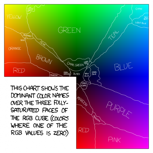
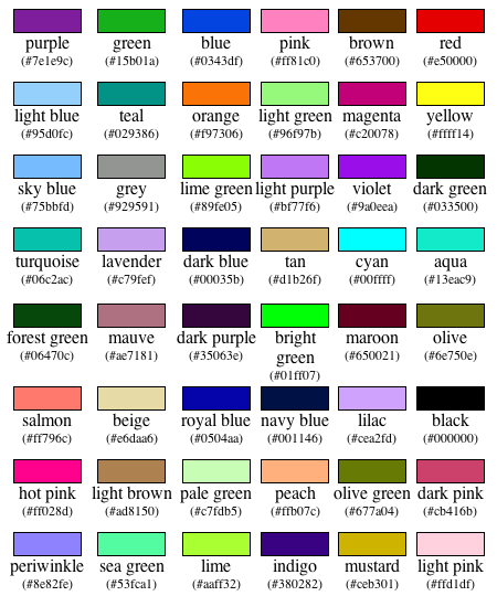
As a engineer, one of my core functions is to display physical information in a graphical format – be it the results of geological modelling or a production schedule. One problem I often have is finding a colour palette that has individual elements that are sufficiently distinguishable from each other – yes it may seem like a trivial issue, but it’s important to make it easy for people to interpret plans without them getting caught up in having to try to work out which interval, or which value, they are looking at.
In my search I came across this little gem (ColorBrewer), it’s based on work done by Prof Cynthia Brewer; who has done a lot of research on colour theory in cartography.
I just wanted to share as it’s a great site with some very cool resources.
As an engineer, one of my pet peeves is my inability to display physical information in a graphical format. I still haven’t found a good piece of software or software suite that will do that. Either the software has a ratshit font, such as Gimp, or can’t display 2-D data and 3-D data as for example a contour plot, such as Excel. Software has gone backwards in both respects in the past 20 years. I used to like “metawindows graphics” that allowed me to plot graphics directly from Fortran, but that died.
The Excel colour scheme for graphics is now much worse than it used to be. It used to default to primary colours that were not too difficult to tell apart so long as yellow (too close to white) was manually replaced by some other colour (eg. red). Now it’s total ratshit, OK, it’s more subtle which is useful when more than six colours are required, but it’s so bad that I wish they had a monochrome default option.
I’ve only done a little GIS, but I sympathise with the difficulty.
When I used to do 3-D graphics on Ansys, the default scheme there was quite good for slowly varying colours, it defaulted to a “rainbow” palette that went around the colour wheel: purple, red, orange, yellow, green, blue. Some programs that skipped the purple and went from red through to blue were not as good.
I tend to be envious of the colour schemes used in illustrating the Mandelbrot set.
I love the colours of ColorBrewer, particularly the rejection of schemes that are not safe for the colourblind, with the slight proviso that I don’t see any way to allow for the distinction between a white background and a black background. A light hue on a white background doesn’t work. Hold on a moment, it appears that all of the ColorBrewer palettes are optimised for a black background – see how the lines between regions on the GIS examples at right are all black, the colours wouldn’t work if the lines between regions were white.
But how to apply? Is there any expert out there who can tell me how to reset the default chart colours of Excel to one of those on ColorBrewer?

