Date: 26/06/2017 14:56:00
From: Rule 303
ID: 1082966
Subject: Dyslexic Font
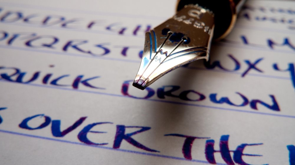
I was playing with a special dyslexic font in my training resources the other day and noticed that there is a pronounced difference in the line width at various points in the letters. Given that this is a purpose-built font, I presume it’s important.
I have also been writing a lot with a fountain pen lately, and was wondering whether the writing produced by an Italic nib might be better for people with Dyslexia.
Anyone in the position to test the theory?