> Define greyscale brightness…
I’ve got a formal and an informal definition. The formal definition is that if a colour is placed immediately adjacent to a grey colour, and if immediately next to the border between the two the colour side appears lighter than the grey side then the colour is lighter than the grey. And visa versa. I’m finding that good, but not good enough. It seems to fail for pure red and pure blue. For pure blue that version gives a blue which in bulk appears too light. So my informal guide is whether the colour in bulk appears brighter or darker.
I can do the formal method myself without help. But that tends to give a wrong answer for primary bulk colours, which is more subjective, hence my need for help. With the formal method I get an equivalence of rgb 50,50,50 with blue 0,0,255. But looking at the bulk colour that blue appears too bright, it’s more like an equivalence of grey 50,50,50 with dark blue 0,0,200 or even darker.
> Your objective is unclear to me.
Normal colour charts, paint charts for instance, with colour names like eggshell, olive, sea blue, confuse the hell out of colourblind people. I’m looking for a set of colours (using a selection of traditional names) that will be instantly separable, comparable and recognisable.
> http://www.color-blindness.com/2009/01/19/colorblind-colors-of-confusion/ They give you the lines of colour confusion for the three generally defined types of colour blindness. Click on the spot for protan (poor red, a red light may be invisible at night it is so dull), deutan (poor green, a green light may be so desaturated that it looks white) and tritan (rare, and different genetics)
Thanks for that buffy! I’ve been looking for a chart like that on the web for ages, with a complete lack of success. I’m deutan, but the lines of confusion on the chart don’t take into account greyscale. I do not confuse green, red and yellow for instance. I confuse vivid green with pale orange and dirty yellow. Whereas the lines of confusion on the chart appear to convert a 2-D colour space into a 1-D colour space, that isn’t true. The lines of confusion convert a 3-D colour space into a 2-D colour space. And a 2-D colour space is just the perfect dimensionality for drawing a colour chart.
> Luckily this has already been done… http://colorbrewer2.org
That’s a start. But what it really does is to eliminate the screamingly bad, not optimise the result to make it the best. Also, as above, what it ends up with is a 1-D colour space when colourblind people really do have a 2-D colour space.
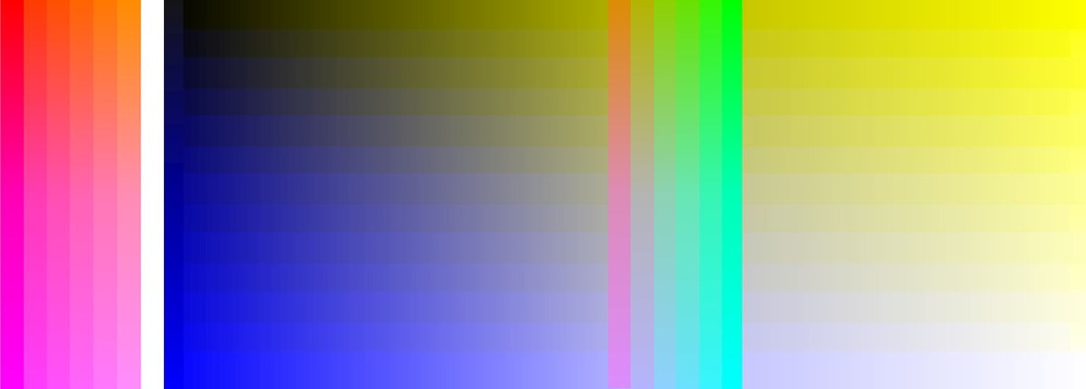
Here are four colour strips, where I’ve tried to match the greyscale brightness for each one. Comparisons please.